CSS positioning and float floating
1. Position positioning
(1): Position attributes
1.absolute : Generate absolutely positioned elements, positioned relative to the parent element whose latest level positioning is not static;
2.relative: Generate relatively positioned elements, positioned relative to the normal document flow position where they are located;
3.static: Default value, no positioning, the element appears in the normal document flow;
4.fixed: Not supported by old IE, consistent with absolute, positioned relative to the window, When the scroll bar appears, it does not scroll with scrolling;
5.sticky: (CSS3) has compatibility issues. It is like a combination of relative and fixed. When it is on the screen, it is typeset according to the regular flow. When scrolling out of the screen, it behaves like fixed. The performance of this attribute is the adsorption effect you see in reality.
(2): Regarding the problems generally caused by the use of position
1. If there is a p with a default width of 100%, once it is added When using absolute positioning, the element will be immediately inline-blocked, and the default width will adapt to the internal width of the element, which will cause the width and height of the page to collapse.
2. Due to the flexibility of absolute positioning, for ordinary page layouts, sometimes it is easy to abuse absolute/relative/top/left/z-index for the sake of saving trouble, which will cause later Expansion and maintenance cause trouble
(3): position code example
1.relative relative positioning.
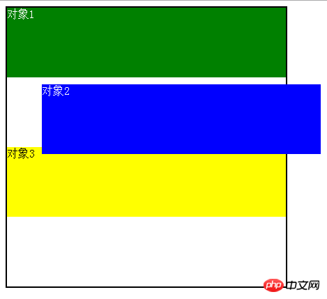
Object 2 moves relative to the original position of its own document flow, and still occupies the document flow. The yellow block below continues to move according to its original position. In the lower arrangement, relative only changes the visual position.
<style>
body{color: #fff;}
.aa{width: 400px;margin: 0 auto;border: 2px solid #000;height: 400px}
#position1 {height: 100px;background: green;}
#position2 {height: 100px;background: blue;position: relative;top: 10px;left: 50px;}
#position3{height: 100px;background: yellow;color: #000}
</style>
<body>
<p class="aa">
    <p id="position1">对象1</p>
    <p id="position2">对象2</p>
    <p id="position3">对象3</p>
</p>
</body>2.absolute absolute positioning
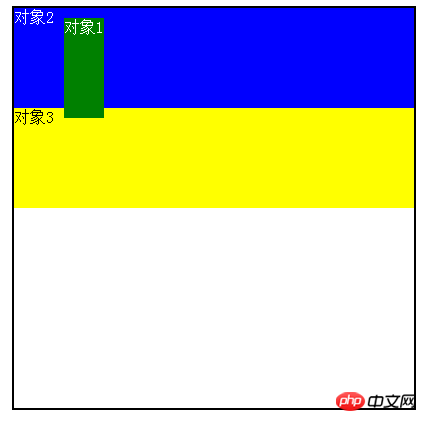
Object 1absolut attribute is offset relative to the parent p, separated from the document flow, and the width and height collapse, above the document flow.
<style>
body{color: #fff;}
.aa{width: 400px;margin: 0 auto;border: 2px solid #000;height: 400px;position: relative;}
#position1 {height: 100px;background: green;position: absolute;top: 10px;left:50px; }
#position2 {height: 100px;background: blue;}
#position3{height: 100px;background: yellow;color: #000}
</style>
</head>
<body>
<p class="aa">
    <p id="position1">对象1</p>
    <p id="position2">对象2</p>
    <p id="position3">对象3</p>
</p>2. float float
(1) Definition of float
float attribute defines the element to float in the left/right direction. A floated element creates a block-level box, regardless of what type of element it is.
Value of float: left/right/none
(2) Float implements text wrapping
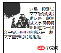
With floating attribute The element can also make the element inline-block, which has wrapping properties, so that the element combines the advantages of block elements and inline elements. Elements with floating attributes will be arranged out of the standard flow. The floating elements after breaking away from the standard flow will float on top of the normal block elements, but still occupy the text space of the normal document flow, so that the subsequent text will be in the space other than the floating elements. As a basis for arrangement, the text wrapping effect is formed.
<style>
.a{width: 200px;height: 400px;margin: 0 auto;border: 1px solid #000;}
.pic{float: left;}
p{font-size: 16px;line-height: 18px;font-family: "Microsoft Yahei"}
</style>
</head>
<body>
<p class="a">
    <img  class="pic lazy"  src="/static/imghw/default1.png"  data-src="2.jpg"      style="max-width:90%" width="100"  alt="CSS positioning and float floating" >
    <p>这是一段测试文字啦啦啦啦啦这是一段测试文字啊啊啊啊啊这是一段文字显示呐呐呐呐这是一段文字显示啦啦啦啦啦</p>
</p>##(3) float floating layout
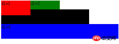
(4) Why to clear floats and several methods to clear floats
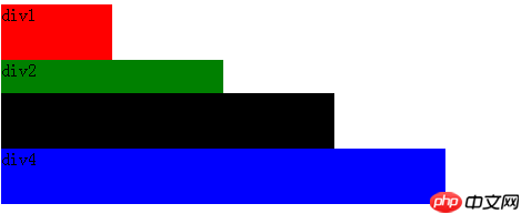
Due to the side effects of floating causing the element height to collapse, the parent box The border cannot be stretched, the background cannot be displayed, and the margin and padding settings between parent and child levels cannot be displayed correctly.
<style>
.p1{width: 400px;border: 2px solid #000;}
.p2{width: 100px;height: 100px;background: blue;float: left;}
.p3{width: 100px;height: 100px;background: green;float: right;}
</style>
</head>
<body>
<p class="p1">
    <p class="p2">p2</p>
    <p class="p3">p3</p>
</p>##Method 1: Add a child tag before the end of the parent
<p class="p1">
    <p class="p2">p2</p>
    <p class="p3">p3</p>
    <p style="clear:both;"></p>
</p>方法2:在父级css属性加上入overflow:hidden;zoom:1;或者overflow:auto;zoom:1;
方法3:在父级用zoom+:after方法,原理类似于clear:both,利用CSS方式:after在元素内部加一个clear:both的元素块
.box1{zoom:1;}
.box1:after{display:block; content:'clear'; clear:both; line-height:0; visibility:hidden;}方法4:对父级设置合适的高度直接撑开
(五)float和JavaScript
IE浏览器:
obj.style.styleFloat = "left";
其他浏览器:
obj.style.cssFloat = "left";
更多CSS positioning and float floating相关文章请关注PHP中文网!

Hot AI Tools

Undresser.AI Undress
AI-powered app for creating realistic nude photos

AI Clothes Remover
Online AI tool for removing clothes from photos.

Undress AI Tool
Undress images for free

Clothoff.io
AI clothes remover

Video Face Swap
Swap faces in any video effortlessly with our completely free AI face swap tool!

Hot Article

Hot Tools

Notepad++7.3.1
Easy-to-use and free code editor

SublimeText3 Chinese version
Chinese version, very easy to use

Zend Studio 13.0.1
Powerful PHP integrated development environment

Dreamweaver CS6
Visual web development tools

SublimeText3 Mac version
God-level code editing software (SublimeText3)

Hot Topics
 Vue 3
Apr 02, 2025 pm 06:32 PM
It's out! Congrats to the Vue team for getting it done, I know it was a massive effort and a long time coming. All new docs, as well.
 Can you get valid CSS property values from the browser?
Apr 02, 2025 pm 06:17 PM
I had someone write in with this very legit question. Lea just blogged about how you can get valid CSS properties themselves from the browser. That's like this.
 A bit on ci/cd
Apr 02, 2025 pm 06:21 PM
I'd say "website" fits better than "mobile app" but I like this framing from Max Lynch:
 Stacked Cards with Sticky Positioning and a Dash of Sass
Apr 03, 2025 am 10:30 AM
The other day, I spotted this particularly lovely bit from Corey Ginnivan’s website where a collection of cards stack on top of one another as you scroll.
 Using Markdown and Localization in the WordPress Block Editor
Apr 02, 2025 am 04:27 AM
If we need to show documentation to the user directly in the WordPress editor, what is the best way to do it?
 Comparing Browsers for Responsive Design
Apr 02, 2025 pm 06:25 PM
There are a number of these desktop apps where the goal is showing your site at different dimensions all at the same time. So you can, for example, be writing
 How to Use CSS Grid for Sticky Headers and Footers
Apr 02, 2025 pm 06:29 PM
CSS Grid is a collection of properties designed to make layout easier than it’s ever been. Like anything, there's a bit of a learning curve, but Grid is
 Google Fonts Variable Fonts
Apr 09, 2025 am 10:42 AM
I see Google Fonts rolled out a new design (Tweet). Compared to the last big redesign, this feels much more iterative. I can barely tell the difference


