


 收藏
收藏


 天蓬老师
天蓬老师批改状态:合格
老师批语:

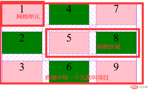
CSS 网格布局擅长于将一个页面划分为几个主要区域,以及定义这些区域的大小、位置、层次等关系(前提是HTML生成了这些区域)。
像表格一样,网格布局让我们能够按行或列来对齐元素。 然而在布局上,网格比表格更可能做到或更简单。 例如,网格容器的子元素可以自己定位,以便它们像CSS定位的元素一样,真正的有重叠和层次。

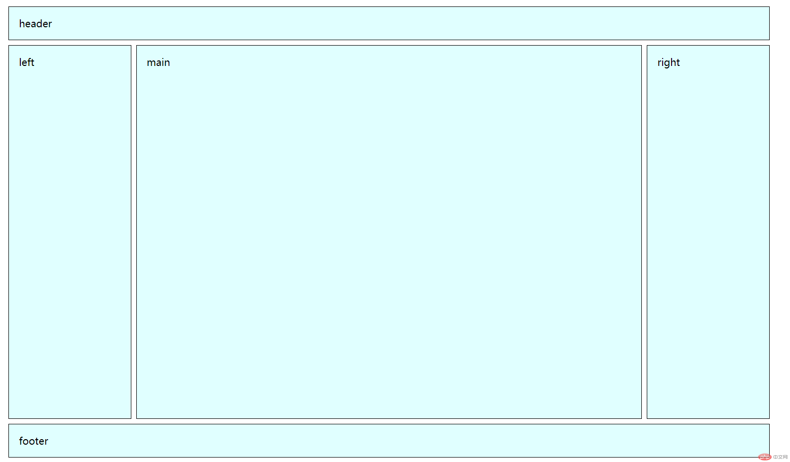
上图这样的布局,就是 Grid 布局的拿手好戏。
Grid 布局与 Flex 布局有一定的相似性,都可以指定容器内部多个项目的位置。但是,它们也存在重大区别。
Flex 布局是轴线布局,只能指定”项目”针对轴线的位置,可以看作是一维布局。Grid 布局则是将容器划分成”行”和”列”,产生单元格,然后指定”项目所在”的单元格,可以看作是二维布局。Grid 布局远比 Flex 布局强大。
| 序号 | 属性 | 描述 |
|---|---|---|
| 1 | grid-template-columns |
定义网格轨道中的列宽 |
| 2 | grid-template-rows |
定义网格轨道中的行高 |
| 3 | gap |
网格轨道间距 |
| 4 | grid-auto-flow |
项目在容器中的排列方向 |
| 5 | grid-auto-rows |
隐式网格单元的行高 |
| 6 | grid-auto-columns |
隐式网格单元的列宽 |
| 7 | grid-area |
定义网格区域 |
| 8 | place-items |
所有项目在网络单元中的对齐方式 |
| 9 | place-self |
某个项目在网络单元(含网格区域)中的对齐方式 |
| 10 | place-content |
项目在网格容器中的对齐方式 |
| 序号 | 术语 | 描述 |
|---|---|---|
| 1 | 网格容器 | dispaly:grid属性定义的元素 |
| 2 | 网格项目 | 网格容器的直接子元素 |
| 3 | 网格区域 | 由一个或多个单元格组成的矩形区域 |
| 4 | 网格轨道 | 有行轨道与列轨道之分 |
| 5 | 轨道间距 | 分为行轨间隙和列轨间隙 |
grid快速实现”圣怀布局 代码
<!DOCTYPE html><html lang="zh-CN"><head><meta charset="UTF-8"><meta http-equiv="X-UA-Compatible" content="IE=edge"><meta name="viewport" content="width=device-width, initial-scale=1.0"><title>grid快速实现"圣怀布局"</title><style>/* 圣怀布局:grid实现,二边固定,中间自适应,主体优先渲染 */body * {border: 1px solid #000;}body {display: grid;grid-template-columns: 15em minmax(50vw,auto) 15em;grid-template-rows: 3em minmax(80vh,auto) 3em;gap: 0.5em;}header,footer {grid-area: span 1 / span 3;}main {grid-area: 2 /2;}</style></head><body><!-- 圣怀布局要求主体区优先显示,根据浏览器渲染顺序,主体应该写到前面去。 --><header>header</header><!-- 主体main应该优先渲染 --><main>main</main><aside class="left">left</aside><aside class="right">right</aside><footer>footer</footer></body></html>
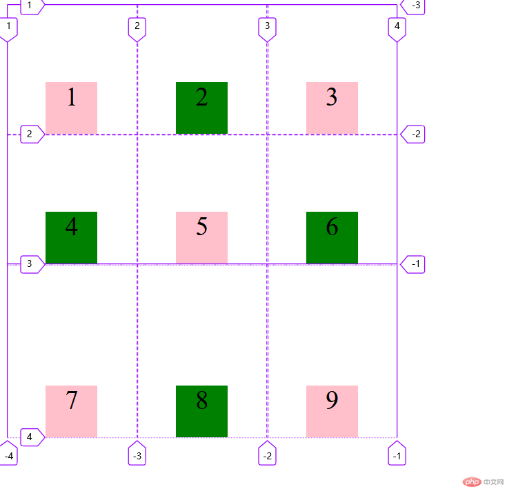
容器指定了网格布局以后,接着就要划分行和列。grid-template-columns属性定义每一列的列宽grid-template-rows属性定义每一行的行高。
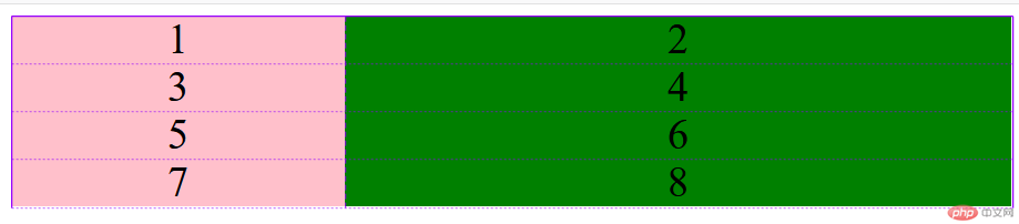
指定三行三列的网格,列宽和行高都是100px
<!DOCTYPE html><html lang="en"><head><meta charset="UTF-8"><meta name="viewport" content="width=device-width, initial-scale=1.0"><title>grid网格布局</title><style>.container {display: grid;grid-template-columns: 100px 100px 100px;grid-template-rows: 100px 100px 100px;/* 除了使用绝对单位,也可以使用百分比 *//* grid-template-columns: 33.33% 33.33% 33.33%;grid-template-rows: 33.33% 33.33% 33.33%; */}.container .item {font-size: 60px;text-align: center;background-color: pink;}.container .item:nth-child(even) {background-color: green;}</style></head><body><div class="container"><div class="item">1</div><div class="item">2</div><div class="item">3</div><div class="item">4</div><div class="item">5</div><div class="item">6</div><div class="item">7</div><div class="item">8</div><div class="item">9</div></div></body></html>
.container {display: grid;grid-template-columns: 100px 100px 100px;grid-template-rows: 100px 100px 100px;/* gap: 水平间隙(行) 垂直间隙(列) */gap: 10px 20px;}
划分网格以后,容器的子元素会按照顺序,自动放置在每一个网格。默认的放置顺序是”先行后列”,即先填满第一行,再开始放入第二行
.container {display: grid;grid-template-columns: repeat(3, 150px);grid-template-rows: repeat(3, 150px);gap: 1px;/* 项目在容器中的排列方向 */grid-auto-flow: column}
这个顺序由grid-auto-flow属性决定,默认值是row,即”先行后列”。也可以将它设成column,变成”先列后行”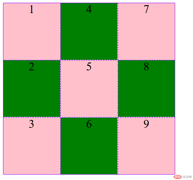
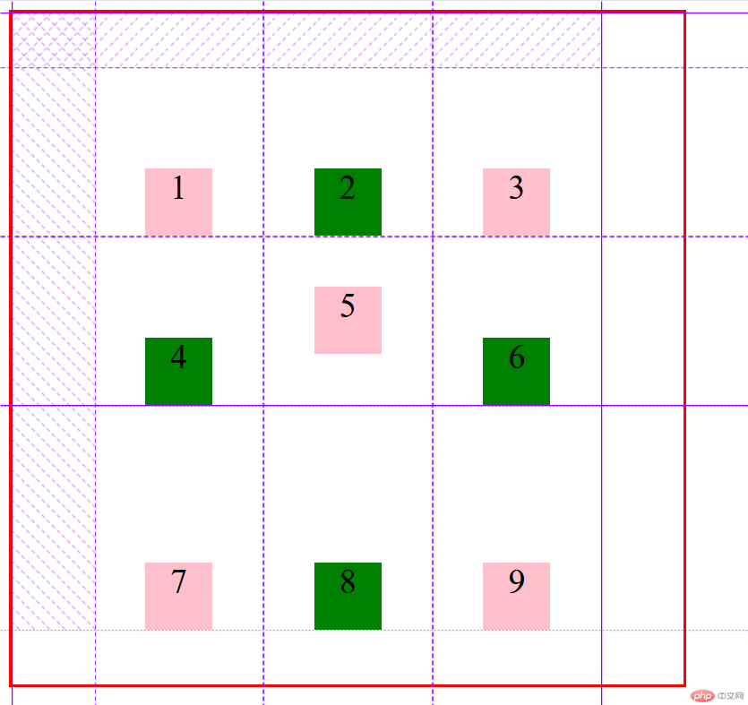
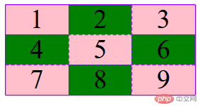
有时候,一些项目的指定位置,在现有网格的外部。比如网格只有3列,但是某一个项目指定在第5行。这时,浏览器会自动生成多余的网格,以便放置项目。grid-auto-columns属性和grid-auto-rows属性用来设置,浏览器自动创建的多余网格的列宽和行高。它们的写法与grid-template-columns和grid-template-rows完全相同。如果不指定这两个属性,浏览器完全根据单元格内容的大小,决定新增网格的列宽和行高。
划分好的网格是3行 x 3列,但是,8号项目指定在第4行,9号项目指定在第5行。
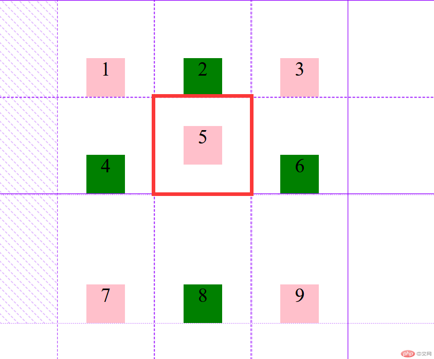
.container {display: grid;grid-template-columns: 100px 100px 100px;grid-template-rows: 100px 100px 100px;grid-auto-rows: 50px;}
指定新增的行高统一为50px(原始的行高为100px)
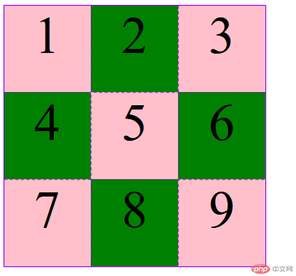
网格布局允许指定”区域”(area),一个区域由单个或多个单元格组成。grid-template-areas属性用于定义区域。
.container {display: grid;grid-template-columns: 100px 100px 100px;grid-template-rows: 100px 100px 100px;grid-template-areas: 'a b c' 'd e f' 'g h i';}
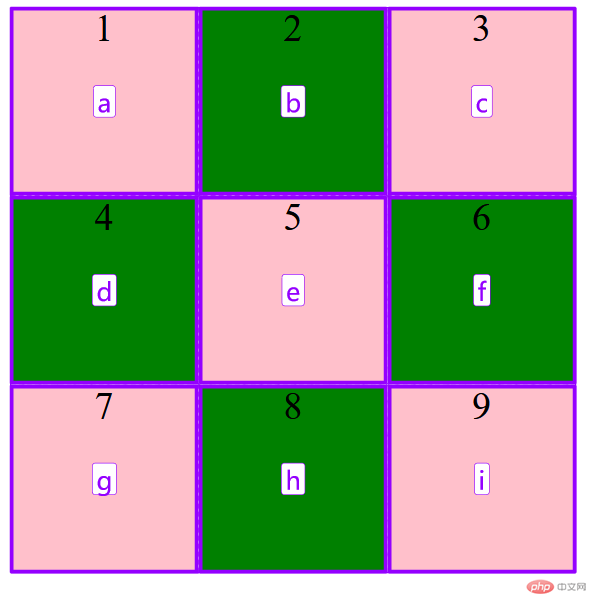
先划分出9个单元格,然后将其定名为a到i的九个区域,分别对应这九个单元格。
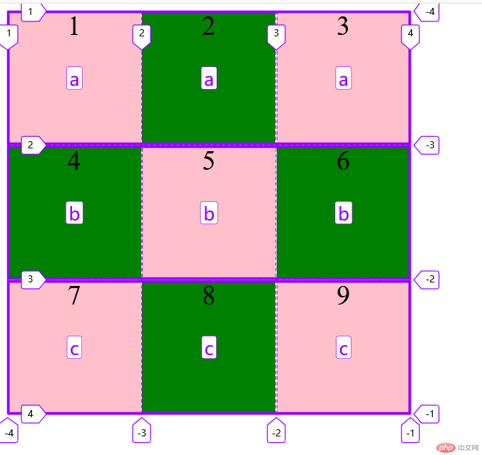
多个单元格合并成一个区域的写法如下。将9个单元格分成a、b、c三个区域
grid-template-areas: 'a a a''b b b''c c c';
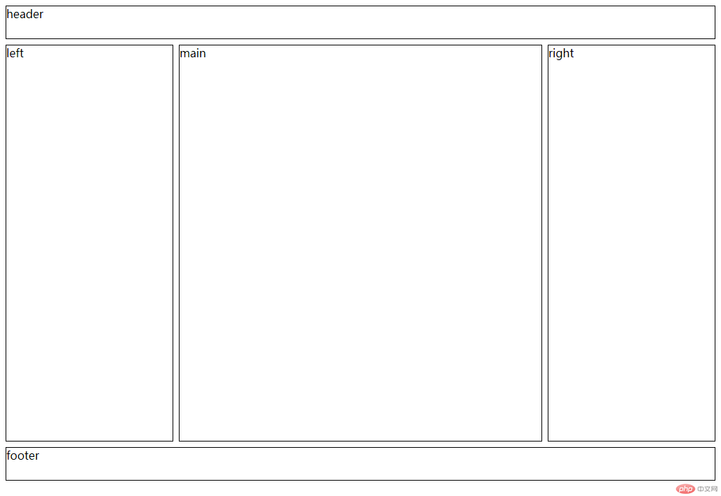
下面是一个布局实例圣杯布局
<!DOCTYPE html><html lang="en"><head><meta charset="UTF-8"><meta name="viewport" content="width=device-width, initial-scale=1.0"><title>圣杯布局</title><style>body * {border: 1px solid #000;}body {display: grid;grid-template-columns: 15em minmax(50vw, auto) 15em;grid-template-rows: 3em minmax(80vh, auto) 3em;place-content: center;gap: 0.5em;grid-template-areas: "header header header""left main right""footer footer footer";}/* header,footer {grid-area: span 1 / span 3;}main {grid-area: 2 /2;} *//* 等同于 */header {grid-area: header;}footer {grid-area: footer;}main {grid-area: main;}aside.left{grid-area: left;}aside.right{grid-area: right;}</style></head><body><header>header</header><main>main</main><aside class="left">left</aside><aside class="right">right</aside><footer>footer</footer></body></html>
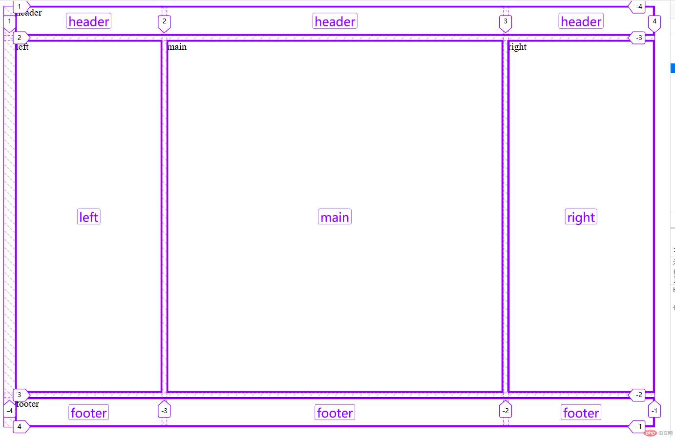
顶部是页眉区域header,底部是页脚区域footer,中间部分则为left、main和right。
如果某些区域不需要利用,则使用”点”(.)表示
grid-template-areas: 'a . c''d . f''g . i';
中间一列为点,表示没有用到该单元格,或者该单元格不属于任何区域。
place-items属性设置单元格内容的水平位置(左中右)垂直位置(上中下)
.container {/* 如果省略第二个值,则浏览器认为与第一个值相等 *//* 垂直对齐方式 水平对齐方式 */place-items: start end;}
注意:项目默认是拉伸的,如果设置了大小,并小于单元空间的话
在单元格中就会存在剩余空间可以被分配,这时对齐就有意义了。
.container {display: grid;grid-template-columns: repeat(3, 150px);grid-template-rows: repeat(2, 150px);gap: 1px;grid-auto-flow: row;grid-auto-rows: 200px;/* 单元格内容对齐方式 */place-items: end center;}.item{font-size: 30px;text-align: center;background-color: pink;width: 60px;height: 60px;}
整个内容区域在容器里面的水平位置(左中右),垂直位置(上中下)
place-content: space-around space-evenly;
.container {width: 600px;height: 600px;display: grid;grid-template-columns: repeat(3, 150px);grid-template-rows: repeat(2, 150px);gap: 1px;grid-auto-flow: row;grid-auto-rows: 200px;/* 单元格内容对齐方式 */place-items: end center;/* 整个内容区域在容器里面对齐方式 */place-content: center center;}
grid-area属性指定项目放在哪一个区域
项目的位置是可以指定的,具体方法就是指定项目的四个边框,分别定位在哪根网格线。
四个值分别是:
grid-row-start属性:上边框所在的水平网格线grid-column-start属性:左边框所在的垂直网格线grid-row-end属性:下边框所在的水平网格线grid-column-end属性:右边框所在的垂直网格线
.item-1 {grid-area: e;/* 行起始编号 / 列起始编号 / 行结束编号 / 列结束编号 */grid-area: 1 / 1 / 3 / 3;/* 结束行列编号可以省略,默认跨越1行1列 */grid-area: 1 / 1;/* 例如跨越两行三列 */grid-area: 1 / 1 / 3 / 4;/* 还可以使用`span`关键字,表示"跨越",即左右边框(上下边框)之间跨越多少个网格 *//* 通常不关心结束位置,我们只想要知道跨越几行几列 */grid-area: 1 / 1 / span 2 / span 3;}
place-self属性
place-self: center center;
place-items属性的用法完全一致,但只作用于单个项目
.container .item:nth-child(5){place-self: center;}
有时候,重复写同样的值非常麻烦,尤其网格很多时。这时,可以使用repeat()函数,简化重复的值。上面的代码用repeat()改写如下。
.container {display: grid;grid-template-columns: repeat(3, 33.33%);grid-template-rows: repeat(3, 33.33%);}
repeat()接受两个参数,第一个参数是重复的次数(上例是3),第二个参数是所要重复的值。repeat()重复某种模式也是可以的。
grid-template-columns: repeat(2, 100px 20px 80px);
定义了6列,第一列和第四列的宽度为100px,第二列和第五列为20px,第三列和第六列为80px。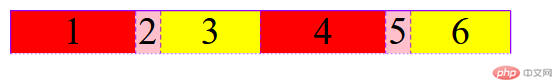
为了方便表示比例关系,网格布局提供了fr关键字(fraction 的缩写,意为”片段”)。如果两列的宽度分别为1fr和2fr,就表示后者是前者的两倍。
.container {display: grid;grid-template-columns: 1fr 2fr;}
.container {display: grid;grid-template-columns: repeat(3,1fr);grid-template-rows: repeat(3,1fr);}
fr可以与绝对长度的单位结合使用,这时会非常方便。
.container {display: grid;grid-template-columns: 150px 1fr 2fr;grid-template-rows: repeat(3, 1fr);gap: 1px;}
表示,第一列的宽度为150像素,第二列的宽度是第三列的一半。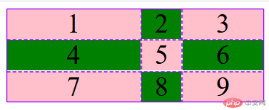
.container {/* 转为网格容器进行布局 */display: grid;border: 1px solid #000;padding: 0.5em;/* 1. 设置轨道的列宽 *//* grid-template-columns: auto auto auto; *//* 要求,第二列是第一列和第三的宽度的2倍,这个功能用auto是无法实现 *//* grid-template-columns: 1fr 3fr 1fr; *//* grid-template-columns: 25% 50% 25%; *//* grid-template-columns: 20% 60% 20%; */grid-template-columns: 8em 1fr 2fr 100px;/* 先计算出固定的值: 8*16 + 100 = ? *//* 总宽度 - 已知的固定宽度(8*16 + 100) = 100% *//* 第2列,分到1/3, 第3列分到2/3 *//* 2. 设置田轨道的行高 */grid-template-rows: 5em 5em;/* 3. 设置轨道间的间隙 */gap: 0.5em;}
有时,单元格的大小是固定的,但是容器的大小不确定。如果希望每一行(或每一列)容纳尽可能多的单元格,这时可以使用auto-fill关键字表示自动填充。
.container {display: grid;grid-template-columns: repeat(*auto-fill*, 100px);}
表示每列宽度100px,然后自动填充,直到容器不能放置更多的列。
产生一个长度范围,表示长度就在这个范围之中。它接受两个参数,分别为最小值和最大值。
minmax(100px, 1fr)表示中间的列宽不小于100px,不大于1fr。
auto关键字表示由浏览器自己决定长度。
grid-template-columns: 100px auto 100px;
第二列的宽度,基本上等于该列单元格的最大宽度,除非单元格内容设置了min-width,且这个值大于最大宽度。
grid-template-columns: auto auto auto;
三列平均分配占满浏览器
.container {/* 转为网格容器进行布局 */display: grid;border: 1px solid #000;padding: 0.5em;/* 1. 设置轨道的列宽 *//* grid-template-columns: 10em 10em 10em; *//* 1. repeat() *//* grid-template-columns: repeat(3, 10em); *//* 第二个参数支持多个值 *//* grid-template-columns: repeat(3, 10em 2em);grid-template-columns: 10em 2em 10em 2em 10em 2em; *//* grid-template-columns: repeat(3, 1fr); *//* 2. minmax() *//* grid-template-columns: 1fr 2fr 1fr; *//* 第二个设置一个最小值 */grid-template-columns: 1fr minmax(20em, 2fr) 1fr;/* 2. 设置田轨道的行高 */grid-template-rows: 5em 5em;/* 3. 设置轨道间的间隙 */gap: 0.5em;}
网格容器/网格项目/网格单元/网格轨道/轨道间距
<!DOCTYPE html><html lang="zh-CN"><head><meta charset="UTF-8"><meta http-equiv="X-UA-Compatible" content="IE=edge"><meta name="viewport" content="width=device-width, initial-scale=1.0"><title>网格容器/网格项目/网格单元/网格轨道/轨道间距</title><style>/* 1.网格容器:由若干个矩形网格单元构成2.网格项目:网格容器的子元素,必须放在网格单元中3.网格单元:有"单元格"和"网格区域"二种表现形式4.网格轨道:由多个网格单元组成,根据排列方向有"行轨"和"列轨"之分5.轨道间距:容器中轨道之间的间距,有"行轨间距"和"列轨间距" *//* 网格容器 */.container {border: 1px solid #000;padding: 0.5em;/* flex中子元素默认为行内(inline)元素,grid中子元素默认为块(block)元素 */display: grid;/* 1.设置轨道的列宽 *//* 设置一个3列2行的布局空间 */grid-template-columns: auto;grid-template-columns: 10em 10em 10em;/* 2.设置轨道的行高 */grid-template-rows: auto;grid-template-rows: 5em 5em;/* 3.设置轨道的间距 *//* gap: 水平 垂直 */gap: 0.5em 1em;gap: 0.5em 0.5em;/* gap: 0.5em 0.5em;可简写gap: 0.5em; */gap: 0.5em;}/* 网格项目:网格容器中的"子元素"(不能是孙元素),与flex是一样的 */.container>.item {/* 默认生成一列N行的容器(N就是项目的数量) */background-color: pink;border: 1px solid #000;padding: 0.5em;}</style></head><body><div class="container"><span class="item">item1</span><span class="item">item2</span><span class="item">item3</span><span class="item">item4</span><span class="item">item5</span><span class="item">item6</span></div></body></html>
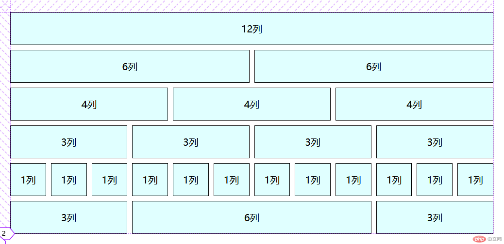
/* 初始化 */* {margin: 0;padding: 0;box-sizing: border-box;}body {width: 100vw;height: 100vh;display: grid;place-content: center;}.container {min-width: 80vw;display: grid;gap: 0.5em;}.container > .row {display: grid;grid-template-columns: repeat(12,1fr);min-height: 3em;gap: 0.5em;}.container > .row >.item{background: lightcyan;padding: 1em;text-align: center;/* background-color: lightcyan; */border: 1px solid;/* border-radius: 5px; */}.col-12 {grid-area: auto / span 12;}.col-11 {grid-area: auto / span 11;}.col-10 {grid-area: auto / span 10;}.col-9 {grid-area: auto / span 9;}.col-8 {grid-area: auto / span 8;}.col-7 {grid-area: auto / span 7;}.col-6 {grid-area: auto / span 6;}.col-5 {grid-area: auto / span 5;}.col-4 {grid-area: auto / span 4;}.col-3 {grid-area: auto / span 3;}.col-2 {grid-area: auto / span 2;}.col-1 {grid-area: auto / span 1;}
<!DOCTYPE html><html lang="zh-CN"><head><meta charset="UTF-8"><meta http-equiv="X-UA-Compatible" content="IE=edge"><meta name="viewport" content="width=device-width, initial-scale=1.0"><title>模拟bootstrap/layui的12列栅格布局组件</title><link rel="stylesheet" href="style.css"></head><body><div class="container"><!-- 一等份 --><!-- 栅格布局分为二步:1.先创建一个行2.在行中进行列的划分 --><div class="row"><span class="item col-12">12列</span></div><!-- 二等分 --><div class="row"><span class="item col-6">6列</span><span class="item col-6">6列</span></div><!-- 三等分 --><div class="row"><span class="item col-4">4列</span><span class="item col-4">4列</span><span class="item col-4">4列</span></div><!-- 四等分 --><div class="row"><span class="item col-3">3列</span><span class="item col-3">3列</span><span class="item col-3">3列</span><span class="item col-3">3列</span></div><!-- 十二等分 --><div class="row"><span class="item col-1">1列</span><span class="item col-1">1列</span><span class="item col-1">1列</span><span class="item col-1">1列</span><span class="item col-1">1列</span><span class="item col-1">1列</span><span class="item col-1">1列</span><span class="item col-1">1列</span><span class="item col-1">1列</span><span class="item col-1">1列</span><span class="item col-1">1列</span><span class="item col-1">1列</span></div><!-- 左中右三列,左右相同,中间不同 --><div class="row"><span class="item col-3">3列</span><span class="item col-6">6列</span><span class="item col-3">3列</span></div></div></body></html>
使用封装好的grid布局组件来写一个圣杯布局 代码
<!DOCTYPE html><html lang="zh-CN"><head><meta charset="UTF-8"><meta http-equiv="X-UA-Compatible" content="IE=edge"><meta name="viewport" content="width=device-width, initial-scale=1.0"><title>使用封装好的grid布局组件来写一个圣杯布局</title><link rel="stylesheet" href="grid.css"><style>.row:nth-of-type(2){height: 80vh;}</style></head><body><!-- 通用三列布局 --><div class="container"><!-- 页眉 --><div class="row"><div class="item col-12 header">header</div></div><!-- 主体 --><div class="row"><div class="item col-2 header">left</div><div class="item col-8 header">main</div><div class="item col-2 header">right</div></div><!-- 页脚 --><div class="row"><div class="item col-12 header">footer</div></div></div></body></html>
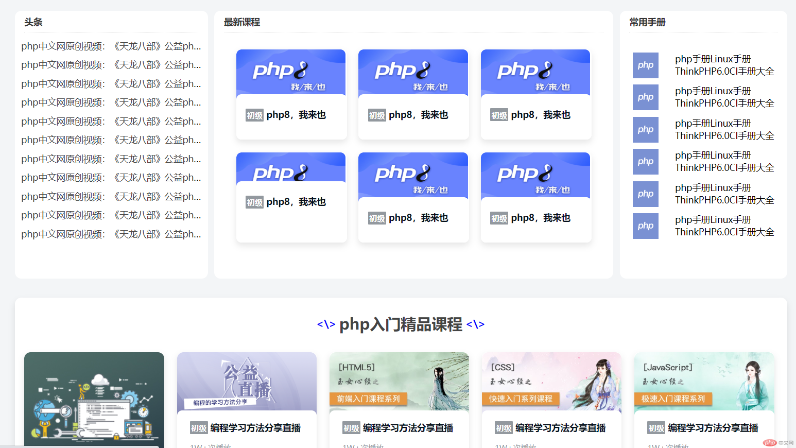
<!DOCTYPE html><html lang="zh-CN"><head><meta charset="UTF-8"><meta http-equiv="X-UA-Compatible" content="IE=edge"><meta name="viewport" content="width=device-width, initial-scale=1.0"><title>grid仿php.cn首页</title><link rel="stylesheet" href="css/php.css"></head><body><!-- 页眉 --><header><div class="logo"><a href="http://" target="_blank" title="php中文网"></a></div><ul class="top-navs"><li><a href="#" class="item">首页</a></li><li><a href="#" class="item">视频教程</a></li><li><a href="#" class="item">入门教程</a></li><li><a href="#" class="item">社区问答</a></li><li><a href="#" class="item">技术文章</a><span></span></li><li><a href="#" class="item">编程词典</a><span></span></li><li><a href="#" class="item">资源下载</a><span></span></li><li><a href="#" class="item">工具下载</a><span></span></li><li><a href="#" class="item">PHP培训</a><span>新</span></li></ul><div class="user-card-box"><img src="https://img.php.cn/upload/avatar/000/524/683/603603465c46e400.jpg" height="40" width="40"></div></header><!-- 主体顶部区 --><div class="main-top"><!-- 侧边菜单 --><ul class="menus"><li class="item"><h5>php开发</h5><h5>></h5></li><li class="item"><h5>前端开发</h5><h5>></h5></li><li class="item"><h5>服务端开发</h5><h5>></h5></li><li class="item"><h5>移动开发</h5><h5>></h5></li><li class="item"><h5>数据库</h5><h5>></h5></li><li class="item"><h5>服务器运维&下载</h5><h5>></h5></li><li class="item"><h5>在线工具箱</h5><h5>></h5></li><li class="item"><h5>常用类库</h5><h5>></h5></li></ul><!-- 顶部菜单 --><ul class="navs"><li><div><a href="">PHP头条</a><h6>新</h6></div></li><li><div><a href="">独孤九贱</a><h6></h6></div></li><li><div><a href="">学习路线</a><h6>新</h6></div></li><li><div><a href="">在线工具</a><h6></h6></div></li><li><div><a href="">趣味课堂</a><h6>新</h6></div></li><li><div><a href="">社区问答</a><h6></h6></div></li><li><div><a href="">课程直播</a><h6></h6></div></li><li><input type="text" placeholder="输入关键字搜索"></li></ul><!-- 轮播图 --><div class="slider"><img src="https://img.php.cn/upload/article/000/000/001/6034a327aef30703.png" alt=""></div><!-- 底部的课程推荐 --><ul class="course"><li><a href=""><img src="https://www.php.cn/static/images/index_yunv.jpg" alt=""></a></li><li><a href=""><img src="https://www.php.cn/static/images/index_php_item2_.png?1" alt=""></a></li><li><a href=""><img src="https://www.php.cn/static/images/index_php_item3.jpg?1" alt=""></a></li><li><a href=""><img src="https://www.php.cn/static/images/index_php_new4.jpg?1" alt=""></a></li></ul></div><!-- 广告区 --><div class="index_ad_top"><a href=""><img src="https://img.php.cn/upload/article/000/000/001/6034a36c9c07c118.png" alt=""></a></div><!-- 头条 --><div class="headline"><div class="article"><div class="panel-title">头条</div><ul><li><a href="">php中文网原创视频:《天龙八部》公益php培训系列课程汇总!</a></li><li><a href="">php中文网原创视频:《天龙八部》公益php培训系列课程汇总!</a></li><li><a href="">php中文网原创视频:《天龙八部》公益php培训系列课程汇总!</a></li><li><a href="">php中文网原创视频:《天龙八部》公益php培训系列课程汇总!</a></li><li><a href="">php中文网原创视频:《天龙八部》公益php培训系列课程汇总!</a></li><li><a href="">php中文网原创视频:《天龙八部》公益php培训系列课程汇总!</a></li><li><a href="">php中文网原创视频:《天龙八部》公益php培训系列课程汇总!</a></li><li><a href="">php中文网原创视频:《天龙八部》公益php培训系列课程汇总!</a></li><li><a href="">php中文网原创视频:《天龙八部》公益php培训系列课程汇总!</a></li><li><a href="">php中文网原创视频:《天龙八部》公益php培训系列课程汇总!</a></li><li><a href="">php中文网原创视频:《天龙八部》公益php培训系列课程汇总!</a></li></ul></div><div class="course"><div class="panel-title">最新课程</div><ul><li><a href=""><img src="https://img.php.cn/upload/course/000/000/013/6049da2b3898c385.jpg" alt=""><div class="php-course-intro"><h3><i>初级</i>php8,我来也</h3></div></a></li><li><a href=""><img src="https://img.php.cn/upload/course/000/000/013/6049da2b3898c385.jpg" alt=""><div class="php-course-intro"><h3><i>初级</i>php8,我来也</h3></div></a></li><li><a href=""><img src="https://img.php.cn/upload/course/000/000/013/6049da2b3898c385.jpg" alt=""><div class="php-course-intro"><h3><i>初级</i>php8,我来也</h3></div></a></li><li><a href=""><img src="https://img.php.cn/upload/course/000/000/013/6049da2b3898c385.jpg" alt=""><div class="php-course-intro"><h3><i>初级</i>php8,我来也</h3></div></a></li><li><a href=""><img src="https://img.php.cn/upload/course/000/000/013/6049da2b3898c385.jpg" alt=""><div class="php-course-intro"><h3><i>初级</i>php8,我来也</h3></div></a></li><li><a href=""><img src="https://img.php.cn/upload/course/000/000/013/6049da2b3898c385.jpg" alt=""><div class="php-course-intro"><h3><i>初级</i>php8,我来也</h3></div></a></li></ul></div><div class="manual"><div class="panel-title">常用手册</div><ul><li><img src="https://www.php.cn/upload/system/000/000/001/57d55fe881432245.jpg" alt=""><p>php手册Linux手册ThinkPHP6.0CI手册大全</p></li><li><img src="https://www.php.cn/upload/system/000/000/001/57d55fe881432245.jpg" alt=""><p>php手册Linux手册ThinkPHP6.0CI手册大全</p></li><li><img src="https://www.php.cn/upload/system/000/000/001/57d55fe881432245.jpg" alt=""><p>php手册Linux手册ThinkPHP6.0CI手册大全</p></li><li><img src="https://www.php.cn/upload/system/000/000/001/57d55fe881432245.jpg" alt=""><p>php手册Linux手册ThinkPHP6.0CI手册大全</p></li><li><img src="https://www.php.cn/upload/system/000/000/001/57d55fe881432245.jpg" alt=""><p>php手册Linux手册ThinkPHP6.0CI手册大全</p></li><li><img src="https://www.php.cn/upload/system/000/000/001/57d55fe881432245.jpg" alt=""><p>php手册Linux手册ThinkPHP6.0CI手册大全</p></li></ul></div></div><!-- 课程列表区 --><div class="main-courses"><div class="title"><div><\></div><h2>php入门精品课程</h2><div><\></div></div><ul class="course-list"><li><a href=""><img src="https://www.php.cn/static/images/index_learn_first.jpg" alt=""></a></li><li><a href=""><img src="https://img.php.cn/upload/course/000/000/001/5b63c72c61569244.png" alt=""></a><div class="php-course-intro"><h3><i>初级</i>编程学习方法分享直播公益课</h3><p>本章节讲解的是有关CSS基础的内容,轻松明快,适合新手观看学习。</p></div><div class="php-course-bottom"><span>1W+次播放</span></div></li><li><a href=""><img src="https://img.php.cn/upload/course/000/126/153/5aa23f0ded921649.jpg" alt=""></a><div class="php-course-intro"><h3><i>初级</i>编程学习方法分享直播公益课</h3><p>本章节讲解的是有关CSS基础的内容,轻松明快,适合新手观看学习。</p></div><div class="php-course-bottom"><span>1W+次播放</span></div></li><li><a href=""><img src="https://img.php.cn/upload/course/000/126/153/5ab346fc62ce4221.jpg" alt=""></a><div class="php-course-intro"><h3><i>初级</i>编程学习方法分享直播公益课</h3><p>本章节讲解的是有关CSS基础的内容,轻松明快,适合新手观看学习。</p></div><div class="php-course-bottom"><span>1W+次播放</span></div></li><li><a href=""><img src="https://img.php.cn/upload/course/000/126/153/5acc118f11d6b969.jpg" alt=""></a><div class="php-course-intro"><h3><i>初级</i>编程学习方法分享直播公益课</h3><p>本章节讲解的是有关CSS基础的内容,轻松明快,适合新手观看学习。</p></div><div class="php-course-bottom"><span>1W+次播放</span></div></li><li><a href=""><img src="https://img.php.cn/upload/course/000/000/001/5d1c6e0d2b744633.jpg" alt=""></a><div class="php-course-intro"><h3><i>初级</i>编程学习方法分享直播公益课</h3><p>本章节讲解的是有关CSS基础的内容,轻松明快,适合新手观看学习。</p></div><div class="php-course-bottom"><span>1W+次播放</span></div></li><li><a href=""><img src="https://img.php.cn/upload/course/000/001/120/5a9fb97057b15707.jpeg" alt=""></a><div class="php-course-intro"><h3><i>初级</i>编程学习方法分享直播公益课</h3><p>本章节讲解的是有关CSS基础的内容,轻松明快,适合新手观看学习。</p></div><div class="php-course-bottom"><span>1W+次播放</span></div></li><li><a href=""><img src="https://img.php.cn/upload/course/000/000/001/5d24019911a24370.jpg" alt=""></a><div class="php-course-intro"><h3><i>初级</i>编程学习方法分享直播公益课</h3><p>本章节讲解的是有关CSS基础的内容,轻松明快,适合新手观看学习。</p></div><div class="php-course-bottom"><span>1W+次播放</span></div></li><li><a href=""><img src="https://img.php.cn/upload/course/000/000/003/5a699f1b2da2b398.jpg" alt=""></a><div class="php-course-intro"><h3><i>高级</i>编程学习方法分享直播公益课</h3><p>本章节讲解的是有关CSS基础的内容,轻松明快,适合新手观看学习。</p></div><div class="php-course-bottom"><span>1W+次播放</span></div></li><li><a href=""><img src="https://img.php.cn/upload/course/000/000/001/5cecd27a4348b582.jpg" alt=""></a><div class="php-course-intro"><h3><i>初级</i>编程学习方法分享直播公益课</h3><p>本章节讲解的是有关CSS基础的内容,轻松明快,适合新手观看学习。</p></div><div class="php-course-bottom"><span>1W+次播放</span></div></li><li><a href=""><img src="https://img.php.cn/upload/course/000/000/001/5d1c6dfc9eb09885.jpg" alt=""></a><div class="php-course-intro"><h3><i>中级</i>编程学习方法分享直播公益课</h3><p>本章节讲解的是有关CSS基础的内容,轻松明快,适合新手观看学习。</p></div><div class="php-course-bottom"><span>1W+次播放</span></div></li><li><a href=""><img src="https://img.php.cn/upload/course/000/000/003/5a13c87351613730.jpg" alt=""></a><div class="php-course-intro"><h3><i>中级</i>编程学习方法分享直播公益课</h3><p>本章节讲解的是有关CSS基础的内容,轻松明快,适合新手观看学习。</p></div><div class="php-course-bottom"><span>1W+次播放</span></div></li><li><a href=""><img src="https://img.php.cn/upload/course/000/171/829/5b19ef2990649817.jpg" alt=""></a><div class="php-course-intro"><h3><i>初级</i>编程学习方法分享直播公益课</h3><p>本章节讲解的是有关CSS基础的内容,轻松明快,适合新手观看学习。</p></div><div class="php-course-bottom"><span>1W+次播放</span></div></li><li><a href=""><img src="https://img.php.cn/upload/course/000/000/001/5d240300be85b731.jpg" alt=""></a><div class="php-course-intro"><h3><i>高级</i>编程学习方法分享直播公益课</h3><p>本章节讲解的是有关CSS基础的内容,轻松明快,适合新手观看学习。</p></div><div class="php-course-bottom"><span>1W+次播放</span></div></li></ul></div><!-- 课程列表区 --><div class="main-courses"><div class="title"><div><\></div><h2>php入门精品课程</h2><div><\></div></div><ul class="course-list"><li><a href=""><img src="https://www.php.cn/static/images/index_learn_first.jpg" alt=""></a></li><li><a href=""><img src="https://img.php.cn/upload/course/000/000/001/5b63c72c61569244.png" alt=""></a><div class="php-course-intro"><h3><i>初级</i>编程学习方法分享直播公益课</h3><p>本章节讲解的是有关CSS基础的内容,轻松明快,适合新手观看学习。</p></div><div class="php-course-bottom"><span>1W+次播放</span></div></li><li><a href=""><img src="https://img.php.cn/upload/course/000/126/153/5aa23f0ded921649.jpg" alt=""></a><div class="php-course-intro"><h3><i>初级</i>编程学习方法分享直播公益课</h3><p>本章节讲解的是有关CSS基础的内容,轻松明快,适合新手观看学习。</p></div><div class="php-course-bottom"><span>1W+次播放</span></div></li><li><a href=""><img src="https://img.php.cn/upload/course/000/126/153/5ab346fc62ce4221.jpg" alt=""></a><div class="php-course-intro"><h3><i>初级</i>编程学习方法分享直播公益课</h3><p>本章节讲解的是有关CSS基础的内容,轻松明快,适合新手观看学习。</p></div><div class="php-course-bottom"><span>1W+次播放</span></div></li><li><a href=""><img src="https://img.php.cn/upload/course/000/126/153/5acc118f11d6b969.jpg" alt=""></a><div class="php-course-intro"><h3><i>初级</i>编程学习方法分享直播公益课</h3><p>本章节讲解的是有关CSS基础的内容,轻松明快,适合新手观看学习。</p></div><div class="php-course-bottom"><span>1W+次播放</span></div></li><li><a href=""><img src="https://img.php.cn/upload/course/000/000/001/5d1c6e0d2b744633.jpg" alt=""></a><div class="php-course-intro"><h3><i>初级</i>编程学习方法分享直播公益课</h3><p>本章节讲解的是有关CSS基础的内容,轻松明快,适合新手观看学习。</p></div><div class="php-course-bottom"><span>1W+次播放</span></div></li><li><a href=""><img src="https://img.php.cn/upload/course/000/001/120/5a9fb97057b15707.jpeg" alt=""></a><div class="php-course-intro"><h3><i>初级</i>编程学习方法分享直播公益课</h3><p>本章节讲解的是有关CSS基础的内容,轻松明快,适合新手观看学习。</p></div><div class="php-course-bottom"><span>1W+次播放</span></div></li><li><a href=""><img src="https://img.php.cn/upload/course/000/000/001/5d24019911a24370.jpg" alt=""></a><div class="php-course-intro"><h3><i>初级</i>编程学习方法分享直播公益课</h3><p>本章节讲解的是有关CSS基础的内容,轻松明快,适合新手观看学习。</p></div><div class="php-course-bottom"><span>1W+次播放</span></div></li><li><a href=""><img src="https://img.php.cn/upload/course/000/000/003/5a699f1b2da2b398.jpg" alt=""></a><div class="php-course-intro"><h3><i>高级</i>编程学习方法分享直播公益课</h3><p>本章节讲解的是有关CSS基础的内容,轻松明快,适合新手观看学习。</p></div><div class="php-course-bottom"><span>1W+次播放</span></div></li><li><a href=""><img src="https://img.php.cn/upload/course/000/000/001/5cecd27a4348b582.jpg" alt=""></a><div class="php-course-intro"><h3><i>初级</i>编程学习方法分享直播公益课</h3><p>本章节讲解的是有关CSS基础的内容,轻松明快,适合新手观看学习。</p></div><div class="php-course-bottom"><span>1W+次播放</span></div></li><li><a href=""><img src="https://img.php.cn/upload/course/000/000/001/5d1c6dfc9eb09885.jpg" alt=""></a><div class="php-course-intro"><h3><i>中级</i>编程学习方法分享直播公益课</h3><p>本章节讲解的是有关CSS基础的内容,轻松明快,适合新手观看学习。</p></div><div class="php-course-bottom"><span>1W+次播放</span></div></li><li><a href=""><img src="https://img.php.cn/upload/course/000/000/003/5a13c87351613730.jpg" alt=""></a><div class="php-course-intro"><h3><i>中级</i>编程学习方法分享直播公益课</h3><p>本章节讲解的是有关CSS基础的内容,轻松明快,适合新手观看学习。</p></div><div class="php-course-bottom"><span>1W+次播放</span></div></li><li><a href=""><img src="https://img.php.cn/upload/course/000/171/829/5b19ef2990649817.jpg" alt=""></a><div class="php-course-intro"><h3><i>初级</i>编程学习方法分享直播公益课</h3><p>本章节讲解的是有关CSS基础的内容,轻松明快,适合新手观看学习。</p></div><div class="php-course-bottom"><span>1W+次播放</span></div></li><li><a href=""><img src="https://img.php.cn/upload/course/000/000/001/5d240300be85b731.jpg" alt=""></a><div class="php-course-intro"><h3><i>高级</i>编程学习方法分享直播公益课</h3><p>本章节讲解的是有关CSS基础的内容,轻松明快,适合新手观看学习。</p></div><div class="php-course-bottom"><span>1W+次播放</span></div></li></ul></div><!-- 页脚 --><footer><div class="left"><ul class="bottom-navs"><li><a href="">网站首页</a></li><li><a href="">PHP视频</a></li><li><a href="">PHP代码</a></li><li><a href="">PHP手册</a></li><li><a href="">词条</a></li><li><a href="">手记</a></li><li><a href="">编程词典</a></li><li><a href="">php培训</a></li></ul><div>php中文网:公益在线php培训,帮助PHP学习者快速成长!</div><div>Copyright 2014-2021 https://www.php.cn/ All Rights Reserved | 苏州跃动光标网络科技有限公司 |</div></div><div class="right"><img src="" alt=""><img src="" alt=""></div></footer></body></html>
/* 初始化 */* {margin: 0;padding: 0;box-sizing: border-box;}li {list-style: none;}a {color: #444;text-decoration: none;}body {background-color: #f3f5f7;}/* -------------------- *//* 页眉 */header {min-width: 1200px;height: 60px;color: #999;background-color: black;margin-bottom: 30px;display: flex;align-items: center;}header .logo a {display: inline-block;height: 60px;width: 140px;background: url(https://www.php.cn/static/images/logo.png) no-repeat center center;background-size: 100%;}header .top-navs {margin-left: 30px;text-align: center;line-height: 60px;height: 60px;display: flex;}header .top-navs li {margin-right: 10px;height: 60px;cursor: pointer;}header .top-navs li a {display: inline-block;padding: 0 20px;width: 100%;height: 100%;font-size: 14px;color: rgba(255, 255, 255, .7);}header>ul.top-navs>li a:hover {color: rgb(255, 255, 255);border-bottom: 5px solid lightgreen;}header>ul.top-navs>li a:hover+span {}header>ul.top-navs>li:first-of-type {background-color: #444;}header>ul.top-navs>li {position: relative;}header>ul.top-navs>li:nth-last-of-type(3) span,header>ul.top-navs>li:nth-last-of-type(4) span,header>ul.top-navs>li:nth-last-of-type(5) span {width: 0;height: 0;border-style: solid dashed dashed;border-color: #fff transparent transparent;border-top-color: rgb(255, 255, 255);overflow: hidden;cursor: pointer;transition: all .2s;-webkit-transition: all .2s;position: absolute;top: 50%;right: 3px;margin-top: -3px;border-width: 6px;border-top-color: rgba(255, 255, 255, .7);}header>ul.top-navs>li:nth-last-of-type(2) span {position: absolute;background-color: red;width: 8px;height: 8px;border-radius: 50%;top: 24px;right: 6px;}header>ul.top-navs>li:last-of-type span {position: absolute;background-color: red;width: 20px;height: 20px;top: 3px;left: 70px;line-height: 20px;font-size: 12px;color: #fff;border-radius: 4px;}header .user-card-box {margin-right: 20px;margin-left: auto;}header .user-card-box img {border-radius: 50%;vertical-align: middle;}/* 页脚 */footer {display: grid;grid-auto-flow: column;grid-template-columns: 1000px 200px;height: 160px;color: #666;background-color: #444;place-items: center start;place-content: center;}footer>div.left {min-width: 1200px;height: 160px;display: grid;place-items: center start;margin: 0 auto;}footer .left>ul.bottom-navs {display: grid;grid-auto-flow: column;gap: 10px;margin-left: 10px;}footer .left>ul.bottom-navs>li>a {color: white;}/* 主体顶部区 */.main-top {height: 540px;width: 1200px;margin-bottom: 30px;display: grid;grid-template-columns: 200px 1fr;grid-template-rows: 60px 1fr 120px;margin: auto;background: #fff;box-shadow: 0 5px 10px 0 rgba(0, 0, 0, 0.1);}/* 左侧导航区 */.main-top>.menus {grid-area: span 3;background-color: #444;color: #ccc;border-radius: 10px 0 0 10px;padding: 10px 0 10px 0;display: grid;grid-template-columns: 1fr;place-items: center space-between;}.main-top>.menus>li.item {display: grid;grid-auto-flow: column;grid-template-columns: 1fr 20px;padding: 0 0px 0 20px;place-items: center start;}.main-top>.menus>li.item:hover {background-color: #666;cursor: pointer;}/* 顶部的导航区 */.main-top>ul.navs {display: grid;grid-template-columns: repeat(8, 103px) 1fr;place-items: center;border-radius: 0 10px 0 0;}.main-top>ul.navs>li>div {font-size: 14px;display: grid;grid-auto-flow: column;place-items: center center;}.main-top>ul.navs>li>div>h6 {width: 20px;color: white;text-align: center;margin-left: 2px;border-radius: 3px;padding: 3px;}.main-top>ul.navs>li:nth-of-type(1)>div>h6 {background-color: orangered;}.main-top>ul.navs>li:nth-of-type(3)>div>h6 {background-color: #444;}.main-top>ul.navs>li:nth-of-type(5)>div>h6 {background-color: orange;}.main-top>ul.navs>li:last-of-type {background-color: #eee;height: 36px;width: 250px;/* 搜索 */place-self: center start;padding: 0px 10px 0 10px;}.main-top>ul.navs>li:last-of-type>input {height: 36px;border: none;outline: none;background-color: #eee;}/* 轮播图 */.main-top .slider {background-color: #ccc;}/* 底部的课程推荐 */.main-top>ul.course>li>a>img {background-color: violet;cursor: pointer;border-radius: 10px;}.main-top>ul.course {grid-template-columns: repeat(4, 1fr);gap: 10px;padding: 10px;display: grid;border-radius: 0 0 10px 0;}/* -------------------- *//* 广告 */.index_ad_top {width: 1200px;margin: 20px auto;text-align: center;}/* 头条 */.headline {margin: 0 auto;width: 1200px;height: 416px;/* border: 1px solid red; */display: grid;grid-template-columns: 300px 620px 260px;gap: 10px;}.headline>div {background-color: #fff;border-radius: 10px;}.headline .panel-title {height: 35px;line-height: 35px;font-weight: 550;margin: 0 15px 10px;border-bottom: 1px dotted #e9e9e9;color: #343535;font-size: 14px;}.headline .article ul {padding: 0 10px;}.headline .article ul li {white-space: nowrap;overflow: hidden;text-overflow: ellipsis;margin-bottom: 10px;font-size: 14px;}.headline .course ul {padding: 20px;display: grid;grid-template-columns: repeat(3, 170px);grid-template-rows: repeat(2, 140px);place-items: center;place-content: center;gap: 20px;}.headline .course ul li {width: 172px;height: 140px;float: left;margin: 10px 10px 20px 10px;box-shadow: 0 5px 10px 0 rgba(0, 0, 0, 0.1);position: relative;border-radius: 8px;box-sizing: border-box;overflow: hidden;position: relative;}.headline .course ul .php-course-intro {padding: 5px;border-radius: 8px;box-sizing: border-box;position: absolute;transition: top .5s;top: 70px;height: 144px;width: 100%;background: #fff;}.headline .course ul .php-course-intro h3 {padding-left: 10px;font-size: 14px;max-height: 40px;overflow: hidden;line-height: 21px;}.headline .course img {width: 170px;height: 90px;margin-bottom: 10px;border-radius: 8px;}.headline .course ul li:hover .php-course-intro {top: 45px;}.headline .manual ul {padding: 20px;}.headline .manual ul li {display: grid;grid-template-columns: 30% 70%;margin-bottom: 10px;}.headline .manual ul li p {font-size: 14px;}.headline .manual ul img {width: 40px;margin-right: 10px;}/* -------------------- *//* 主体课程 */.main-courses {width: 1200px;height: 646px;padding: 15px;background-color: #fff;margin: 30px auto;display: grid;grid-template-rows: 50px 1fr;gap: 20px;border-radius: 10px;box-shadow: 0 5px 10px 0 rgba(0, 0, 0, 0.1);}/* 标题 */.main-courses .title {color: #444;display: grid;grid-auto-flow: column;grid-template-columns: 1fr 200px 1fr;place-items: center center;margin-bottom: 30px;font-weight: bolder;}.main-courses .title>div:first-of-type {color: blue;place-self: center end;}.main-courses .title>div:last-of-type {color: blue;place-self: center start;}.main-courses .course-list {display: grid;grid-template-columns: repeat(5, 217px);grid-template-rows: repeat(3, 172px);gap: 20px;}.main-courses .course-list>li>a>img {width: 100%;border-radius: 10px;}.main-courses .course-list>li:first-of-type {grid-area: span 2;}.main-courses .course-list>li {overflow: hidden;position: relative;border-radius: 8px;box-shadow: 0 5px 10px 0 rgba(0, 0, 0, 0.1);}.main-courses .course-list>li .php-course-intro {border-radius: 8px;box-sizing: border-box;position: absolute;padding: 0 20px;transition: top .5s;top: 90px;height: 144px;width: 100%;background: #fff;}.main-courses .course-list>li:hover .php-course-intro {top: 10px;cursor: pointer;}.php-course-intro h3 {margin: 0;padding: 16px 0 6px;font-size: 14px;max-height: 40px;overflow: hidden;color: #07111b;line-height: 21px;}.php-course-intro h3 i {margin-top: 2px;margin-right: 4px;padding: 2px;font-style: normal;font-size: 12px;color: #fff;line-height: 12px;border-radius: 1px;background-color: #93999f;}.php-course-intro p {color: #93999f;font-size: 12px;height: 40px;overflow: hidden;line-height: 20px;}.php-course-bottom {position: absolute;padding: 0 20px;bottom: 0;box-sizing: border-box;width: 100%;height: 42px;background-color: #fff;color: #93999f;font-size: 12px;line-height: 36px;}
效果图:


轨道排列方式:”行优先” 和 “列优先”
grid-auto-flow: row;
grid-auto-flow: column;
隐式轨道: 新项目显示的轨道
隐式轨道的行高:grid-auto-rows
隐式轨道的列宽:grid-auto-columns
grid-area: 设置任何一个项目所在的网格单元的区域
格式” grid-area:行起始编号 / 列起始编号 / 行结束编号 / 列结束编;”
place-items: 所有项目在网格单元中的对齐方式
格式”place-items: center center; “
place-self: 某一个项目在网格单元中的对齐方式
格式”place-self: center center; “
place-content: 项目在网格容器中的对齐方式(垂直方向 水平方向)
格式”place-content: 垂直方向 水平方向”
将所有项目做为一个整体在容器中对齐:place-content: center center;
将所有项目打散成独立个体在容器中设置对齐方式:place-content: space-around space-evenly;
命名式的网格区域:
使用grid-area关联(header { grid-area: header; }) 再使用grid-template-areas来分配( grid-template-areas: ‘header header header’ ‘. main .’ ‘footer footer footer’;)

Copyright 2014-2025 https://www.php.cn/ All Rights Reserved | php.cn | 湘ICP备2023035733号


