

CSS box model knowledge summary

Contents of this chapter:
Knowledge point one:
Box Model: Box Model, consisting of element content, filling ( There are four components: padding, border, and margin. These four components include top/right/bottom/left.
The picture downloaded from w3school, let’s take a look at the four components of the box model
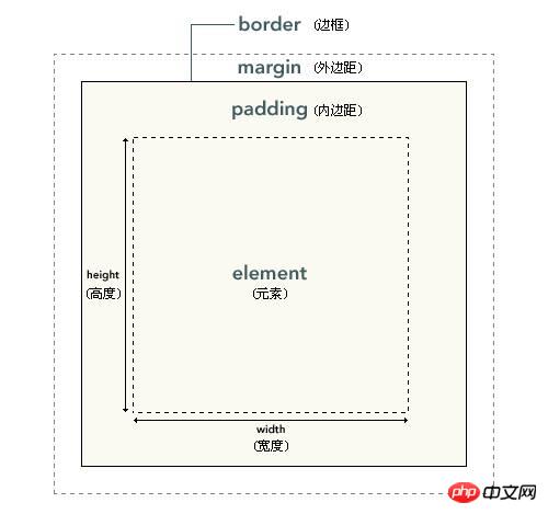
Description: The innermost part of the element box in the picture is the actual content (element); what directly surrounds the content is padding (padding), which presents the background of the element (background); the edge of the padding is Border; outside the border is margin (margin). The margin is transparent by default, so it will not block any elements behind it (in fact, the margin of an element is the padding of its parent element).
When placing an element on the page as to what size it needs to be, add all the declared padding, border, and margin values to the content area. Of course, if an element has no padding, borders, or margins, its size is determined solely by its content. Ignore the superposition effect of outer margins first. The calculation formula is as follows:
Total width = left margin + left border + left padding + width + right padding + right border + right margin
Total height = top margin + top border + top padding + height + bottom padding + bottom border + bottom margin
Take one of the examples as an example:
Introduction code:
<p style="width: 500px;">
 <p style="margin: 10px; border: 5px solid blue; padding: 10px; ">
   网上很多设置的方式,目前以二进制的方式来讲解(ID CLASS ELEMENT)
   网上很多设置的方式,目前以二进制的方式来讲解(ID CLASS ELEMENT)
   网上很多设置的方式,目前以二进制的方式来讲解(ID CLASS ELEMENT)
 </p>
</p>
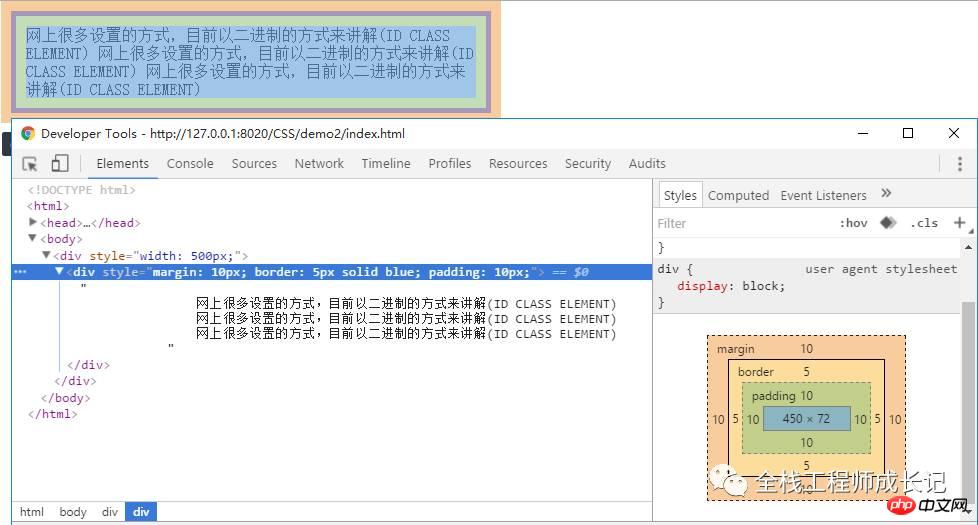
The total calculated size of the above elements is:
Total width = 10 + 5 + 10 + 450+ 10 + 5 + 10 = 500px
Total height = 10 + 5 + 10 + 72+ 10 + 5 + 10 = 122px
Knowledge point 2:
After having a preliminary understanding of the box model, we considered these scenarios:
1. Relative positioning or no positioning (the default position is static )
Introduction code:
<!DOCTYPE html>
<html>
<head>
<meta charset="UTF-8">
<title></title>
<style type="text/css">
.box {
  background:black;
  color:White;
  height:100px;
  padding:10px;
  border:20px solid Red;
  margin:30px;
}
</style>
</head>
<body>
  <h2>Static or Relative Box</h2>
  <p class="box">不设置任何position属性及宽度</p>
</body>
</html>
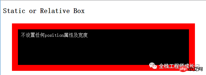
The width of the block is extended Automatically fill the width area of its parent element
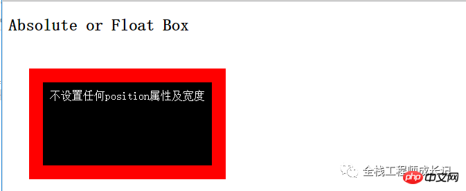
2. Floating float elements and absolute positioning elements (have wrapping properties, and can also achieve wrapping effects by setting display: table;, you can Set it yourself and see the effect)
Introduction code:
<!DOCTYPE html>
<html>
<head>
<meta charset="UTF-8">
<title></title>
<style type="text/css">
.box {
  background:black;
  color:White;
  height:100px;
  padding:10px;
  border:20px solid Red;
  margin:30px;
  position: absolute;
}
</style>
</head>
<body>
  <h2>Absolute or Float Box</h2>
  <p class="box">不设置任何position属性及宽度</p>
</body>
</html>
3 .Speciality: Set the style of p to box-sizing: border-box;
Introduction code:
<p style="width: 500px;">
 <p style="margin: 10px; border: 5px solid blue; padding: 10px; width: 300px; box-sizing: border-box; ">
   网上很多设置的方式,目前以二进制的方式来讲解(ID CLASS ELEMENT)
   网上很多设置的方式,目前以二进制的方式来讲解(ID CLASS ELEMENT)
   网上很多设置的方式,目前以二进制的方式来讲解(ID CLASS ELEMENT)
 </p>
</p>
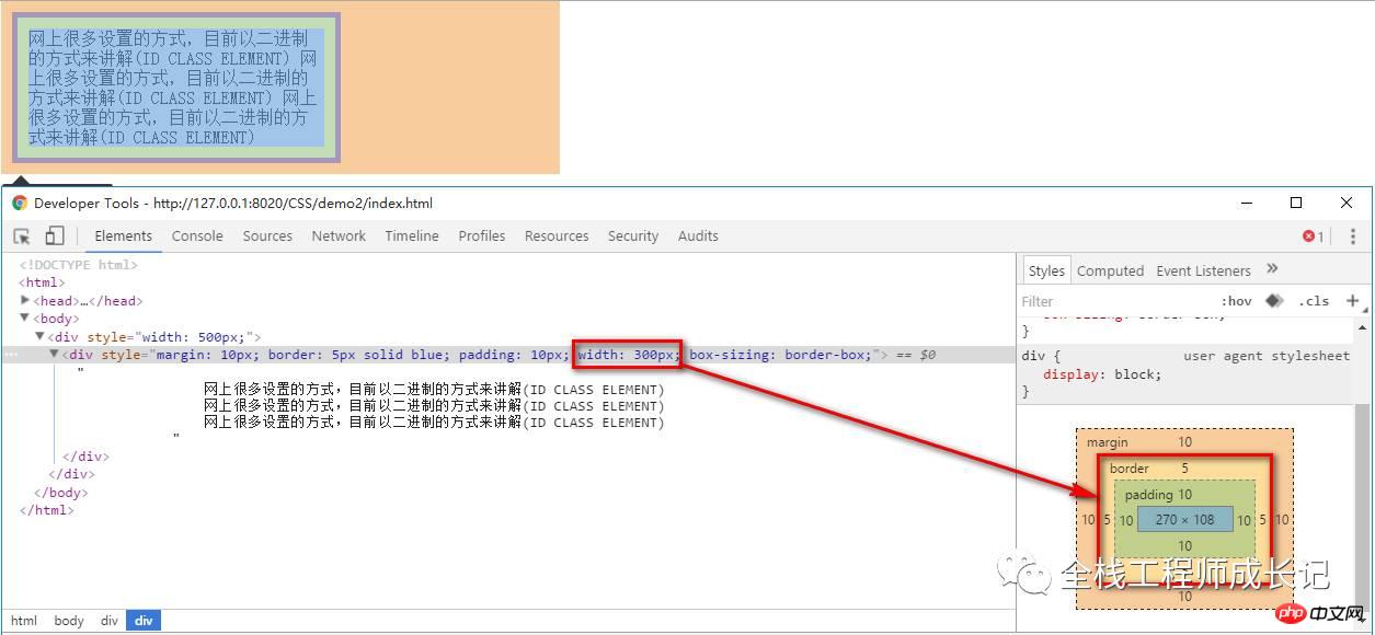
Found that the content width is: border width + padding width + content width
4. The margin attribute of the box model:
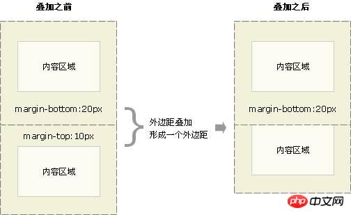
If two elements are placed together, the corresponding margin will only be the larger one
The above is the detailed content of CSS box model knowledge summary. For more information, please follow other related articles on the PHP Chinese website!

Hot AI Tools

Undresser.AI Undress
AI-powered app for creating realistic nude photos

AI Clothes Remover
Online AI tool for removing clothes from photos.

Undress AI Tool
Undress images for free

Clothoff.io
AI clothes remover

Video Face Swap
Swap faces in any video effortlessly with our completely free AI face swap tool!

Hot Article
Hot Tools

Notepad++7.3.1
Easy-to-use and free code editor

SublimeText3 Chinese version
Chinese version, very easy to use

Zend Studio 13.0.1
Powerful PHP integrated development environment

Dreamweaver CS6
Visual web development tools

SublimeText3 Mac version
God-level code editing software (SublimeText3)
Hot Topics


 How to use bootstrap in vue
Apr 07, 2025 pm 11:33 PM
How to use bootstrap in vue
Apr 07, 2025 pm 11:33 PM
Using Bootstrap in Vue.js is divided into five steps: Install Bootstrap. Import Bootstrap in main.js. Use the Bootstrap component directly in the template. Optional: Custom style. Optional: Use plug-ins.
 The Roles of HTML, CSS, and JavaScript: Core Responsibilities
Apr 08, 2025 pm 07:05 PM
The Roles of HTML, CSS, and JavaScript: Core Responsibilities
Apr 08, 2025 pm 07:05 PM
HTML defines the web structure, CSS is responsible for style and layout, and JavaScript gives dynamic interaction. The three perform their duties in web development and jointly build a colorful website.
 Understanding HTML, CSS, and JavaScript: A Beginner's Guide
Apr 12, 2025 am 12:02 AM
Understanding HTML, CSS, and JavaScript: A Beginner's Guide
Apr 12, 2025 am 12:02 AM
WebdevelopmentreliesonHTML,CSS,andJavaScript:1)HTMLstructurescontent,2)CSSstylesit,and3)JavaScriptaddsinteractivity,formingthebasisofmodernwebexperiences.
 How to set up the framework for bootstrap
Apr 07, 2025 pm 03:27 PM
How to set up the framework for bootstrap
Apr 07, 2025 pm 03:27 PM
To set up the Bootstrap framework, you need to follow these steps: 1. Reference the Bootstrap file via CDN; 2. Download and host the file on your own server; 3. Include the Bootstrap file in HTML; 4. Compile Sass/Less as needed; 5. Import a custom file (optional). Once setup is complete, you can use Bootstrap's grid systems, components, and styles to create responsive websites and applications.
 How to write split lines on bootstrap
Apr 07, 2025 pm 03:12 PM
How to write split lines on bootstrap
Apr 07, 2025 pm 03:12 PM
There are two ways to create a Bootstrap split line: using the tag, which creates a horizontal split line. Use the CSS border property to create custom style split lines.
 How to insert pictures on bootstrap
Apr 07, 2025 pm 03:30 PM
How to insert pictures on bootstrap
Apr 07, 2025 pm 03:30 PM
There are several ways to insert images in Bootstrap: insert images directly, using the HTML img tag. With the Bootstrap image component, you can provide responsive images and more styles. Set the image size, use the img-fluid class to make the image adaptable. Set the border, using the img-bordered class. Set the rounded corners and use the img-rounded class. Set the shadow, use the shadow class. Resize and position the image, using CSS style. Using the background image, use the background-image CSS property.
 How to use bootstrap button
Apr 07, 2025 pm 03:09 PM
How to use bootstrap button
Apr 07, 2025 pm 03:09 PM
How to use the Bootstrap button? Introduce Bootstrap CSS to create button elements and add Bootstrap button class to add button text
 How to resize bootstrap
Apr 07, 2025 pm 03:18 PM
How to resize bootstrap
Apr 07, 2025 pm 03:18 PM
To adjust the size of elements in Bootstrap, you can use the dimension class, which includes: adjusting width: .col-, .w-, .mw-adjust height: .h-, .min-h-, .max-h-
