

Use css3 and js to implement a clock code process

The content of this article is about using css3 and js to implement a clock code process. It has certain reference value. Friends in need can refer to it. I hope it will be helpful to you.
One day I saw the css3 rotation attribute, and I wrote a clock on a whim (without browser compatibility). Let’s take a look at how it is written!
First of all The finished picture, the final result is what it looks like (dynamic). Picture, and then the remaining three layers are the hour hand, minute hand, and second hand layers.
The html code is as follows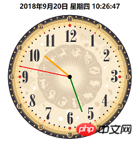
<div class="dial">
</div>
<div class="bigdiv bigdiv1" id="secondHand">
    <div class="secondHand"></div>
</div>
<div class="bigdiv bigdiv2" id="minuteHand">
    <div class="minuteHand"></div>
</div>
<div class="bigdiv bigdiv3" id="hourHand">
    <div class="center"></div>
    <div class="hourHand"></div>
</div>The variable names are randomly chosen, don’t mind; class=center This p is the small black dot in the center of the watch.
The hour hand rotates once in 60*60*60s, the minute hand rotates in 60*60s, and the second hand rotates in 60s, so the css code is as follows↓
.dial{
    width:600px;
    height:600px;
    margin:0 auto;
    position: absolute;
    border-radius: 50%;
    overflow: hidden;
    background-color: rgba(153,50,204,0.2);
    background-image: url(img/表盘.jpg);
    background-size: 100% 100%;
}
.bigdiv{
    width:600px;
    height:600px;
    margin:0 auto;
    position: absolute;
    border-radius: 50%;
    overflow: hidden;
}
.bigdiv>div{
    position: absolute;
    left:298px;
    border-radius: 100px;
}
.bigdiv1{
    animation: moves 60s steps(60) infinite;
}
.bigdiv1 .secondHand{
    width:4px;
    height:250px;
    background-color: red;
    top:50px;
    left:298px;
}
.bigdiv2{
    animation: moves 3600s steps(3600) infinite;
}
.bigdiv2 .minuteHand{
    width:6px;
    height:180px;
    background-color: green;
    top:120px;
    left:297px;
}
.bigdiv3{
    animation: moves 216000s steps(216000) infinite;
}
.bigdiv3 .hourHand{
    width:8px;
    height:160px;
    background-color: orange;
    top:140px;
    left:296px;
    border-radius: 100px;
}
.bigdiv .center{
    top:290px;
    left:290px;
    width:20px;
    height:20px;
    background-color: black;
    z-index: 2;
}
@keyframes moves{
    from{ transform: rotateZ(0deg); }
    to{ transform: rotateZ(360deg); }
}Then use js to calculate the current time,
var date = new Date();
var hours = date.getHours();
var minutes = date.getMinutes();
var seconds = date.getSeconds();
Then calculate the current time The rotation angle of each needle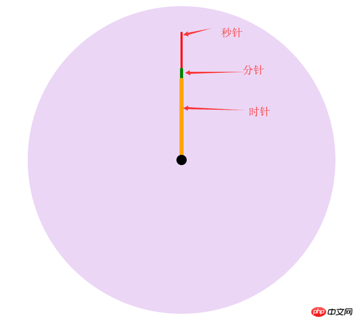
var secondAngle = seconds;
var minuteAngle = minutes * 60 + seconds;
var hourAngle = (60/12) * ((hours%12) * 3600 + minuteAngle);
The initial idea was to let the three layers of p rotate at the corresponding angle, and then start again. Later, I couldn’t think of it, because it still rotates once in a fixed time, and the pointer pointing will be deviated. Now we need The first rotation of the page when it comes in is a fixed angle, and the rest can be rotated by the original fixed time. There is an animation-delay attribute in css3, which means animation delay, and a negative number means Start early (for example, -5s means the animation starts from the 5th time), can be used just in time to let these pointers start the corresponding angles in advance. js code is as follows
hourHand.style.cssText = "animation-delay: -"+ hourAngle +"s";
minuteHand.style.cssText = "animation-delay: -"+ minuteAngle +"s";
secondHand.style.cssText = "animation-delay: -"+ secondAngle +"s";
CSS
body,html{
    margin:0;
}
.location{
    position: relative;
    width:600px;
    height:600px;
    left: calc(50% - 300px);
}
.dial{
    width:600px;
    height:600px;
    margin:0 auto;
    position: absolute;
    border-radius: 50%;
    overflow: hidden;
    background-color: rgba(153,50,204,0.2);
    background-image: url(img/表盘.jpg);
    background-size: 100% 100%;
}
.bigdiv{
    width:600px;
    height:600px;
    margin:0 auto;
    position: absolute;
    border-radius: 50%;
    overflow: hidden;
}
.bigdiv>div{
    position: absolute;
    left:298px;
    border-radius: 100px;
}
.bigdiv1{
    animation: moves 60s steps(60) infinite;
}
.bigdiv1 .secondHand{
    width:4px;
    height:250px;
    background-color: red;
    top:50px;
    left:298px;
}
.bigdiv2{
    animation: moves 3600s steps(3600) infinite;
}
.bigdiv2 .minuteHand{
    width:6px;
    height:180px;
    background-color: green;
    top:120px;
    left:297px;
}
.bigdiv3{
    animation: moves 216000s steps(216000) infinite;
}
.bigdiv3 .hourHand{
    width:8px;
    height:160px;
    background-color: orange;
    top:140px;
    left:296px;
    border-radius: 100px;
}
.bigdiv .center{
    top:290px;
    left:290px;
    width:20px;
    height:20px;
    background-color: black;
    z-index: 2;
}
@keyframes moves{
    from{ transform: rotateZ(0deg); }
    to{ transform: rotateZ(360deg); }
}
#dateshow{
    text-align: center;
}html code
<div class="dial">
</div>
<div class="bigdiv bigdiv1" id="secondHand">
    <div class="secondHand"></div>
</div>
<div class="bigdiv bigdiv2" id="minuteHand">
    <div class="minuteHand"></div>
</div>
<div class="bigdiv bigdiv3" id="hourHand">
    <div class="center"></div>
    <div class="hourHand"></div>
</div>
var dateshow = document.getElementById("dateshow");
var clock = {
    weeks : ["一","二","三","四","五","六","日"],
    getDate:function(){
        date = new Date();
        year = date.getFullYear();
        month = date.getMonth()+1;
        day = date.getDate();
        hours = date.getHours();
        minutes = date.getMinutes();
        seconds = date.getSeconds();
        week = date.getDay();    // 星期
        dateText = year+"年"+month+"月"+clock.format(day)+"日 星期"+clock.formatnum(week)+" "+
            clock.format(hours)+":"+clock.format(minutes)+":"+clock.format(seconds);
        return dateText;
    },
    format:function (data){
        if(data.toString().length == 1){
            data = "0" + data;
        };
        return data;
    },
    formatnum:function (num){
        return clock.weeks[num-1];
    },
    showdate:function (){
        dateshow.innerText = clock.getDate();
    },
    go:function (){
        var secondHand = document.getElementById("secondHand");
        var minuteHand = document.getElementById("minuteHand");
        var hourHand = document.getElementById("hourHand");
        date = new Date();
        hours = date.getHours();
        minutes = date.getMinutes();
        seconds = date.getSeconds();
        var secondAngle = seconds;
        var minuteAngle = minutes * 60 + seconds;
        var hourAngle = (60/12) * ((hours%12) * 3600 + minuteAngle);
        hourHand.style.cssText = "animation-delay: -"+ hourAngle +"s";
        minuteHand.style.cssText = "animation-delay: -"+ minuteAngle +"s";
        secondHand.style.cssText = "animation-delay: -"+ secondAngle +"s";
    }

}
clock.go();
clock.showdate();
setInterval("clock.showdate()",1000);The above is the detailed content of Use css3 and js to implement a clock code process. For more information, please follow other related articles on the PHP Chinese website!

Hot AI Tools

Undresser.AI Undress
AI-powered app for creating realistic nude photos

AI Clothes Remover
Online AI tool for removing clothes from photos.

Undress AI Tool
Undress images for free

Clothoff.io
AI clothes remover

Video Face Swap
Swap faces in any video effortlessly with our completely free AI face swap tool!

Hot Article
Hot Tools

Notepad++7.3.1
Easy-to-use and free code editor

SublimeText3 Chinese version
Chinese version, very easy to use

Zend Studio 13.0.1
Powerful PHP integrated development environment

Dreamweaver CS6
Visual web development tools

SublimeText3 Mac version
God-level code editing software (SublimeText3)
Hot Topics


 Stacked Cards with Sticky Positioning and a Dash of Sass
Apr 03, 2025 am 10:30 AM
Stacked Cards with Sticky Positioning and a Dash of Sass
Apr 03, 2025 am 10:30 AM
The other day, I spotted this particularly lovely bit from Corey Ginnivan’s website where a collection of cards stack on top of one another as you scroll.
 Google Fonts Variable Fonts
Apr 09, 2025 am 10:42 AM
Google Fonts Variable Fonts
Apr 09, 2025 am 10:42 AM
I see Google Fonts rolled out a new design (Tweet). Compared to the last big redesign, this feels much more iterative. I can barely tell the difference
 How to Create an Animated Countdown Timer With HTML, CSS and JavaScript
Apr 11, 2025 am 11:29 AM
How to Create an Animated Countdown Timer With HTML, CSS and JavaScript
Apr 11, 2025 am 11:29 AM
Have you ever needed a countdown timer on a project? For something like that, it might be natural to reach for a plugin, but it’s actually a lot more
 Why are the purple slashed areas in the Flex layout mistakenly considered 'overflow space'?
Apr 05, 2025 pm 05:51 PM
Why are the purple slashed areas in the Flex layout mistakenly considered 'overflow space'?
Apr 05, 2025 pm 05:51 PM
Questions about purple slash areas in Flex layouts When using Flex layouts, you may encounter some confusing phenomena, such as in the developer tools (d...
 HTML Data Attributes Guide
Apr 11, 2025 am 11:50 AM
HTML Data Attributes Guide
Apr 11, 2025 am 11:50 AM
Everything you ever wanted to know about data attributes in HTML, CSS, and JavaScript.
 How to select a child element with the first class name item through CSS?
Apr 05, 2025 pm 11:24 PM
How to select a child element with the first class name item through CSS?
Apr 05, 2025 pm 11:24 PM
When the number of elements is not fixed, how to select the first child element of the specified class name through CSS. When processing HTML structure, you often encounter different elements...
 A Proof of Concept for Making Sass Faster
Apr 16, 2025 am 10:38 AM
A Proof of Concept for Making Sass Faster
Apr 16, 2025 am 10:38 AM
At the start of a new project, Sass compilation happens in the blink of an eye. This feels great, especially when it’s paired with Browsersync, which reloads
 In front-end development, how to use CSS and JavaScript to achieve searchlight effects similar to Windows 10 settings interface?
Apr 05, 2025 pm 10:21 PM
In front-end development, how to use CSS and JavaScript to achieve searchlight effects similar to Windows 10 settings interface?
Apr 05, 2025 pm 10:21 PM
How to implement Windows-like in front-end development...
