

CSS3实现的10种Loading效果

这篇文章主要为大家详细介绍了CSS3实现10种Loading效果,效果实现简单新颖,具有一定的参考价值,感兴趣的小伙伴们可以参考一下
用CSS3实现了几种常见的Loading效果,虽然很简单,但还是分享一下,顺便也当是做做笔记……
第1种效果:

代码如下:
<p class="loading">
        <span></span>
        <span></span>
        <span></span>
        <span></span>
        <span></span>
</p>.loading{
width: 80px;
height: 40px;
margin: 0 auto;
margin-top:100px;
}
.loading span{
display: inline-block;
width: 8px;
height: 100%;
border-radius: 4px;
background: lightgreen;
-webkit-animation: load 1s ease infinite;
}
@-webkit-keyframes load{
0%,100%{
height: 40px;
background: lightgreen;
}
50%{
height: 70px;
margin: -15px 0;
background: lightblue;
}
}
.loading span:nth-child(2){
-webkit-animation-delay:0.2s;
}
.loading span:nth-child(3){
-webkit-animation-delay:0.4s;
}
.loading span:nth-child(4){
-webkit-animation-delay:0.6s;
}
.loading span:nth-child(5){
-webkit-animation-delay:0.8s;
}第2种效果:
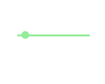
代码如下:
<p class="loading">
        <span></span>
</p>.loading{
width: 150px;
height: 4px;
border-radius: 2px;
margin: 0 auto;
margin-top:100px;
position: relative;
background: lightgreen;
-webkit-animation: changeBgColor 1.04s ease-in infinite alternate;
}
.loading span{
display: inline-block;
width: 16px;
height: 16px;
border-radius: 50%;
background: lightgreen;
position: absolute;
margin-top: -7px;
margin-left:-8px;
-webkit-animation: changePosition 1.04s ease-in infinite alternate;
}
@-webkit-keyframes changeBgColor{
0%{
background: lightgreen;
}
100%{
background: lightblue;
}
}
@-webkit-keyframes changePosition{
0%{
background: lightgreen;
}
100%{
margin-left: 142px;
background: lightblue;
}
}第3-5种效果:
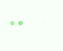


代码如下:
<p class="loading">
        <span></span>
        <span></span>
        <span></span>
        <span></span>
        <span></span>
</p>第3-5种效果的css样式分别为:
.loading{
            width: 150px;
            height: 15px;
            margin: 0 auto;
            position: relative;
            margin-top:100px;
        }
        .loading span{
            position: absolute;
            width: 15px;
            height: 100%;
            border-radius: 50%;
            background: lightgreen;
            -webkit-animation: load 1.04s ease-in infinite alternate;
        }
        @-webkit-keyframes load{
            0%{
                opacity: 1;
                -webkit-transform: translate(0px);
            }
            100%{
                opacity: 0.2;
                -webkit-transform: translate(150px);
            }
        }
        .loading span:nth-child(1){
            -webkit-animation-delay:0.13s;
        }
        .loading span:nth-child(2){
            -webkit-animation-delay:0.26s;
        }
        .loading span:nth-child(3){
            -webkit-animation-delay:0.39s;
        }
        .loading span:nth-child(4){
            -webkit-animation-delay:0.52s;
        }
        .loading span:nth-child(5){
            -webkit-animation-delay:0.65s;
}第6-8种效果:

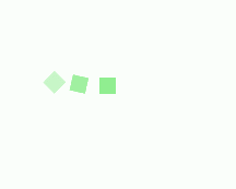

代码如下:
<p class="loading">
        <span></span>
        <span></span>
        <span></span>
        <span></span>
        <span></span>
</p>第6-8种效果的css样式分别为:
.loading{
            width: 150px;
            height: 15px;
            margin: 0 auto;
            margin-top:100px;
            text-align: center;
        }
        .loading span{
            display: inline-block;
            width: 15px;
            height: 100%;
            margin-right: 5px;
            background: lightgreen;
            -webkit-animation: load 1.04s ease infinite;
        }
        .loading span:last-child{
            margin-right: 0px;
        }
        @-webkit-keyframes load{
            0%{
                opacity: 1;
            }
            100%{
                opacity: 0;
            }
        }
        .loading span:nth-child(1){
            -webkit-animation-delay:0.13s;
        }
        .loading span:nth-child(2){
            -webkit-animation-delay:0.26s;
        }
        .loading span:nth-child(3){
            -webkit-animation-delay:0.39s;
        }
        .loading span:nth-child(4){
            -webkit-animation-delay:0.52s;
        }
        .loading span:nth-child(5){
            -webkit-animation-delay:0.65s;
}第9-10种效果:


代码如下:
<p class="loadEffect">
        <span></span>
        <span></span>
        <span></span>
        <span></span>
        <span></span>
        <span></span>
        <span></span>
        <span></span>
</p>CSS样式分别为:
.loadEffect{
            width: 100px;
            height: 100px;
            position: relative;
            margin: 0 auto;
            margin-top:100px;
        }
        .loadEffect span{
            display: inline-block;
            width: 16px;
            height: 16px;
            border-radius: 50%;
            background: lightgreen;
            position: absolute;
            -webkit-animation: load 1.04s ease infinite;
        }
        @-webkit-keyframes load{
            0%{
                opacity: 1;
            }
            100%{
                opacity: 0.2;
            }
        }
        .loadEffect span:nth-child(1){
            left: 0;
            top: 50%;
            margin-top:-8px;
            -webkit-animation-delay:0.13s;
        }
        .loadEffect span:nth-child(2){
            left: 14px;
            top: 14px;
            -webkit-animation-delay:0.26s;
        }
        .loadEffect span:nth-child(3){
            left: 50%;
            top: 0;
            margin-left: -8px;
            -webkit-animation-delay:0.39s;
        }
        .loadEffect span:nth-child(4){
            top: 14px;
            rightright:14px;
            -webkit-animation-delay:0.52s;
        }
        .loadEffect span:nth-child(5){
            rightright: 0;
            top: 50%;
            margin-top:-8px;
            -webkit-animation-delay:0.65s;
        }
        .loadEffect span:nth-child(6){
            rightright: 14px;
            bottombottom:14px;
            -webkit-animation-delay:0.78s;
        }
        .loadEffect span:nth-child(7){
            bottombottom: 0;
            left: 50%;
            margin-left: -8px;
            -webkit-animation-delay:0.91s;
        }
        .loadEffect span:nth-child(8){
            bottombottom: 14px;
            left: 14px;
            -webkit-animation-delay:1.04s;
}PS:CSS样式代码其实很多重复,主要就是动画不一样,但为了方便以后直接拿来用,就先不整理了。
以上就是本文的全部内容,希望对大家的学习有所帮助,更多相关内容请关注PHP中文网!
相关推荐:
以上是CSS3实现的10种Loading效果的详细内容。更多信息请关注PHP中文网其他相关文章!

热AI工具

Undresser.AI Undress
人工智能驱动的应用程序,用于创建逼真的裸体照片

AI Clothes Remover
用于从照片中去除衣服的在线人工智能工具。

Undress AI Tool
免费脱衣服图片

Clothoff.io
AI脱衣机

Video Face Swap
使用我们完全免费的人工智能换脸工具轻松在任何视频中换脸!

热门文章
热工具

记事本++7.3.1
好用且免费的代码编辑器

SublimeText3汉化版
中文版,非常好用

禅工作室 13.0.1
功能强大的PHP集成开发环境

Dreamweaver CS6
视觉化网页开发工具

SublimeText3 Mac版
神级代码编辑软件(SublimeText3)


 纯CSS3怎么实现波浪效果?(代码示例)
Jun 28, 2022 pm 01:39 PM
纯CSS3怎么实现波浪效果?(代码示例)
Jun 28, 2022 pm 01:39 PM
纯CSS3怎么实现波浪效果?本篇文章就来给大家介绍一下使用 SVG 和 CSS 动画制作波浪效果的方法,希望对大家有所帮助!
![在Illustrator中加载插件时出错[修复]](https://img.php.cn/upload/article/000/465/014/170831522770626.jpg?x-oss-process=image/resize,m_fill,h_207,w_330) 在Illustrator中加载插件时出错[修复]
Feb 19, 2024 pm 12:00 PM
在Illustrator中加载插件时出错[修复]
Feb 19, 2024 pm 12:00 PM
启动AdobeIllustrator时是否会弹出加载插件时出错的消息?一些Illustrator用户在打开该应用程序时遇到了此错误。消息后面紧跟着一系列有问题的插件。该错误提示表明已安装的插件存在问题,但也可能是由于VisualC++DLL文件损坏或首选项文件受损等其他原因引起。如果遇到此错误,我们将在本文中指导您修复问题,请继续阅读以下内容。在Illustrator中加载插件时出错如果您在尝试启动AdobeIllustrator时收到“加载插件时出错”的错误消息,您可以使用以下用途:以管理员身
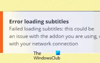 Stremio字幕不工作;加载字幕时出错
Feb 24, 2024 am 09:50 AM
Stremio字幕不工作;加载字幕时出错
Feb 24, 2024 am 09:50 AM
字幕在你的WindowsPC上不能在Stremio上运行吗?一些Stremio用户报告说,视频中没有显示字幕。许多用户报告说遇到了一条错误消息,上面写着“加载字幕时出错”。以下是与此错误一起显示的完整错误消息:加载字幕时出错加载字幕失败:这可能是您正在使用的插件或您的网络有问题。正如错误消息所说,可能是您的互联网连接导致了错误。因此,请检查您的网络连接,并确保您的互联网工作正常。除此之外,这个错误的背后可能还有其他原因,包括字幕加载项冲突、特定视频内容不支持字幕以及Stremio应用程序过时。如

 css怎么隐藏元素但不占空间
Jun 01, 2022 pm 07:15 PM
css怎么隐藏元素但不占空间
Jun 01, 2022 pm 07:15 PM
两种方法:1、利用display属性,只需给元素添加“display:none;”样式即可。2、利用position和top属性设置元素绝对定位来隐藏元素,只需给元素添加“position:absolute;top:-9999px;”样式。
 PHP实现无限滚动加载
Jun 22, 2023 am 08:30 AM
PHP实现无限滚动加载
Jun 22, 2023 am 08:30 AM
随着互联网的发展,越来越多的网页需要支持滚动加载,而无限滚动加载是其中的一种。它可以让页面不断加载新的内容,使用户可以更流畅地浏览网页。在这篇文章中,我们将介绍如何使用PHP实现无限滚动加载。一、什么是无限滚动加载?无限滚动加载是一种基于滚动条的网页内容加载方式。它的原理是当用户滚动至页面底部时,通过AJAX异步调取后台数据,实现不断加载新的内容。这种加载方
 css加载不出来怎么解决
Oct 20, 2023 am 11:29 AM
css加载不出来怎么解决
Oct 20, 2023 am 11:29 AM
css加载不出来的解决办法有检查文件路径、检查文件内容、清除浏览器缓存、检查服务器设置、使用开发者工具和检查网络连接等。详细介绍:1、检查文件路径,首先请确保CSS文件的路径正确,如果CSS文件位于网站的不同部分或子目录中,需要提供正确的路径,如果CSS文件位于根目录下,路径应该是直接的;2、检查文件内容,如果路径正确,那么问题可能出在CSS文件本身,打开CSS文件检查等等。
 css3怎么实现花边边框
Sep 16, 2022 pm 07:11 PM
css3怎么实现花边边框
Sep 16, 2022 pm 07:11 PM
在css中,可以利用border-image属性来实现花边边框。border-image属性可以使用图片来创建边框,即给边框加上背景图片,只需要将背景图片指定为花边样式即可;语法“border-image: url(图片路径) 向内偏移值 图像边界宽度 outset 是否重复;”。
