原文标题:用wpf实现微信公众号多客服功能
简介:
这是利用WPF作为前端技术,实现桌面版微信多客服系统。项目采用Prism作为前端框架,采用MVVM模式极好的对UI和逻辑代码分离,使用MefBootstrapper集成的MEF IOC容器,解耦各模块对象。合理利用 IEventAggregator 实现事件和交互。文章在介绍对应功能时候会给出相关实现的参考,读者可以参考改进,引入到自己的项目中。
程序运行界面及功能预览:
一、登陆:
功能:支持记住用户和用户设置,可选择记住用户密码。
实现相关:
自定义登陆窗口,引入Microsoft.Windows.Shell。可参考 WPF Custom Chrome Library 和 MSDN WindowChrome Class 有相关自定义窗口实现。
最小化、最大化、关闭按钮功能实现可参考上面的例子。
登陆按钮,自定义Style,重写Button的Template,参考代码如下:


 <Style x:Key="LogginButton" TargetType="{x:Type Button}">
        <Setter Property="Template">
            <Setter.Value>
                <ControlTemplate TargetType="{x:Type Button}">
                    <Grid  >
                        <Border   x:Name="Bd" Background="{TemplateBinding Background }" BorderBrush="#d3d3d3" BorderThickness="1">
                        </Border>
                        <ContentPresenter  x:Name="contentPresenter" HorizontalAlignment="{TemplateBinding HorizontalContentAlignment}" VerticalAlignment="{TemplateBinding VerticalContentAlignment}" SnapsToDevicePixels="{TemplateBinding SnapsToDevicePixels}" RecognizesAccessKey="True"/>
                    </Grid>
                    <ControlTemplate.Triggers>
                        <Trigger Property="IsMouseOver" Value="True">
                            <Setter TargetName="Bd" Property="BorderBrush" Value="#08bd14"/>
                            <Setter TargetName="Bd" Property="Opacity" Value="0.8"/>
                        </Trigger>
                        <Trigger Property="IsPressed" Value="True">
                            <Setter TargetName="Bd" Property="Background" Value="#f3f3f3"/>
                            <Setter TargetName="contentPresenter" Property="Margin" Value="2,2,0,0"/>
                        </Trigger>
                    </ControlTemplate.Triggers>
                </ControlTemplate>
            </Setter.Value>
        </Setter>
</Style>View Code
记住密码,采用 XmlSerializer 把用户信息序列化到本地xml配置文件中,程序启动时加载该xml配置文件。用法 MSDN XmlSerializer
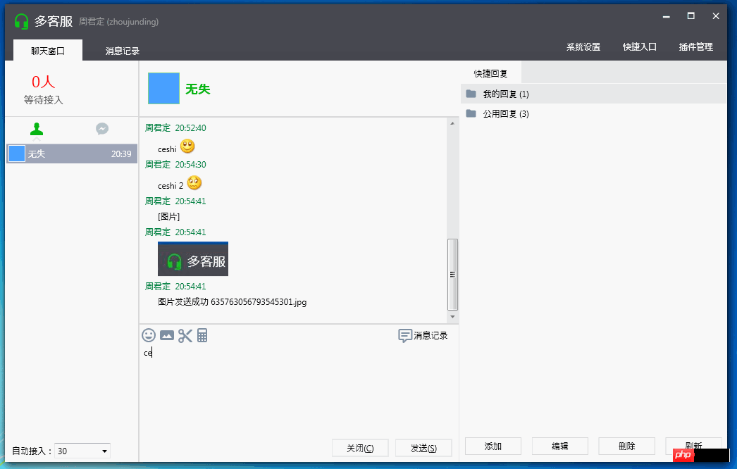
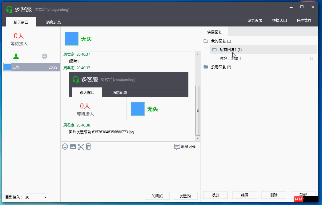
二、聊天窗口,信息发送
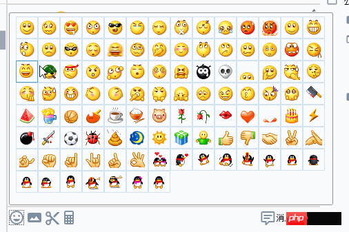
功能:文字发送,表情发送,图片发送,屏幕截图,快捷回复
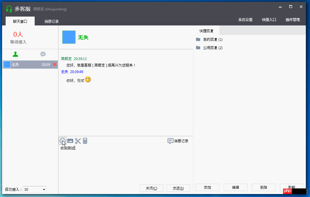
RichTextBox 相关实现:文字,表情,图片所有输入都是在富文本框 里实现,因此针对 TextChanged 事件对输入进行一系列处理。
文字:不用做任何处理。
表情:文本框里输入的是表情的转义符号,然后根据转义符号找到对应表情图片进行替换。InlineUIContainer
Gif 动态图:WPF中不支持Gif,所以要编写自定义用户控件作为用来显示gif表情。参考 周银辉 [WPF疑难]在WPF中显示动态GIF
截图功能:源码在网上找到的,是Winform的一个截图。做了小许修改引进到项目。
参考:C# 实现完整功能的截图控件(4)-完整版 http://www.php.cn/
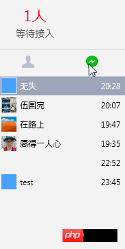
三、客户列表
控件为 TabControl,重写了TabControl 的Style 和 TabItem的Style
    <Style x:Key="CustomerTabStyle" TargetType="{x:Type TabControl}">
        <Setter Property="Foreground" Value="{DynamicResource {x:Static SystemColors.ControlTextBrushKey}}"/>
        <Setter Property="Padding" Value="4,4,4,4"/>
        <Setter Property="Background" Value="#F9F9F9"/>
        <Setter Property="HorizontalContentAlignment" Value="Center"/>
        <Setter Property="VerticalContentAlignment" Value="Center"/>
        <Setter Property="Template">
            <Setter.Value>
                <ControlTemplate TargetType="{x:Type TabControl}">
                    <Grid ClipToBounds="true" SnapsToDevicePixels="true" KeyboardNavigation.TabNavigation="Local">
                        <Grid.ColumnDefinitions>
                            <ColumnDefinition x:Name="ColumnDefinition0"/>
                            <ColumnDefinition x:Name="ColumnDefinition1" Width="0"/>
                        </Grid.ColumnDefinitions>
                        <Grid.RowDefinitions>
                            <RowDefinition x:Name="RowDefinition0" Height="Auto"/>
                            <RowDefinition x:Name="RowDefinition1" Height="*"/>
                        </Grid.RowDefinitions>
                        <TabPanel x:Name="HeaderPanel" Grid.Column="0" Background="#f6f6f6" IsItemsHost="true"  Grid.Row="0" KeyboardNavigation.TabIndex="1" Panel.ZIndex="1"/>
                        <Border x:Name="ContentPanel"  Background="{TemplateBinding Background}" Grid.Column="0" KeyboardNavigation.DirectionalNavigation="Contained" Grid.Row="1" KeyboardNavigation.TabIndex="2" KeyboardNavigation.TabNavigation="Local">
                            <ContentPresenter x:Name="PART_SelectedContentHost" ContentSource="SelectedContent"  SnapsToDevicePixels="{TemplateBinding SnapsToDevicePixels}"/>
                        </Border>
                    </Grid>
                    <ControlTemplate.Triggers>
                        <Trigger Property="IsEnabled" Value="false">
                            <Setter Property="Foreground" Value="{DynamicResource {x:Static SystemColors.GrayTextBrushKey}}"/>
                        </Trigger>
                    </ControlTemplate.Triggers>
                </ControlTemplate>
            </Setter.Value>
        </Setter>
    </Style>

    <Style x:Key="ConnectedTabItemStyle" TargetType="{x:Type TabItem}">
        <Setter Property="Foreground" Value="Black"/>
        <Setter Property="Padding" Value="20,8,20,0"/>
        <Setter Property="BorderBrush" Value="Transparent"/>
        <Setter Property="Background" Value="#b9c0cc"/>
        <Setter Property="HorizontalContentAlignment" Value="Stretch"/>
        <Setter Property="VerticalContentAlignment" Value="Stretch"/>
        <Setter Property="Template">
            <Setter.Value>
                <ControlTemplate TargetType="{x:Type TabItem}">
                    <Grid SnapsToDevicePixels="true">
                        <Border x:Name="Bd" Background="#f6f6f6" Padding="{TemplateBinding Padding}">
                            <StackPanel>
                                <Path  Width="18" Height="18"  Stretch="Fill" Fill="{TemplateBinding Background}" Data="F1 M 38,19C 43.5417,19 45.9167,22.1667 45.1174,28.8134C 45.8315,29.2229 46.3125,29.9928 46.3125,30.875C 46.3125,31.9545 45.5923,32.8658 44.6061,33.1546C 44.1941,34.623 43.5543,35.9229 42.75,36.9628L 42.75,41.9583C 45.3889,42.4861 47.5,42.75 50.6667,44.3333C 53.8333,45.9167 54.8889,47.3681 57,49.4792L 57,57L 19,57L 19,49.4792C 21.1111,47.3681 22.1667,45.9167 25.3333,44.3333C 28.5,42.75 30.6111,42.4861 33.25,41.9583L 33.25,36.9628C 32.4457,35.9229 31.8059,34.623 31.3939,33.1546C 30.4077,32.8658 29.6875,31.9545 29.6875,30.875C 29.6875,29.9928 30.1685,29.2229 30.8826,28.8134C 30.0833,22.1667 32.4583,19 38,19 Z "/>
                                <Border HorizontalAlignment="Center" x:Name="BottomBd" Margin="-6,-6,0,0" Visibility="Hidden">
                                    <Path  Fill="#e1e1e1" Data="M7.41,15.41L12,10.83L16.59,15.41L18,14L12,8L6,14L7.41,15.41Z" />
                                </Border>
                            </StackPanel>
                        </Border>
                    </Grid>
                    <ControlTemplate.Triggers>
                        <Trigger Property="IsMouseOver" Value="true">
                            <Setter Property="Background" TargetName="Bd" Value="#ededef"/>
                        </Trigger>
                        <Trigger Property="IsSelected" Value="true">
                            <Setter Property="Panel.ZIndex" Value="1"/>
                            <Setter Property="Background" TargetName="Bd" Value="#ffffff"/>
                            <Setter Property="Background" Value="#08bd14"/>
                            <Setter Property="Visibility" TargetName="BottomBd" Value="Visible"/>
                        </Trigger>
                        <MultiTrigger>
                            <MultiTrigger.Conditions>
                                <Condition Property="IsSelected" Value="false"/>
                                <Condition Property="IsMouseOver" Value="true"/>
                            </MultiTrigger.Conditions>
                            <Setter Property="BorderBrush" TargetName="Bd" Value="#ffffff"/>
                        </MultiTrigger>

                    </ControlTemplate.Triggers>
                </ControlTemplate>
            </Setter.Value>
        </Setter>
</Style>View Code
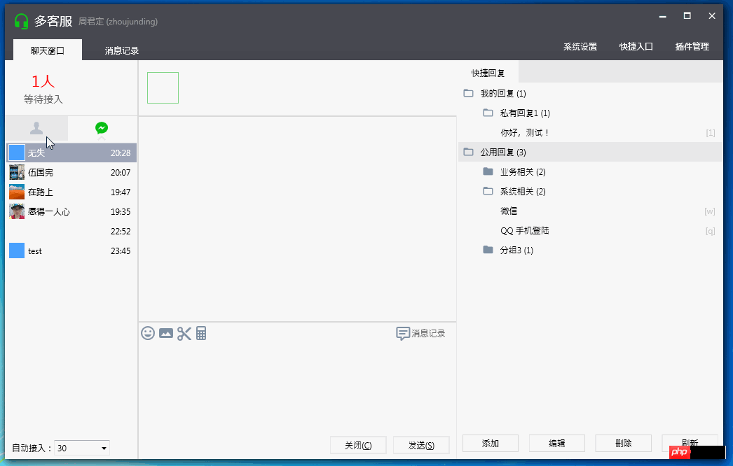
四、快捷回复面板
应用 TreeView 加 HierarchicalDataTemplate 实现树形列表。
五、转接客户
自定义转接客户窗口,样式Xaml代码如下:
<Style x:Key="NoResize_Window" TargetType="{x:Type Window}">
                        <Setter Property="FontFamily" Value="Consolas,Microsoft YaHei" />
                        <Setter Property="ResizeMode" Value="CanMinimize" />
                        <Setter Property="Template">
                            <Setter.Value>
                                <ControlTemplate TargetType="{x:Type Window}">
                                    <Grid>
                                        <Grid.RowDefinitions>
                                            <RowDefinition Height="30" />
                                            <RowDefinition Height="*" />
                                        </Grid.RowDefinitions>
                                        <Border Grid.Row="0"  >
                                            <Border.Background>
                                                <LinearGradientBrush StartPoint="0,0" EndPoint="0,1">
                                                    <GradientStop Color="#494A52" Offset="0"/>
                                                    <GradientStop Color="#45464f" Offset="1"/>
                                                </LinearGradientBrush>
                                            </Border.Background>
                                            <Grid>
                                                <!--Icon and Title-->
                                                <DockPanel     >
                                                    <TextBlock Margin="12,0,0,0" Text="{TemplateBinding Title}" FontFamily="Calibri"  VerticalAlignment="Center" Foreground="#FFFFFF" />
                                                    <StackPanel HorizontalAlignment="Right" Orientation="Horizontal" VerticalAlignment="Top">
                                                        <ctrl:MinAndCloseCaptionButton></ctrl:MinAndCloseCaptionButton>
                                                    </StackPanel>
                                                </DockPanel>
                                            </Grid>
                                        </Border>

                                        <Grid Grid.Row="1" >
                                            <Border Background="{TemplateBinding Background}"
                                        BorderBrush="{TemplateBinding BorderBrush}"
                                        BorderThickness="{TemplateBinding BorderThickness}"
                                        Padding="{TemplateBinding Margin}"
                                        SnapsToDevicePixels="{TemplateBinding SnapsToDevicePixels}"  >
                                                <ContentPresenter />
                                            </Border>
                                        </Grid>
                                    </Grid>
                                </ControlTemplate>
                            </Setter.Value>
                        </Setter>
</Style>View Code
转接客户列表,样式Xaml代码如下:
    <Style x:Key="OnlineUserListBoxStyle" TargetType="{x:Type ListBox}">
        <Setter Property="Background" Value="{DynamicResource {x:Static SystemColors.WindowBrushKey}}"/>
        <Setter Property="Foreground" Value="{DynamicResource {x:Static SystemColors.ControlTextBrushKey}}"/>
        <Setter Property="ScrollViewer.HorizontalScrollBarVisibility" Value="Auto"/>
        <Setter Property="ScrollViewer.VerticalScrollBarVisibility" Value="Auto"/>
        <Setter Property="ScrollViewer.CanContentScroll" Value="true"/>
        <Setter Property="ScrollViewer.PanningMode" Value="Both"/>
        <Setter Property="Stylus.IsFlicksEnabled" Value="False"/>
        <Setter Property="VerticalContentAlignment" Value="Center"/>
        <Setter Property="Template">
            <Setter.Value>
                <ControlTemplate TargetType="{x:Type ListBox}">
                    <Border x:Name="Bd" BorderBrush="{TemplateBinding BorderBrush}" BorderThickness="{TemplateBinding BorderThickness}" Background="{TemplateBinding Background}" Padding="1" SnapsToDevicePixels="true">
                        <DockPanel>
                            <Border BorderBrush="#dbdbdb" BorderThickness="0,0,0,1" DockPanel.Dock="Top">
                                <Grid Background="#f6f6f6"  TextElement.Foreground="#999999" DockPanel.Dock="Top">
                                    <Grid.ColumnDefinitions>
                                        <ColumnDefinition Width="*" />
                                        <ColumnDefinition Width="*"/>
                                        <ColumnDefinition Width="*"/>
                                    </Grid.ColumnDefinitions>
                                    <TextBlock Margin="5,7,0,6" Grid.Column="0">状态</TextBlock>
                                    <TextBlock Margin="5,7,0,6" Grid.Column="1">工号</TextBlock>
                                    <TextBlock Margin="5,7,0,6" Grid.Column="2">昵称</TextBlock>
                                </Grid>
                            </Border>
                            <ScrollViewer Focusable="false" Padding="{TemplateBinding Padding}">
                                <ItemsPresenter SnapsToDevicePixels="{TemplateBinding SnapsToDevicePixels}"/>
                            </ScrollViewer>
                        </DockPanel>
                    </Border>
                    <ControlTemplate.Triggers>
                        <Trigger Property="IsEnabled" Value="false">
                            <Setter Property="Background" TargetName="Bd" Value="{DynamicResource {x:Static SystemColors.ControlBrushKey}}"/>
                        </Trigger>
                    </ControlTemplate.Triggers>
                </ControlTemplate>
            </Setter.Value>
        </Setter>
    </Style>
    <Style x:Key="OnlineUserListBoxItemStyle" TargetType="{x:Type ListBoxItem}">
        <Setter Property="Background" Value="Transparent"/>
        <Setter Property="HorizontalContentAlignment" Value="{Binding HorizontalContentAlignment, RelativeSource={RelativeSource AncestorType={x:Type ItemsControl}}}"/>
        <Setter Property="VerticalContentAlignment" Value="{Binding VerticalContentAlignment, RelativeSource={RelativeSource AncestorType={x:Type ItemsControl}}}"/>
        <Setter Property="Padding" Value="2,0,0,0"/>
        <Setter Property="Template">
            <Setter.Value>
                <ControlTemplate TargetType="{x:Type ListBoxItem}">
                    <Border x:Name="Bd" BorderBrush="{TemplateBinding BorderBrush}" BorderThickness="{TemplateBinding BorderThickness}" Background="{TemplateBinding Background}" Padding="{TemplateBinding Padding}" SnapsToDevicePixels="true">
                        <Grid>
                            <Grid.ColumnDefinitions>
                                <ColumnDefinition Width="*" />
                                <ColumnDefinition Width="*"/>
                                <ColumnDefinition Width="*"/>
                            </Grid.ColumnDefinitions>

                            <StackPanel Grid.Column="0" Orientation="Horizontal" >
                                <Border Margin="4,2,4,2" Height="24" Width="24" >
                                    <Grid>
                                        <Path Fill="#6f6f6f" Data="M6,17C6,15 10,13.9 12,13.9C14,13.9 18,15 18,17V18H6M15,9A3,3 0 0,1 12,12A3,3 0 0,1 9,9A3,3 0 0,1 12,6A3,3 0 0,1 15,9M3,5V19A2,2 0 0,0 5,21H19A2,2 0 0,0 21,19V5A2,2 0 0,0 19,3H5C3.89,3 3,3.9 3,5Z"  />
                                        <Path Visibility="{Binding Path=IsOnLine,Converter={StaticResource BoolToVisibilityConverter}}" Fill="#8bc34a" Data="M6,17C6,15 10,13.9 12,13.9C14,13.9 18,15 18,17V18H6M15,9A3,3 0 0,1 12,12A3,3 0 0,1 9,9A3,3 0 0,1 12,6A3,3 0 0,1 15,9M3,5V19A2,2 0 0,0 5,21H19A2,2 0 0,0 21,19V5A2,2 0 0,0 19,3H5C3.89,3 3,3.9 3,5Z" />
                                    </Grid>
                                </Border>
                                <TextBlock Padding="4,0,4,0" VerticalAlignment="Center"  Text="{Binding Path=OnLineStatus}" />
                            </StackPanel>
                            <StackPanel Grid.Column="1" Orientation="Horizontal"  >
                                <TextBlock Padding="4,0,4,0"  VerticalAlignment="Center" Text="{Binding Path=Name}"/>
                            </StackPanel>
                            <StackPanel Grid.Column="2" Orientation="Horizontal"  >
                                <TextBlock Padding="4,0,4,0"  VerticalAlignment="Center" Text="{Binding Path=RealName}"/>
                            </StackPanel>
                        </Grid>
                    </Border>
                    <ControlTemplate.Triggers>
                        <Trigger Property="IsSelected" Value="true">
                            <Setter Property="Background" TargetName="Bd" Value="#9ea5b8"/>
                            <Setter Property="Foreground" Value="#ffffff"/>
                        </Trigger>
                        <MultiTrigger>
                            <MultiTrigger.Conditions>
                                <Condition Property="IsSelected" Value="false" />
                                <Condition Property="IsMouseOver" Value="true" />
                            </MultiTrigger.Conditions>
                            <Setter Property="Background" TargetName="Bd" Value="#e0e1e5"/>
                        </MultiTrigger>
                        <Trigger Property="IsEnabled" Value="false">
                            <Setter Property="Foreground" Value="{DynamicResource {x:Static SystemColors.GrayTextBrushKey}}"/>
                        </Trigger>
                    </ControlTemplate.Triggers>
                </ControlTemplate>
            </Setter.Value>
        </Setter>
</Style>View Code

关于以上控件的事件与命令,引进System.Windows.Interactivity.
在Xmal中导入命名控件 xmlns:i="http://schemas.microsoft.com/expression/2010/interactivity"
使用代码如下:
                <ListBox Margin="12,0,12,0" BorderThickness="1"
                                 Style="{DynamicResource OnlineUserListBoxStyle}"
                                 ItemContainerStyle="{DynamicResource OnlineUserListBoxItemStyle}"
                                 ItemsSource="{Binding Path= AllUsers}"
                                 SelectedItem="{Binding Path=SelectedUser}"
                                 >
                    <i:Interaction.Triggers>
                        <i:EventTrigger EventName="SelectionChanged">
                            <i:InvokeCommandAction Command="{Binding Path= UserSelectedChangedCommand}" />
                        </i:EventTrigger>
                    </i:Interaction.Triggers>
</ListBox>View Code
系统运行截图:
说明:
程序UI布局及展示为模仿微信多客服官方程序,所有样式源码为本人所写及参考网上部分资源。
程序中所用图标来源于这两个资源库:http://www.php.cn/ http://www.php.cn/
小结:
本文只作了简单的介绍,主要介绍UI上的一些实现和功能介绍。具体后台业务逻辑看以后能否补上,包括Prism使用,和微信公众号相关的知识。
博客地址:http://www.php.cn/
博客版权:本文以学习、研究和分享为主,欢迎转载,但必须在文章页面明显位置标明原文连接并保留此处说明。
如果文中有不妥或者错误的地方还望您指出,以免让读者产生误解。
感谢您的阅读,喜欢就点个赞,【推荐】一下!

微信是一款手机通信软件,支持通过手机网络发送语音短信、视频、图片和文字。微信可以单聊及群聊,还能根据地理位置找到附近的人,带给大家全新的移动沟通体验,有需要的小伙伴快来保存下载体验吧!

 广告
广告![ThinkPHP5快速开发企业站点[全程实录]](https://img.php.cn/upload/course/000/000/068/6253d918a3ce7278.png)
 收藏
收藏
 收藏
收藏
Copyright 2014-2025 https://www.php.cn/ All Rights Reserved | php.cn | 湘ICP备2023035733号


 47910
47910