

Excel에서 타임 라인을 작성하여 피벗 테이블 및 차트를 필터링하는 방법

This article will guide you through the process of creating a timeline for Excel pivot tables and charts and demonstrate how you can use it to interact with your data in a dynamic and engaging way.
You've got your data organized in a pivot table and are ready to dig in, but there is a catch – it has a time element. Maybe it's sales figures over months or project deadlines scattered throughout the year. How do you make sense of it all without drowning in numbers? The answer is timelines!
What is a timeline in Excel pivot tables and charts?
Timeline in an Excel PivotTable or PivotChart is an interactive tool that lets you quickly filter data by time periods using a slider control. Timelines are available for pivot tables and pivot charts that have a date field in the rows or columns area. They can be used to filter data by years, quarters, months, or days, and can be formatted to match the style of your workbook.

Picture this: you've got your pivot table or chart set up, but instead of scrolling through endless rows of dates or fiddling with filters, you've got this neat little slider right in front of you. That's your timeline! This nifty tool lets you zoom in and out of specific time periods with just a few clicks, making it super easy to focus on the data that matters most. They are fully dynamic, meaning you can adjust the timeframe on the fly and your pivot table and graph will instantly update to reflect the changes.
How to create a timeline for Excel pivot table
It's very quick to make a pivot table timeline in Excel. Just follow these steps:
- Click anywhere in the pivot table to activate its ribbon tabs.
- On the PivotTable Analyze tab, in the Filter group, click the Insert Timeline button.
- In the dialog box that pops up, select the date field you want to include.
- Once you've made your selection, hit the OK button.
And just like that, you've successfully added a timeline to your Excel pivot table! Now you can easily filter and examine your data by time periods, revealing useful insights with no trouble.

Tips and notes:
- To insert a timeline, a date field doesn't necessarily have to be displayed within the pivot table. However, the source dataset must contain at least one column with date/time values. These values serve as the foundation for the timeline functionality, even if they are not directly visible in the pivot table itself.
- To add multiple timelines at once, select two or more date/time fields in the dialog box. Each selected field will produce its own separate dynamic filter.
How to make a timeline for Excel pivot chart
When you make a timeline for an Excel pivot table, it gets automatically connected to all pivot charts based on that table. If you wish to incorporate a timeline directly into the pivot chart area, follow these steps:
- Click on your pivot chart to ensure it's selected.
- Navigate to the PivotChart Analyze tab and click Insert Timeline.
- Select the target date field and click OK. This will insert the timeline in the worksheet.
- Resize the chart area as needed by dragging the borders. You can make the chart area bigger and the plot area smaller to accommodate the timeline.
- Drag the timeline into the empty space at the bottom of the chart area.
The result might look something like this:

How to use a timeline in Excel
Once you have set up your timeline, you can use it to filter your pivot table and chart by time period.
- Select time level – utilize the Time Level dropdown menu to choose the desired time, whether it's years, quarters, months, or days.
- Pick the period – Use the timespan slider to select your preferred time interval. To choose a single period, simply click on the corresponding tile. For selecting multiple days, months, quarters, or years in sequence, click on one tile, then drag the timespan handles to adjust the date range on either or both sides.
- Scroll through periods - navigate through different time periods by dragging the scrollbar to the desired position.

Tip. To prevent pivot table columns from resizing when using a timeline, turn off the Autofit column widths on update feature.
How to customize Excel timeline
To make your data analysis even better, you have the flexibility to fine-tune the default timeline created by Excel. By changing its appearance, position, and size, you can get the dynamic filter to perfectly complement your pivot table or chart.
Move a timeline
To relocate the timeline to a more suitable position, simply drag it as you would any other object in the sheet:
- Hover the cursor over the upper part of the timeline until the four-pointed arrow appears, indicating that the timeline is ready to be moved.
- Click and drag the timeline to your desired location.

Resize a timeline
To quickly change the size of the timeline, click it, and then drag the sizing handles to the size you want.
Alternatively, you can set the desired height and width in this way:
- Select the timeline.
- On the Timeline tab, in the Size group, set the height and width in the corresponding boxes.

Change timeline style
You can make your timeline better suited to your presentation needs by customizing its style. With 12 pre-defined styles and the ability to design your own, you have plenty of options to get the desired look.
Here are the steps to change the timeline style:
- Select the timeline to activate its ribbon tab.
- On the Timeline tab, pick the style you want from the Timeline Styles gallery.
- Alternatively, click New Timeline Style to create your own unique style.
With these options, you can easily modify the appearance of your timespan slider to suit your preferences and make your data analysis more engaging to look at.

Change timeline caption
By default, the caption name of an Excel timeline mirrors the name of the corresponding date column. However, you can customize it at any time using the following steps:
- Select the timeline by clicking on it.
- Navigate to the Timeline tab.
- In the Timeline Caption box, enter the desired name for the caption.
- Press Enter to confirm the change.
With these simple steps, you can personalize the timeline caption to better reflect its context or purpose.

Hide or show the selection label
By default, the date range currently included in the filter is displayed in the upper-left corner of the timeline. You can control its visibility using the Selection Label option located in the Timeline tab, within the Show group. To hide the filtered date range, uncheck this checkbox. To make it visible again, just re-select the checkbox.

How to lock the timeline position in a sheet
To ensure that the position of a timeline remains fixed within a sheet, follow these steps:
- Right-click on the timeline, and then select Size and Properties… from the context menu.
- In the Format Timeline pane, navigate to the Properties section, and check the Don't move or size with cells option.
This way, your dynamic filter will stay in place even as you add or delete rows and columns, adjust fields in the pivot table, or make other modifications.

How to connect a timeline to multiple pivot tables
If you have several PivotTables based on the same data source, you can use a single timeline to filter those multiple tables simultaneously. To link a timeline to more than one table, follow these steps:
- Select the timeline by clicking on it.
- Go to the Timeline tab and click Report Connections. Alternatively, right-clink the timeline and choose Report Connections from the context menu.
- In the Report Connections dialog box, select the PivotTables you want to filter.
To disconnect the timeline from a specific table, uncheck the box next to its name.

Tip. If you wish to filter the same date field using both a timeline and slicers, you can do so by enabling the Allow multiple filters per field feature. To access this option, right-click on the pivot table and select PivotTable Options from the context menu. In the dialog box that opens, switch to the Totals & Filters tab and check the Allow multiple filters per field box.
How to clear timeline filter
To clear a timeline, click the Clear Filter button or press the Alt + C shortcut. This will remove all applied filters and reset the timeline, allowing for a fresh analysis of the data.

How to remove a timeline
After using your filter slider for a while, you may not want it anymore. To delete the timeline from your Excel sheet, you can do any of the following:
- Right-click the timeline and choose Remove Timeline from the context menu.
- Select the timeline and press the Delete key on the keyboard.
Either way, the timeline will be promptly removed from your work sheet, letting you focus on other aspects of your analysis.

Tip. If you accidentally deleted the timeline, don't worry. You can easily bring it back using the Undo feature. Simply press Ctrl + Z or use the Undo button to revert the deletion.
Excel pivot table timeline not working
Encountering an error while trying to insert a timeline for a PivotTable or PivotChart in Excel? You might see a message stating: "We can't create a Timeline for this report because it doesn't have a field formatted as Date" even though your dataset does have a date column.

There are two potential reasons for a pivot table timeline not working:
- Your source dataset lacks a date column altogether.
- Your dataset does have a date column, but the values are stored as text strings that only resemble dates.
To resolve the error, you must either include a column of actual dates or convert the existing text values into dates. Here are some tips to differentiate between normal Excel dates and text-dates, along with quick methods to convert text to date format.
In conclusion, using timelines in Excel pivot tables and charts unlocks a whole new dimension of data analysis. With just a few clicks, they can turn static information into dynamic insights, helping you make smarter decisions faster. So, try it out, experiment, and see how your data comes to life before your eyes.
Practice workbook for download
Excel Timeline - examples (.xlsx file)
위 내용은 Excel에서 타임 라인을 작성하여 피벗 테이블 및 차트를 필터링하는 방법의 상세 내용입니다. 자세한 내용은 PHP 중국어 웹사이트의 기타 관련 기사를 참조하세요!

핫 AI 도구

Undresser.AI Undress
사실적인 누드 사진을 만들기 위한 AI 기반 앱

AI Clothes Remover
사진에서 옷을 제거하는 온라인 AI 도구입니다.

Undress AI Tool
무료로 이미지를 벗다

Clothoff.io
AI 옷 제거제

Video Face Swap
완전히 무료인 AI 얼굴 교환 도구를 사용하여 모든 비디오의 얼굴을 쉽게 바꾸세요!

인기 기사
뜨거운 도구

메모장++7.3.1
사용하기 쉬운 무료 코드 편집기

SublimeText3 중국어 버전
중국어 버전, 사용하기 매우 쉽습니다.

스튜디오 13.0.1 보내기
강력한 PHP 통합 개발 환경

드림위버 CS6
시각적 웹 개발 도구

SublimeText3 Mac 버전
신 수준의 코드 편집 소프트웨어(SublimeText3)


 Excel의 중간 공식 - 실제 예
Apr 11, 2025 pm 12:08 PM
Excel의 중간 공식 - 실제 예
Apr 11, 2025 pm 12:08 PM
이 튜토리얼은 중간 기능을 사용하여 Excel에서 수치 데이터의 중앙값을 계산하는 방법을 설명합니다. 중앙 경향의 주요 척도 인 중앙값은 데이터 세트의 중간 값을 식별하여 Central Tenden의보다 강력한 표현을 제공합니다.
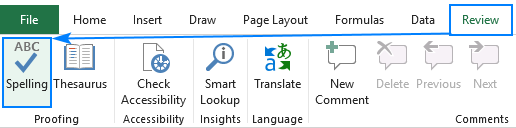 Excel을 철자하는 방법
Apr 06, 2025 am 09:10 AM
Excel을 철자하는 방법
Apr 06, 2025 am 09:10 AM
이 튜토리얼은 Excel의 맞춤법 검사를위한 다양한 방법과 같은 수동 점검, VBA 매크로 및 특수 도구를 사용합니다. 셀, 범위, 워크 시트 및 전체 통합 문서의 철자 확인을 배우십시오. Excel은 워드 프로세서는 아니지만 Spel
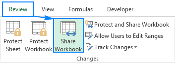 Excel 공유 통합 문서 : 여러 사용자를위한 Excel 파일을 공유하는 방법
Apr 11, 2025 am 11:58 AM
Excel 공유 통합 문서 : 여러 사용자를위한 Excel 파일을 공유하는 방법
Apr 11, 2025 am 11:58 AM
이 튜토리얼은 다양한 방법, 액세스 제어 및 갈등 해결을 다루는 Excel 통합 문서 공유에 대한 포괄적 인 안내서를 제공합니다. Modern Excel 버전 (2010, 2013, 2016 및 이후) 협업 편집을 단순화하여 M에 대한 필요성을 제거합니다.
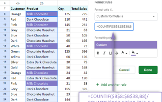 Google 스프레드 시트 Countif 기능은 공식 예제와 함께합니다
Apr 11, 2025 pm 12:03 PM
Google 스프레드 시트 Countif 기능은 공식 예제와 함께합니다
Apr 11, 2025 pm 12:03 PM
마스터 Google Sheets Countif : 포괄적 인 가이드 이 안내서는 Google 시트의 다목적 카운티프 기능을 탐색하여 간단한 셀 카운팅 이외의 응용 프로그램을 보여줍니다. 우리는 정확하고 부분적인 경기에서 Han에 이르기까지 다양한 시나리오를 다룰 것입니다.
 Excel의 절대 값 : 공식 예제와 함께 ABS 기능
Apr 06, 2025 am 09:12 AM
Excel의 절대 값 : 공식 예제와 함께 ABS 기능
Apr 06, 2025 am 09:12 AM
이 튜토리얼은 절대 값의 개념을 설명하고 데이터 세트 내에서 절대 값을 계산하기위한 ABS 기능의 실질적인 Excel 응용 프로그램을 보여줍니다. 숫자는 긍정적이거나 부정적 일 수 있지만 때로는 양수 값 만 필요합니다.
 Excel : 그룹 행 자동 또는 수동으로 행을 붕괴하고 확장합니다.
Apr 08, 2025 am 11:17 AM
Excel : 그룹 행 자동 또는 수동으로 행을 붕괴하고 확장합니다.
Apr 08, 2025 am 11:17 AM
이 튜토리얼은 행을 그룹화하여 복잡한 Excel 스프레드 시트를 간소화하여 데이터를보다 쉽게 분석 할 수 있도록하는 방법을 보여줍니다. 행 그룹을 신속하게 숨기거나 보여주고 전체 개요를 특정 수준으로 붕괴시키는 법을 배우십시오. 크고 상세한 스프레드 시트가 될 수 있습니다
 Excel을 JPG로 변환하는 방법 - 이미지 파일로 .xls 또는 .xlsx를 저장
Apr 11, 2025 am 11:31 AM
Excel을 JPG로 변환하는 방법 - 이미지 파일로 .xls 또는 .xlsx를 저장
Apr 11, 2025 am 11:31 AM
이 자습서는 .xls 파일을 .jpg 이미지로 변환하는 다양한 방법을 탐색하여 내장 된 Windows 도구와 무료 온라인 변환기를 모두 포함합니다. 프레젠테이션을 만들거나 스프레드 시트 데이터를 단단히 공유하거나 문서를 디자인해야합니까? YO를 변환합니다
 Google Sheets 차트 자습서 : Google 시트에서 차트를 만드는 방법
Apr 11, 2025 am 09:06 AM
Google Sheets 차트 자습서 : Google 시트에서 차트를 만드는 방법
Apr 11, 2025 am 09:06 AM
이 자습서는 Google 시트에서 다양한 차트를 작성하여 다양한 데이터 시나리오에 적합한 차트 유형을 선택하는 방법을 보여줍니다. 또한 3D 및 Gantt 차트를 만드는 방법과 차트를 편집, 복사 및 삭제하는 방법을 배웁니다. 데이터 시각화는 CRU입니다
