
 Backend Development
Python Tutorial
Share a case of how Python uses plotly to draw data charts (pictures and texts)
Backend Development
Python Tutorial
Share a case of how Python uses plotly to draw data charts (pictures and texts)
Share a case of how Python uses plotly to draw data charts (pictures and texts)

This article mainly introduces the method of using plotly to draw data charts in Python. It analyzes the techniques of plotly drawing with examples and has certain reference value. Interested friends can refer to it
Introduction: Use The python-plotly module is used to draw stress test data and generate static html page results for display.
Many friends have the experience of stress testing modules during the development process. After the stress test, everyone often likes to use Excel to process the stress test data and draw data visualization views, but this is not very convenient to use. Web page for data display. This article will introduce the use of the python-plotly module to draw stress test data and generate a static HTML page to facilitate the display of results.
Introduction to Plotly
Plotly is a charting tool developed using JavaScript, providing an API to interact with mainstream data analysis languages (such as: Python, R, MATLAB). You can go to the official website https://plot.ly/ for more detailed information. Plotly is capable of drawing beautiful charts with user interaction.
Python-Plotly installation
This document mainly introduces the use of plotly’s Python API to perform several A simple chart drawing. For more usage of Plotly, please refer to https://plot.ly/python/
Python-Plotly can be installed using pip, and it is best to install and use it in Python version 2.7 and above. If you use Python2.6 version, please install Python2.7 and the corresponding pip yourself.
Plotly drawing example
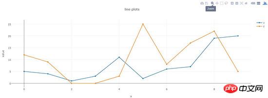
line-plots
Drawing effect:
The generated html page provides rich interactive tools in the upper right corner.
Code:
def line_plots(name):
  '''
  绘制普通线图
  '''
  #数据,x为横坐标,y,z为纵坐标的两项指标,三个array长度相同
  dataset = {'x':[0,1,2,3,4,5,6,7,8,9],
        'y':[5,4,1,3,11,2,6,7,19,20],
        'z':[12,9,0,0,3,25,8,17,22,5]}
  data_g = []
  #分别插入 y, z
  tr_x = Scatter(
    x = dataset['x'],
    y = dataset['y'],
    name = 'y'
  )
  data_g.append(tr_x)
  tr_z = Scatter(
    x = dataset['x'],
    y = dataset['z'],
    name = 'z'
  )
  data_g.append(tr_z)
  #设置layout,指定图表title,x轴和y轴名称
  layout = Layout(title="line plots", xaxis={'title':'x'}, yaxis={'title':'value'})
  #将layout设置到图表
  fig = Figure(data=data_g, layout=layout)
  #绘图,输出路径为name参数指定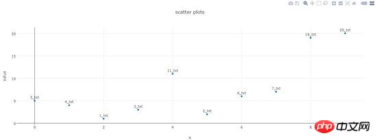
pltoff.plot(fig, filename=name)scatter-plots
Plotting effect :
Code:
def scatter_plots(name):
  '''
  绘制散点图
  '''
  dataset = {'x':[0,1,2,3,4,5,6,7,8,9],
        'y':[5,4,1,3,11,2,6,7,19,20],
        'text':['5_txt','4_txt','1_txt','3_txt','11_txt','2_txt','6_txt','7_txt','19_txt','20_txt']}

  data_g = []

  tr_x = Scatter(
    x = dataset['x'],
    y = dataset['y'],
    text = dataset['text'],
    textposition='top center',
    mode='markers+text',
    name = 'y'
  )
  data_g.append(tr_x)

  layout = Layout(title="scatter plots", xaxis={'title':'x'}, yaxis={'title':'value'})
  fig = Figure(data=data_g, layout=layout)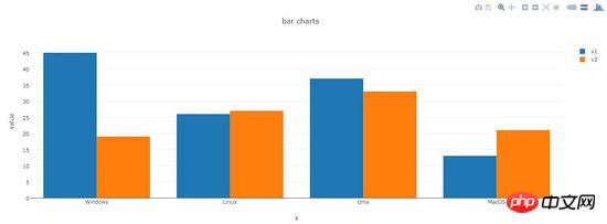
pltoff.plot(fig, filename=name)bar-charts
Drawing Effect:
Code:
def bar_charts(name):
  '''
  绘制柱状图
  '''
  dataset = {'x':['Windows', 'Linux', 'Unix', 'MacOS'],
        'y1':[45, 26, 37, 13],
        'y2':[19, 27, 33, 21]}
  data_g = []
  tr_y1 = Bar(
    x = dataset['x'],
    y = dataset['y1'],
    name = 'v1'
  )
  data_g.append(tr_y1)

  tr_y2 = Bar(
    x = dataset['x'],
    y = dataset['y2'],
    name = 'v2'
  )
  data_g.append(tr_y2)
  layout = Layout(title="bar charts", xaxis={'title':'x'}, yaxis={'title':'value'})
  fig = Figure(data=data_g, layout=layout)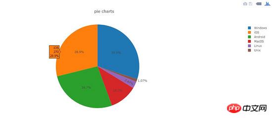
pltoff.plot(fig, filename=name)pie-charts
Plotting effect:
Code:
def pie_charts(name):
  '''
  绘制饼图
  '''
  dataset = {'labels':['Windows', 'Linux', 'Unix', 'MacOS', 'Android', 'iOS'],
        'values':[280, 25, 10, 100, 250, 270]}
  data_g = []
  tr_p = Pie(
    labels = dataset['labels'],
    values = dataset['values']
  )
  data_g.append(tr_p)
  layout = Layout(title="pie charts")
  fig = Figure(data=data_g, layout=layout)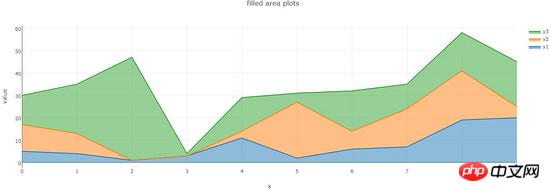
pltoff.plot(fig, filename=name)filled-area-plots
This example is to draw a stacked line chart with a fill effect, which is suitable for analyzing data with stacked percentage attributes
Drawing effect:
Code:
def filled_area_plots(name):
  '''
  绘制堆叠填充的线图
  '''
  dataset = {'x':[0,1,2,3,4,5,6,7,8,9],
        'y1':[5,4,1,3,11,2,6,7,19,20],
        'y2':[12,9,0,0,3,25,8,17,22,5],
        'y3':[13,22,46,1,15,4,18,11,17,20]}

  #计算y1,y2,y3的堆叠占比
  dataset['y1_stack'] = dataset['y1']
  dataset['y2_stack'] = [y1+y2 for y1, y2 in zip(dataset['y1'], dataset['y2'])]
  dataset['y3_stack'] = [y1+y2+y3 for y1, y2, y3 in zip(dataset['y1'], dataset['y2'], dataset['y3'])]

  dataset['y1_text'] = ['%s(%s%%)'%(y1, y1*100/y3_s) for y1, y3_s in zip(dataset['y1'], dataset['y3_stack'])]
  dataset['y2_text'] = ['%s(%s%%)'%(y2, y2*100/y3_s) for y2, y3_s in zip(dataset['y2'], dataset['y3_stack'])]
  dataset['y3_text'] = ['%s(%s%%)'%(y3, y3*100/y3_s) for y3, y3_s in zip(dataset['y3'], dataset['y3_stack'])]

  data_g = []
  tr_1 = Scatter(
    x = dataset['x'],
    y = dataset['y1_stack'],
    text = dataset['y1_text'],
    hoverinfo = 'x+text',
    mode = 'lines',
    name = 'y1',
    fill = 'tozeroy' #填充方式: 到x轴
  )
  data_g.append(tr_1)

  tr_2 = Scatter(
    x = dataset['x'],
    y = dataset['y2_stack'],
    text = dataset['y2_text'],
    hoverinfo = 'x+text',
    mode = 'lines',
    name = 'y2',
    fill = 'tonexty' #填充方式:到下方的另一条线
  )
  data_g.append(tr_2)

  tr_3 = Scatter(
    x = dataset['x'],
    y = dataset['y3_stack'],
    text = dataset['y3_text'],
    hoverinfo = 'x+text',
    mode = 'lines',
    name = 'y3',
    fill = 'tonexty'
  )
  data_g.append(tr_3)

  layout = Layout(title="field area plots", xaxis={'title':'x'}, yaxis={'title':'value'})
  fig = Figure(data=data_g, layout=layout)
pltoff.plot(fig, filename=name)Summary
This article introduces the method of using python-plotly to draw data graphs, including line plots and scatter plots in examples. These five typical charts, scatter plots, bar charts, pie charts, and filled area plots, basically cover most types of test data. Dear friends, It can be deformed to draw more beautiful icons.
The above is the detailed content of Share a case of how Python uses plotly to draw data charts (pictures and texts). For more information, please follow other related articles on the PHP Chinese website!

Hot AI Tools

Undresser.AI Undress
AI-powered app for creating realistic nude photos

AI Clothes Remover
Online AI tool for removing clothes from photos.

Undress AI Tool
Undress images for free

Clothoff.io
AI clothes remover

Video Face Swap
Swap faces in any video effortlessly with our completely free AI face swap tool!

Hot Article
Hot Tools

Notepad++7.3.1
Easy-to-use and free code editor

SublimeText3 Chinese version
Chinese version, very easy to use

Zend Studio 13.0.1
Powerful PHP integrated development environment

Dreamweaver CS6
Visual web development tools

SublimeText3 Mac version
God-level code editing software (SublimeText3)
Hot Topics
 1670
1670
 14
1428
52
1329
25
1274
29
1256
24
14
1428
52
1329
25
1274
29
1256
24

 PHP and Python: Different Paradigms Explained
Apr 18, 2025 am 12:26 AM
PHP and Python: Different Paradigms Explained
Apr 18, 2025 am 12:26 AM
PHP is mainly procedural programming, but also supports object-oriented programming (OOP); Python supports a variety of paradigms, including OOP, functional and procedural programming. PHP is suitable for web development, and Python is suitable for a variety of applications such as data analysis and machine learning.
 Choosing Between PHP and Python: A Guide
Apr 18, 2025 am 12:24 AM
Choosing Between PHP and Python: A Guide
Apr 18, 2025 am 12:24 AM
PHP is suitable for web development and rapid prototyping, and Python is suitable for data science and machine learning. 1.PHP is used for dynamic web development, with simple syntax and suitable for rapid development. 2. Python has concise syntax, is suitable for multiple fields, and has a strong library ecosystem.
 How to run sublime code python
Apr 16, 2025 am 08:48 AM
How to run sublime code python
Apr 16, 2025 am 08:48 AM
To run Python code in Sublime Text, you need to install the Python plug-in first, then create a .py file and write the code, and finally press Ctrl B to run the code, and the output will be displayed in the console.
 PHP and Python: A Deep Dive into Their History
Apr 18, 2025 am 12:25 AM
PHP and Python: A Deep Dive into Their History
Apr 18, 2025 am 12:25 AM
PHP originated in 1994 and was developed by RasmusLerdorf. It was originally used to track website visitors and gradually evolved into a server-side scripting language and was widely used in web development. Python was developed by Guidovan Rossum in the late 1980s and was first released in 1991. It emphasizes code readability and simplicity, and is suitable for scientific computing, data analysis and other fields.
 Python vs. JavaScript: The Learning Curve and Ease of Use
Apr 16, 2025 am 12:12 AM
Python vs. JavaScript: The Learning Curve and Ease of Use
Apr 16, 2025 am 12:12 AM
Python is more suitable for beginners, with a smooth learning curve and concise syntax; JavaScript is suitable for front-end development, with a steep learning curve and flexible syntax. 1. Python syntax is intuitive and suitable for data science and back-end development. 2. JavaScript is flexible and widely used in front-end and server-side programming.
 Golang vs. Python: Performance and Scalability
Apr 19, 2025 am 12:18 AM
Golang vs. Python: Performance and Scalability
Apr 19, 2025 am 12:18 AM
Golang is better than Python in terms of performance and scalability. 1) Golang's compilation-type characteristics and efficient concurrency model make it perform well in high concurrency scenarios. 2) Python, as an interpreted language, executes slowly, but can optimize performance through tools such as Cython.
 Where to write code in vscode
Apr 15, 2025 pm 09:54 PM
Where to write code in vscode
Apr 15, 2025 pm 09:54 PM
Writing code in Visual Studio Code (VSCode) is simple and easy to use. Just install VSCode, create a project, select a language, create a file, write code, save and run it. The advantages of VSCode include cross-platform, free and open source, powerful features, rich extensions, and lightweight and fast.
 How to run python with notepad
Apr 16, 2025 pm 07:33 PM
How to run python with notepad
Apr 16, 2025 pm 07:33 PM
Running Python code in Notepad requires the Python executable and NppExec plug-in to be installed. After installing Python and adding PATH to it, configure the command "python" and the parameter "{CURRENT_DIRECTORY}{FILE_NAME}" in the NppExec plug-in to run Python code in Notepad through the shortcut key "F6".
