
本篇文章给大家介绍一下使用纯css实现血轮眼+轮回眼特效的方法。有一定的参考价值,有需要的朋友可以参考一下,希望对你们有所助。
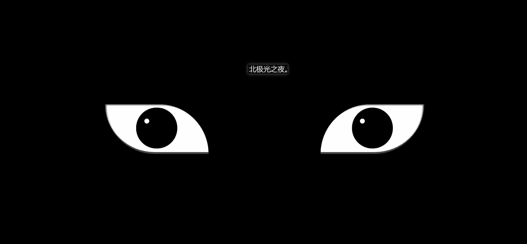
效果(完整代码在底部)
其实实现并不难,都是重复的代码比较多。
1. 先定义基本标签:
<!-- 血轮眼 -->
    <div class="zuo">
        <!-- 眼睛最中间那个黑点 -->
        <div class="zuoZong">
            <!-- 三勾玉所在的圈 -->
            <div class="zuoYu">
                <!-- 三个勾玉 -->
                <span class="yu"></span>
                <span class="yu"></span>
                <span class="yu"></span>
            </div>
        </div>
    </div>
    <!-- 轮回眼 -->
    <div class="you">
        <!-- 眼睛最中间那个黑点 -->
        <div class="dian"></div>
             <!-- 3个轮回圈 -->
            <div class="youYu">
                <span class="quan" style="--r:2;"></span>
                <span class="quan" style="--r:3;"></span>
                <span class="quan" style="--r:4;"></span>
            </div>
</div>2. 定义左右眼的基本css样式:
.zuo , .you{
            width: 250px;
            height: 120px;
            background-color: rgb(255, 255, 255);
            border-bottom: 5px solid rgb(70, 70, 70);
            overflow: hidden;
            position: relative;
}border-bottom: 5px solid rgb(70, 70, 70); 给个灰色的眼底。
overflow:溢出隐藏。
position: relative; 相对定位。
3. 开始先定义血轮眼的基本样式:
.zuo{
            transform: translateX(-135px);
            border-radius: 0 120px 0 120px;
            box-shadow: inset 3px 2px 3px  rgba(17, 17, 17, 0.8);
}transform: translateX(-135px); 向左偏移,让两眼分开。
border-radius:给两个角设置弧度,形成眼睛形状。
bos-shadowL给眼角一点阴影。
4. 设置眼球宽高等:
.zuo::after{
            content: '';
            position: absolute;
            top: 50%;
            left: 50%;
            transform: translate(-50%,-50%);
            width: 95px;
            height: 95px;
            border-radius: 50%;
            border: 2px solid #000;
            animation: colour 2s linear forwards;
        }
        @keyframes colour{
            0%,30%{
                background-color: rgb(0, 0, 0);
            }
            100%{
                 background-color: rgb(255, 4, 4);
             }
}5. 设置眼球正中间的黑点,都是些定位大小啥的,然后设置动画然它慢慢变大:
 .zuoZong{
            position: absolute;
            top: 50%;
            left: 50%;
            transform: translate(-50%,-50%);
            width: 0px;
            height: 0px;
            border-radius: 50%;
            background-color: rgb(0, 0, 0);
            z-index: 1;
            animation: da 3s linear forwards;
        }
        @keyframes da{
            100%{
                width: 15px;
            height: 15px;
            }
}6. 设置三勾玉所在的圈,设置动画让其显示与旋转:
.zuoYu{
            position: absolute;
            top: -25px;
            left: -25px;
            bottom: -25px;
            right: -25px;
            border-radius: 50%;
            border: 2px solid rgb(0, 0, 0);
            animation: zhuan 2s linear 2s forwards;
            opacity: 0;
        }
        @keyframes zhuan{

            100%{
                opacity: 1;
                transform: rotate(720deg);
            }
}7. 制作三勾玉,先做一个圆,再用双伪类制作一个圆弧,两者结合就是勾玉了:
.zuoYu .yu{
             position: absolute;
             width: 15px;
             height: 15px;
             border-radius: 50%;
             background-color: rgb(0, 0, 0);

        }
        .zuoYu .yu::after{
            content: '';
            position: absolute;
            top: -6px;
            left: -1px;
            width: 6px;
            height: 20px;
            border-radius: 50%;
            border-left: 6px solid rgb(0, 0, 0);
}border-radius: 50%;
border-left: 6px solid rgb(0, 0, 0);
先让伪类为圆,再只设置一条边框,圆弧形成,再定位在父元素上,形成勾玉。
8. 给勾玉设置动画,让其从最中间变大旋转到勾玉所在的圈:
  .zuoYu .yu:nth-child(1){
            animation: yu1 2s ease-in 2s  forwards;
        }
        @keyframes yu1{
            0%{
                opacity: 0;
                left: 50%;
                top: 50%;
                transform:translate(-50%,-50%)  scale(0.1) ;
            }
            100%{
                left: 50%;
                top: -9%;
                transform: scale(1) rotate(80deg);
            }
}left: 50%;
top: 50%; 在最中间。
opacity:透明。
scale(0.1);缩小。
100%{…}到对应位置,同时变不透明和放大成正常大小。
9. 一样的,给其它两个勾玉动画:
.zuoYu .yu:nth-child(2){
            animation: yu2 2s ease-in 2s forwards;
        }
        @keyframes yu2{
            0%{
                opacity: 0;
                left: 50%;
                top: 50%;

                transform: translate(-50%,-50%) scale(0.1) ;
            }
            100%{
                top: 60%;
                left: -9%;
                transform: scale(1) rotate(-60deg);
            }
        }
        .zuoYu .yu:nth-child(3){
            animation: yu3 2s ease-in 2s forwards;
        }
        @keyframes yu3{
            0%{
                opacity: 0;
                right: 50%;
                top: 50%;

                transform: translate(-50%,-50%) scale(0.1);
            }
            100%{
                top: 60%;
                right: -9%;
                transform: scale(1) rotate(180deg);
            }
}10.给两个眼睛都设置一个白点,相当于反光效果吧,至此血轮眼做完了:
.zuo::before,.you::before{
            content: '';
            position: absolute;
            left: 38%;
            top: 30%;
            width: 12px;
            height: 12px;
            border-radius: 50%;
            background-color: rgb(255, 255, 255);
            z-index: 10;
}position: absolute;
left: 38%;
top: 30%; 定位相应的位置。
background-color: rgb(255, 255, 255); 白色。
z-index: 10; 设置为10,显示在最上层。
11.设置轮回眼基本css样式,跟血轮眼一样:
 .you{
            transform: translateX(135px);
            border-radius:  120px 0 120px 0;
            box-shadow: inset -3px 2px 3px  rgba(17, 17, 17, 0.8);
}12.设置眼球宽高等:
.you::after{
            content: '';
            position: absolute;
            top: 50%;
            left: 50%;
            transform: translate(-50%,-50%);
            width: 95px;
            height: 95px;
            border-radius: 50%;
            border: 2px solid #000;
            animation: youcolor 2s linear forwards;
         }
         @keyframes youcolor{
            0%,30%{
                background-color: rgb(0, 0, 0);
            }
            100%{
                 background-color: rgb(144, 130, 183);

             }
}position: absolute; 绝对定位
top: 50%;
left: 50%;
transform: translate(-50%,-50%); 居中对齐。
animation:设置动画,让其变紫色。forward:继承最后一帧的属性。
background-color: rgb(0, 0, 0); 黑色
background-color: rgb(144, 130, 183); 紫色。
13. 设置眼球最中间的黑点,跟血轮眼也差不多:
.dian{
             position: absolute;
            top: 50%;
            left: 50%;
            background-color: #000;
            transform: translate(-50%,-50%);
            border-radius: 50%;
            z-index: 10;
            animation: youda 3s linear forwards;
         }
         @keyframes youda{
             0%{
                height: 0px;
            width: 0px;
             }
             100%{
                height: 15px;
            width: 15px;
             }
}14. 设置轮回眼每个圈,同时设置动画让其变大:
 .youYu{
            position: absolute;
          top: 50%;
          left: 50%;
          transform: translate(-50%,-50%);
       }
       .quan{
           position: absolute;
           border-radius: 50%;
           border: 2px solid #000;
           z-index: calc(1 - var(--r));
           animation: zhi 2s ease-out 2s forwards;
       }
       @keyframes zhi{
           0%{
            top: calc(var(--r) * 1px);
           left: calc(var(--r) * 1px);
           right: calc(var(--r) * 1px);
           bottom: calc(var(--r) * 1px);
           }
           100%{
            top: calc(var(--r) * -35px);
           left: calc(var(--r) * -35px);
           right: calc(var(--r) * -35px);
           bottom: calc(var(--r) * -35px);

               background-color: rgb(187, 177, 214);
           }
}z-index: calc(1 - var(–r)); 计算,让最开始的圈显示在最上层。
animation:设置动画,让轮回圈慢慢变大,同时变成紫色。
Document
(学习视频分享:css视频教程)
以上就是纯CSS如何实现血轮眼+轮回眼特效(代码详解)的详细内容,更多请关注php中文网其它相关文章!

Copyright 2014-2024 https://www.php.cn/ All Rights Reserved | php.cn | 湘ICP备2023035733号


 0
0 14
14


 收藏
收藏


![ThinkPHP5实战之[教学管理系统]](https://img.php.cn/upload/course/000/000/068/6253d87459486427.png)


