
最近看了国外大佬用CSS3实现手风琴效果的视频,所以自己学习后写了一下,以博客的形式记录下来,方便自己日后复习,代码结构如下(字体用的是Genericons ):
视屏教程推荐:《CSS视频教程-玉女心经版》
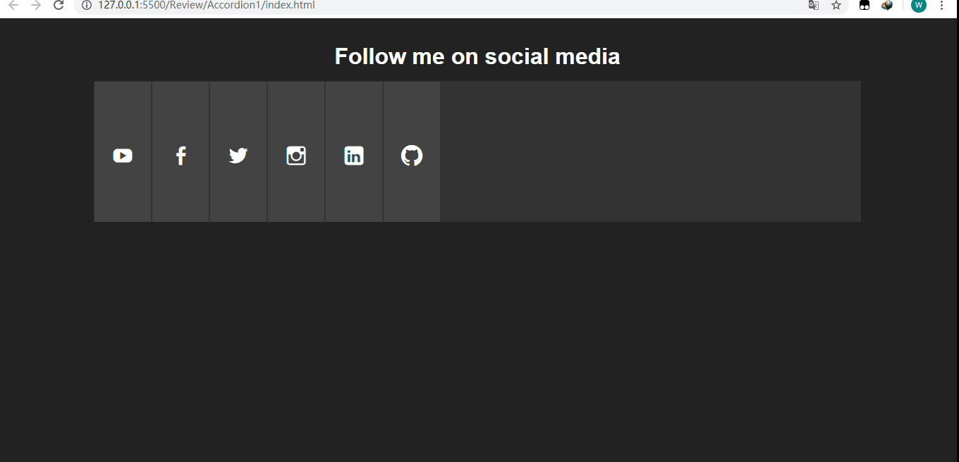
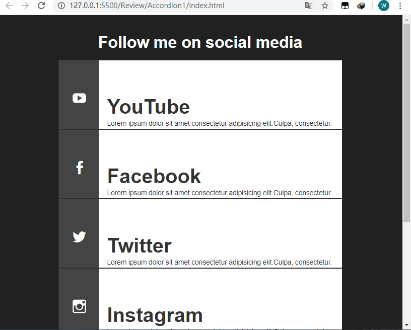
最终效果如下:
全屏时:
屏幕宽度小于960px时:
下面来看一下页面的基本结构(index.html):
<!DOCTYPE html>
<html lang="en">
<head>
  <meta charset="UTF-8">
  <meta name="viewport" content="width=device-width, initial-scale=1.0">
  <title>Document</title>
  <link rel="stylesheet" href="style.css">
</head>
<body>
  <p class="container">
      <!--标题-->
    <header>
      <h1>Follow me on social media</h1>
    </header>

      <!--手风琴部分-->
    <ul class="accordion">
      <li class="tab">
        <p class="social youtube">
          <a href="#">YouTube</a>
        </p>
        <p class="content">
          <h1>YouTube</h1>
          <p>Lorem ipsum dolor sit amet consectetur
            adipisicing elit.Culpa, consectetur.</p>
        </p>
      </li>
      <li class="tab">
        <p class="social facebook">
          <a href="#">Facebook</a>
        </p>
        <p class="content">
          <h1>Facebook</h1>
          <p>Lorem ipsum dolor sit amet consectetur
            adipisicing elit.Culpa, consectetur.</p>
        </p>
      </li>
      <li class="tab">
        <p class="social twitter">
          <a href="#">Twitter</a>
        </p>
        <p class="content">
          <h1>Twitter</h1>
          <p>Lorem ipsum dolor sit amet consectetur
            adipisicing elit.Culpa, consectetur.</p>
        </p>
      </li>
      <li class="tab">
        <p class="social instagram">
          <a href="#">Instagram</a>
        </p>
        <p class="content">
          <h1>Instagram</h1>
          <p>Lorem ipsum dolor sit amet consectetur
            adipisicing elit.Culpa, consectetur.</p>
        </p>
      </li>
      <li class="tab">
        <p class="social linkedin">
          <a href="#">Linkedin</a>
        </p>
        <p class="content">
          <h1>Linkedin</h1>
          <p>Lorem ipsum dolor sit amet consectetur
            adipisicing elit.Culpa, consectetur.</p>
        </p>
      </li>
       <li class="tab">
        <p class="social github">
          <a href="#">Github</a>
        </p>
        <p class="content">
          <h1>Github</h1>
          <p>Lorem ipsum dolor sit amet consectetur
            adipisicing elit.Culpa, consectetur.</p>
        </p>
      </li>
    </ul>
  </p>
</body>
</html>样式(style.css):
*{
  margin: 0;
  padding: 0;
  border: none;
}

body{
  font-family: Arial, Helvetica, sans-serif;
  background-color: #222;
  color: #fff;
}

/*设置字体,因为后面的图标需要用到*/
@font-face {
  font-family: 'Genericons';
  src: url('font/genericons-regular-webfont.woff') format('woff'),
  url('font/genericons-regular-webfont.eot') format('truetype');
}

/*设置外面容器的宽度*/
.container{
  width: 80%;
  margin: 20px auto;
}

header h1{
  font-size: 2rem;
  padding: 1rem;
  text-align: center;
}

/*注意这里font-size设置为0,不然会出现非常糟糕的画面,我们后面再去单独对需要现实的文本设置字体大小
,因为a链接不想让它显示内容*/
.accordion{
  width: 100%;
  min-width: 800px;
  height: 200px;
  background-color: #333;
  list-style: none;
  display: block;
  overflow: hidden;
  font-size: 0;
}

/*对每一个li设置为inline-block,让其排列在一行,溢出隐藏,因为.tab下面的.content宽度为360,而且.tab只有在hover的时候宽度才会变成450px,那时候.content刚好显示.另外设置过渡,使其宽度增长的过程平缓*/
.tab{
  width: 80px;
  height: 100%;
  display: inline-block;
  position: relative;
  margin: 0;
  background-color: #444;
  border: 1px solid #333;
  overflow: hidden;
  transition: all .5s ease .1s;
}

.tab:hover{
  width: 450px;
}
.tab:hover .social a:after{
  transform: translateX(-80px);
}
.tab:hover .social a:before{
  transform: translateX(-100px);
}

/*设置定位为相对定位,不然.content会有部分内容被遮住*/
.tab .content{
  position: relative;
  width: 360px;
  height: 100%;
  background-color: #fff;
  color: #333;
  margin-left: 80px;
  padding: 50px 0 0 15px;
}

.tab .content h1{
  font-size: 2.5rem;
  margin-top: 20px;
}
.tab .content p{
  font-size: .85rem;
  line-height: 1.6;
}

/设置为元素的宽高及字体为Genericons,不然图标无法显现,只会显示白色的空框框/
.social a:before,
.social a:after{
  position: absolute;
  width: 80px;
  height: 200px;
  display: block;
  text-indent: 0;
  padding-top: 90px;
  padding-left: 25px;
  font:normal 30px Genericons;
  color: #fff;
  transition: all .5s ease;
}

/*因为当我们hover上去的时候图标会更大,所以after伪类的字体及padding要重新设置,同时
要将margin-left设置为80px,这要默认情况下显示的就是before伪类的小图标*/
.social a:after{
  font-size: 48px;
  padding-top: 80px;
  padding-left: 20px;
  margin-left: 80px;
}

/*Add icons*/
.youtube a:before,
.youtube a:after{
  content: '\f213';
}

.youtube a:after{
  background-color: #fc0000;
}

.twitter a:before,
.twitter a:after{
  content: '\f202';
}

.twitter a:after{
  background-color: #6dc5dd;
}

.facebook a:before,
.facebook a:after{
  content: '\f204';
}

.facebook a:after{
  background-color: #3b5998;
}

.linkedin a:before,
.linkedin a:after{
  content: '\f208';
}

.linkedin a:after{
  background-color: #00a9cd;
}

.instagram a:before,
.instagram a:after{
  content: '\f215';
}

.instagram a:after{
  background-color: #6dc993;
}

.github a:before,
.github a:after{
  content: '\f200';
}

.github a:after{
  background-color: #6e5494;
}

/*当屏幕最大宽度为960px时*/
@media(max-width:960px){
  .container{
    width: 70%;
  }
    /*让高度为auto*/
  .accordion{
    min-width: 450px;
    height: auto;
  }

    /*让li显示为block,这样就会依次往下排*/
  .tab{
    width: 100%;
    display: block;
    border-bottom: 1px solid #333;
  }
    /*这个一定要设置,因为原本的.tab:hover时宽度为450px,假如.tab的宽度有600px,在hover时就回剩余150px的空白,不是我们想要的效果*/
  .tab:hover{
    width: 100%;
  }
  .tab .content{
    width: 85%;
  }
    /*设置对应伪类的padding值,使其大概显示在中间*/
  .social a:before{
    padding-top: 60px;
    padding-left: 25px;
  }
  .social a:after{
    padding-top: 50px;
    padding-left: 20px;
  }
}推荐教程:《CSS教程》
以上就是CSS3 实现响应式手风琴的详细内容,更多请关注php中文网其它相关文章!


 收藏
收藏
 收藏
收藏
 收藏
收藏
Copyright 2014-2024 https://www.php.cn/ All Rights Reserved | php.cn | 湘ICP备2023035733号


 0
0 34
34


![ThinkPHP5实战之[教学管理系统]](https://img.php.cn/upload/course/000/000/068/6253d87459486427.png)


