


 收藏
收藏


 PHPz
PHPz批改状态:合格
老师批语:
/* border-box 背景被裁剪到边框盒。 *//* padding-box 背景被裁剪到内边距框。*//* content-box 背景被裁剪到内容框。 */
默认情况下,元素的宽度与高度计算方式如下:
width(宽) + padding(内边距) + border(边框) = 元素实际宽度
height(高) + padding(内边距) + border(边框) = 元素实际高度
在盒子内无内容时,这么计算是没有问题的,但是当盒子内的padding值改变时,盒子的大小也跟着改变了。

<!DOCTYPE html><html><head><meta charset="utf-8" /><style>.box {/* 元素的宽度 */width: 100px;/* 元素的高度 */height: 100px;}.box-1 {/* 内边距 */padding: 5px;/* 背景色 */background-color: #f29b76;/* 边框 */border: 1px solid #000;/* 规定背景的绘制区域: *//* border-box 背景被裁剪到边框盒。 *//* padding-box 背景被裁剪到内边距框。 *//* content-box 背景被裁剪到内容框。 */background-clip: content-box;/* 设置下外边距 */margin-bottom: 5px;}.box-2 {/* 内边距 */padding: 5px;/* 背景色 */background-color: #00a1e9;/* 边框 */border: 1px solid #000;/* 将边框包含在内容区的宽和高 */box-sizing: border-box;margin-bottom: 10px;}</style><title>盒模型常用属性</title></head><body><div class="box box-1"></div><div class="box box-2"></div></body></html>


<!DOCTYPE html><html lang="zh-CN"><head><meta charset="UTF-8" /><meta http-equiv="X-UA-Compatible" content="IE=edge" /><meta name="viewport" content="width=device-width, initial-scale=1.0" /><title>媒体查询</title></head><body><button class="btn samll">按钮1</button><button class="btn middle">按钮2</button><button class="btn large">按钮3</button></body><style>html {font-size: 10px;}.btn {background-color: seagreen;color: white;border: none;outline: none;}.btn:hover {cursor: pointer;opacity: 0.8;transition: 0.3s;padding: 0.4rem 0.8rem;}.btn.small {font-size: 1.2rem;}.btn.middle {font-size: 1.6rem;}.btn.large {font-size: 1.8rem;}@media (max-width: 374px) {html {font-size: 12px;background-color: #F20E11;}}@media (min-width: 375px) and (max-width: 413px) {html {font-size: 14px;background-color: #00a1e9;}}@media (min-width: 414px) {html {font-size: 16px;background-color: #21e900;}}</style></html>
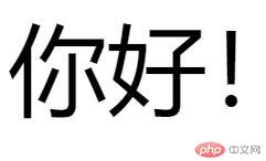
<!DOCTYPE html><html lang="zh-CN"><head><meta charset="UTF-8" /><meta http-equiv="X-UA-Compatible" content="IE=edge" /><meta name="viewport" content="width=device-width, initial-scale=1.0" /><title></title></head><body><div><span>你好!</span></div><style>html {font-size: 6px;/* 在根元素中设置的字号,在其它地方引用是使用rem,并且这个值是不变的 *//* 因为一个页面,只有一个根元素, html *//* 1rem = 6px */}div {font-size: 3rem;}div span {/* 4rem = 4*6=24px */font-size: 4em;}</style></body></html>

<!DOCTYPE html><html lang="zh-CN"><head><meta charset="UTF-8" /><meta http-equiv="X-UA-Compatible" content="IE=edge" /><meta name="viewport" content="width=device-width, initial-scale=1.0" /><title></title></head><body><div><span>你好!</span></div><style>html {font-size: 6px;/* 在根元素中设置的字号,在其它地方引用是使用rem,并且这个值是不变的 *//* 因为一个页面,只有一个根元素, html *//* 1rem = 6px */}div span {/* 4rem = 4*6=24px */font-size: 4rem;}</style></body></html>

Copyright 2014-2025 https://www.php.cn/ All Rights Reserved | php.cn | 湘ICP备2023035733号


