


 收藏
收藏


 WJ
WJ批改状态:合格
老师批语:写的非常认真,格式工整,继续加油!
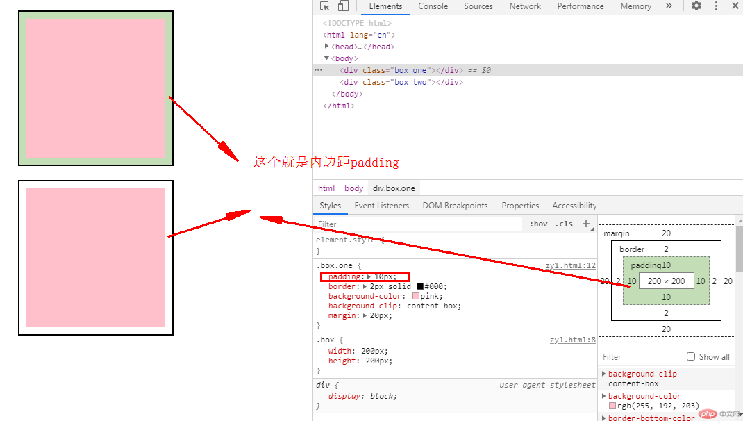
盒子模型有4个部分组成:宽高、内间距、边框、外间距
padding:设置内边距,即边框与内容之间的距离
示例如下:
< !DOCTYPE html><html lang="en"><head><meta charset="UTF-8" /><meta name="viewport" content="width=device-width, initial-scale=1.0" /><title>Document</title><style>.box {width: 200px;height: 200px;}.box.one {/* 设置内边距*/padding: 10px;/* 给盒子设置2px的边框并设置颜色为黑 */border: 2px solid #000;background-color: pink;background-clip: content-box;margin: 20px;}.box.two {/* 设置内边距*/padding: 10px;/* 给盒子设置2px的边框并设置颜色为黑 */border: 2px solid #000;background-color: pink;background-clip: content-box;margin: 20px;}</style></head><body><div class="box one"></div><div class="box two"></div></body></html>
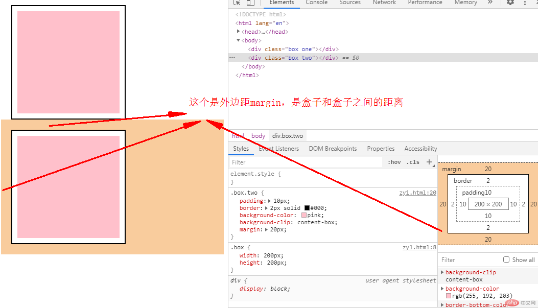
margin:设置外边距,即控制盒子与盒子之间的距离
示例如下:
< !DOCTYPE html><html lang="en"><head><meta charset="UTF-8" /><meta name="viewport" content="width=device-width, initial-scale=1.0" /><title>Document</title><style>.box {width: 200px;height: 200px;}.box.one {padding: 10px;/* 给盒子设置2px的边框并设置颜色为黑 */border: 2px solid #000;background-color: pink;background-clip: content-box;/* 设置外边距 */margin: 20px;}.box.two {padding: 10px;/* 给盒子设置2px的边框并设置颜色为黑 */border: 2px solid #000;background-color: pink;background-clip: content-box;/* 设置外边距 */margin: 20px;}</style></head><body><div class="box one"></div><div class="box two"></div></body></html>
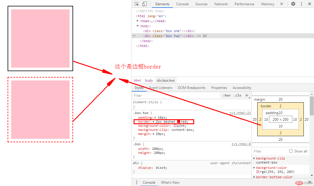
边框有3要素:边框类型、边框颜色、边框厚度
示例如下:
< !DOCTYPE html><html lang="en"><head><meta charset="UTF-8" /><meta name="viewport" content="width=device-width, initial-scale=1.0" /><title>Document</title><style>.box {width: 200px;height: 200px;}.box.one {padding: 10px;/* 给盒子设置2px厚度的实线且颜色为黑色的边框 */border: 2px solid #000;background-color: pink;background-clip: content-box;/* 设置外边距 */margin: 20px;}.box.two {padding: 10px;/* 给盒子设置2px厚度的虚线且颜色为红色的边框*/border: 2px dashed red;background-color: pink;background-clip: content-box;/* 设置外边距 */margin: 20px;}</style></head><body><div class="box one"></div><div class="box two"></div></body></html>
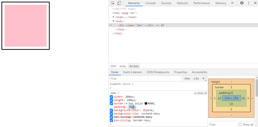
默认情况下,元素的宽度与高度计算方式如下:
width(宽) + padding(内边距) + border(边框) = 元素实际宽度
height(高) + padding(内边距) + border(边框) = 元素实际高度
在盒子内无内容时,这么计算是没有问题的,但是当盒子内的padding值改变时,盒子的大小也跟着改变了。
示例如下:
< !DOCTYPE html><html lang="en"><head><meta charset="UTF-8" /><meta name="viewport" content="width=device-width, initial-scale=1.0" /><title>用户自定义元素大小的计算方式</title><style>.box {width: 200px;height: 200px;border: 3px solid #000;padding: 10px;background-color: pink;background-clip: content-box;}</style></head><body><div class="box"></div></body></html>

box-sizing 属性可以被用来调整这些表现:
content-box 是默认值。如果你设置一个元素的宽为100px,那么这个元素的内容区会有100px 宽,并且任何边框和内边距的宽度都会被增加到最后绘制出来的元素宽度中。
border-box 告诉浏览器:你想要设置的边框和内边距的值是包含在width内的。
示例如下:
< !DOCTYPE html><html lang="en"><head><meta charset="UTF-8" /><meta name="viewport" content="width=device-width, initial-scale=1.0" /><title>用户自定义元素大小的计算方式</title><style>.box {width: 200px;height: 200px;border: 3px solid #000;padding: 10px;background-color: pink;background-clip: content-box;/* 重新计算盒大小,宽和高只用在内容区部分 */box-sizing: content-box;/* 将边框包含在内容区的宽和高 */box-sizing: border-box;}</style></head><body><div class="box"></div></body></html>
示例如下:
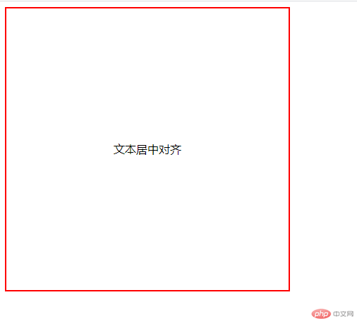
< !DOCTYPE html><html lang="en"><head><meta charset="UTF-8" /><meta name="viewport" content="width=device-width, initial-scale=1.0" /><title>文本居中</title><style>.box {width: 400px;height: 400px;border: 2px solid red;/* 水平居中 */text-align: center;/* 设置与高度相同值来实现垂直居中 */line-height: 400px;}</style></head><body><div class="box">文本居中对齐</div></body></html>
示例如下:
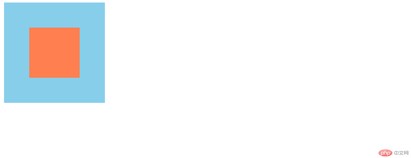
< !DOCTYPE html><html lang="en"><head><meta charset="UTF-8" /><meta name="viewport" content="width=device-width, initial-scale=1.0" /><title>水平居中</title><style>.box {width: 200px;height: 200px;background-color: skyblue;}.box .box1 {width: 100px;height: 100px;background-color: coral;/* 让浏览器自动计算左右外边距实现水平居中 */margin: auto;}</style></head><body><div class="box"><div class="box1"></div></div></body></html>

示例如下:
<! DOCTYPE html><html lang="en"><head><meta charset="UTF-8" /><meta name="viewport" content="width=device-width, initial-scale=1.0" /><title>水平居中</title><style>.box {width: 200px;height: 200px;background-color: skyblue;/* 设置相对定位属性 */position: relative;}.box .box1 {width: 100px;height: 100px;background-color: coral;/* 水平居中 */margin: auto;/* 设置绝对定位属性 */position: absolute;/* 左上上角开始 */top: 0;left: 0;/* 右下角结束 */right: 0;bottom: 0;}</style></head><body><div class="box"><div class="box1"></div></div></body></html>
总结:通过学习和了解盒子模型常用属性以及块级元素的定位对齐水平居中,为后面学习布局打下基础。

Copyright 2014-2025 https://www.php.cn/ All Rights Reserved | php.cn | 湘ICP备2023035733号


