


 收藏
收藏


 天蓬老师
天蓬老师批改状态:合格
老师批语:看上去这些属性的基本参数都知道了, 为什么不去仿写一个具体的页面试试看呢

| 序号 | 简记 | 术语 |
|---|---|---|
| 1 | 二成员 | 容器和项目(container / item) |
| 2 | 二根轴 | 主轴与交叉轴(main-axis / cross-axis) |
| 3 | 二根线 | 起始线与结束线(flex-start / flex-end) |
| 序号 | 属性 | 描述 |
|---|---|---|
| 1 | flex-direction |
设置容器中的主轴方向: 行/水平方向, 列/垂直方向 |
| 2 | flex-wrap |
是否允许创建多行容器,即 flex 项目一行排列不下时, 是否允许换行 |
| 3 | flex-flow |
简化 flex-direction, flex-wrap 属性 |
| 4 | justify-content |
设置 flex 项目在主轴上对齐方式 |
| 5 | align-items |
设置 flex 项目在交叉轴上对齐方式 |
| 6 | align-content |
多行容器中,项目在交叉轴上的对齐方式 |
| 序号 | 属性 | 描述 |
|---|---|---|
| 1 | flex-basis |
项目宽度: 项目分配主轴剩余空间之前, 项目所占据的主轴空间宽度 |
| 2 | flex-grow |
项目的宽度扩展: 将主轴上的剩余空间按比例分配给指定项目 |
| 3 | flex-shrink |
项目的宽度收缩: 将项目上多出空间按比例在项目间进行缩减 |
| 4 | flex |
是上面三个属性的简化缩写: flex: flex-grow flex-shrink flex-basis |
| 5 | align-self |
单独自定义某个项目在交叉轴上的对齐方式 |
| 6 | order |
自定义项目在主轴上的排列顺序,默认为 0,书写顺序,值越小位置越靠前 |
display属性| 序号 | 属性值 | 描述 | 备注 |
|---|---|---|---|
| 1 | flex; |
创建 flex 块级容器 | 内部子元素自动成为 flex 项目 |
| 2 | inline-flex; |
创建 flex 行内容器 | 内部子元素自动成为 flex 项目 |
| 序号 | 容器/项目 | 默认行为 |
|---|---|---|
| 1 | 容器主轴 | 水平方向 |
| 2 | 项目排列 | 沿主轴起始线排列(当前起始线居左) |
| 3 | 项目类型 | 自动转换”行内块级”元素,不管之前是什么类型 |
| 4 | 容器主轴空间不足时 | 项目自动收缩尺寸以适应空间变化,不会换行显示 |
| 5 | 容器主轴存在未分配空间时 | 项目保持自身大小不会放大并充满空间 |
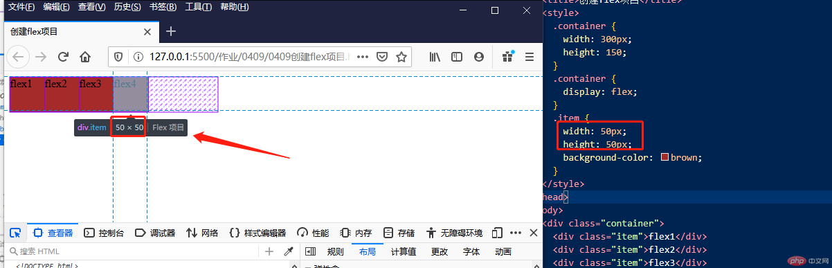
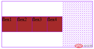
<!DOCTYPE html><html lang="en"><head><meta charset="UTF-8" /><meta name="viewport" content="width=device-width, initial-scale=1.0" /><title>创建flex项目</title><style>.container {width: 300px;height: 150px;}.container {display: flex;}.item {width: 50px;height: 50px;background-color: brown;}</style></head><body><div class="container"><div class="item">flex1</div><div class="item">flex2</div><div class="item">flex3</div><div class="item">flex4</div></div></body></html>
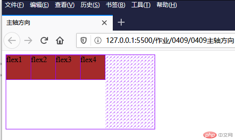
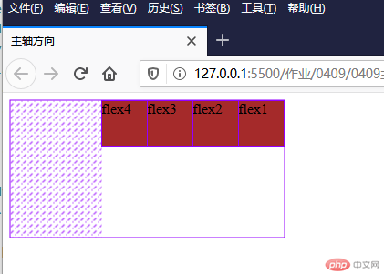
flex-direction属性| 序号 | 属性值 | 描述 |
|---|---|---|
| 1 | row默认值 |
主轴水平: 起始线居中,项目从左到右显示 |
| 2 | row-reverse |
主轴水平:起始线居右, 项目从右向左显示 |
| 3 | column |
主轴垂直: 起始线居上,项目从上向下显示 |
| 4 | column-reverse |
主轴垂直: 起始线居下,项目从下向上显示 |
<!DOCTYPE html><html lang="en"><head><meta charset="UTF-8" /><meta name="viewport" content="width=device-width, initial-scale=1.0" /><title>主轴方向</title><style>.container {width: 300px;height: 150px;}.container {display: flex;}.container {/* flex-direction: row; *//* flex-direction: column; */flex-direction: row-reverse;}.item {width: 50px;height: 50px;background-color: brown;}</style></head><body><div class="container"><div class="item">flex1</div><div class="item">flex2</div><div class="item">flex3</div><div class="item">flex4</div></div></body></html>
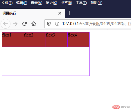
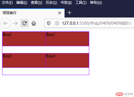
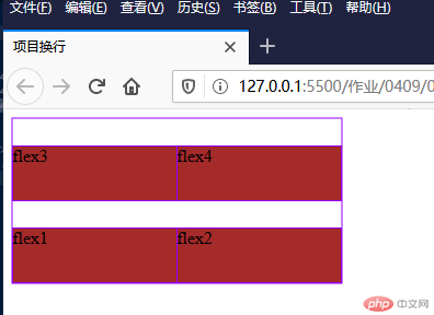
flex-wrap属性| 序号 | 属性值 | 描述 |
|---|---|---|
| 1 | nowrap默认值 |
项目不换行: 单行容器 |
| 2 | wrap |
项目换行: 多行容器,第一行在上方 |
| 3 | wrap-reverse |
项目换行: 多行容器,第一行在下方 |
<!DOCTYPE html><html lang="en"><head><meta charset="UTF-8" /><meta name="viewport" content="width=device-width, initial-scale=1.0" /><title>项目换行</title><style>.container {width: 300px;height: 150px;}.container {display: flex;}.container {/* flex-wrap: nowrap; *//* flex-wrap: wrap; */flex-wrap: wrap-reverse;}.item {width: 150px;height: 50px;background-color: brown;}</style></head><body><div class="container"><div class="item">flex1</div><div class="item">flex2</div><div class="item">flex3</div><div class="item">flex4</div></div></body></html>
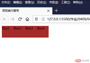
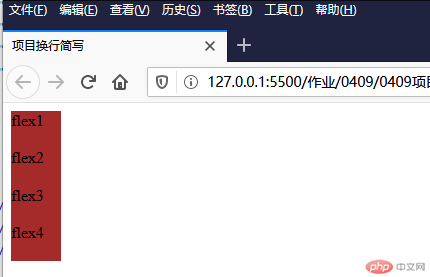
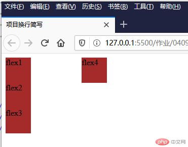
flex-flow属性flex-flow是属性flex-direction和flex-wrap的简写flex-flow: flex-direction flex-wrap| 属性值 | 描述 |
|---|---|
row nowrap默认值 |
主轴水平, 项目不换行 |
<!DOCTYPE html><html lang="en"><head><meta charset="UTF-8" /><meta name="viewport" content="width=device-width, initial-scale=1.0" /><title>项目换行简写</title><style>.container {width: 300px;height: 150px;}.container {display: flex;}.container {/* flex-flow: row nowrap; *//* flex-flow: row wrap; *//* flex-flow: column nowrap; *//* flex-flow: column-reverse nowrap; */flex-flow: column wrap;}.item {width: 50px;height: 50px;background-color: brown;}</style></head><body><div class="container"><div class="item">flex1</div><div class="item">flex2</div><div class="item">flex3</div><div class="item">flex4</div></div></body></html>
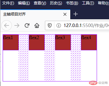
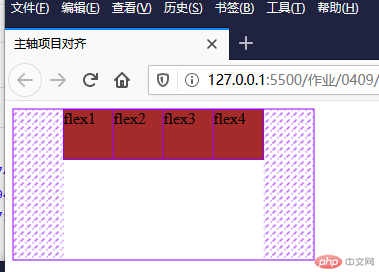
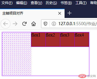
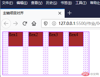
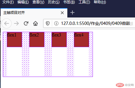
justify-content属性当容器中主轴方向上存在剩余空间时, 该属性才有意义
| 序号 | 属性值 | 描述 |
|---|---|---|
| 1 | flex-start默认 |
所有项目与主轴起始线对齐 |
| 2 | flex-end |
所有项目与主轴终止线对齐 |
| 3 | center |
所有项目与主轴中间线对齐: 居中对齐 |
| 4 | space-between |
两端对齐: 剩余空间在头尾项目之外的项目间平均分配 |
| 5 | space-around |
分散对齐: 剩余空间在每个项目二侧平均分配 |
| 6 | space-evenly |
平均对齐: 剩余空间在每个项目之间平均分配 |
<!DOCTYPE html><html lang="en"><head><meta charset="UTF-8" /><meta name="viewport" content="width=device-width, initial-scale=1.0" /><title>主轴项目对齐</title><style>.container {width: 300px;height: 150px;}.container {display: flex;}.container {/* justify-content: flex-start; *//* justify-content: flex-end; *//* justify-content: center; *//* justify-content: space-between; *//* justify-content: space-evenly; */justify-content: space-around;}.item {width: 50px;height: 50px;background-color: brown;}</style></head><body><div class="container"><div class="item">flex1</div><div class="item">flex2</div><div class="item">flex3</div><div class="item">flex4</div></div></body></html>
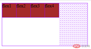
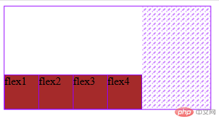
align-items属性| 序号 | 属性值 | 描述 |
|---|---|---|
| 1 | flex-start默认 |
与交叉轴起始线对齐 |
| 2 | flex-end |
与交叉轴终止线对齐 |
| 3 | center |
与交叉轴中间线对齐: 居中对齐 |
<!DOCTYPE html><html lang="en"><head><meta charset="UTF-8" /><meta name="viewport" content="width=device-width, initial-scale=1.0" /><title>交叉轴对齐</title><style>.container {width: 300px;height: 150px;}.container {display: flex;}.container {align-items: flex-start;/* align-items: flex-end; *//* align-items: center; */}.item {width: 50px;height: 50px;background-color: brown;}</style></head><body><div class="container"><div class="item">flex1</div><div class="item">flex2</div><div class="item">flex3</div><div class="item">flex4</div></div></body></html>
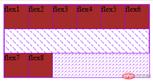
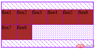
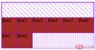
align-content属性| 序号 | 属性值 | 描述 |
|---|---|---|
| 1 | stretch默认 |
项目拉伸占据整个交叉轴 |
| 1 | flex-start |
所有项目与交叉轴起始线(顶部)对齐 |
| 2 | flex-end |
所有项目与交叉轴终止线对齐 |
| 3 | center |
所有项目与交叉轴中间线对齐: 居中对齐 |
| 4 | space-between |
两端对齐: 剩余空间在头尾项目之外的项目间平均分配 |
| 5 | space-around |
分散对齐: 剩余空间在每个项目二侧平均分配 |
| 6 | space-evenly |
平均对齐: 剩余空间在每个项目之间平均分配 |
提示: 多行容器中通过设置
flex-wrap: wrap | wrap-reverse实现
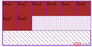
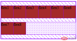
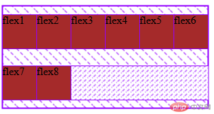
<!DOCTYPE html><html lang="en"><head><meta charset="UTF-8" /><meta name="viewport" content="width=device-width, initial-scale=1.0" /><title>多行容器交叉轴对齐</title><style>.container {width: 300px;height: 150px;}.container {display: flex;}.container {flex-flow: row wrap;/* align-content: stretch; */align-content: flex-start;/* align-content: flex-end; *//* align-content: center; *//* align-content: space-between; *//* align-content: space-around; *//* align-content: space-evenly; */}.item {width: 50px;height: 50px;background-color: brown;}</style></head><body><div class="container"><div class="item">flex1</div><div class="item">flex2</div><div class="item">flex3</div><div class="item">flex4</div><div class="item">flex5</div><div class="item">flex6</div><div class="item">flex7</div><div class="item">flex8</div></div></body></html>
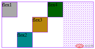
align-self属性align-items, 用以自定义某个项目的对齐方式| 序号 | 属性值 | 描述 |
|---|---|---|
| 1 | auto默认值 |
继承 align-items 属性值 |
| 2 | flex-start |
与交叉轴起始线对齐 |
| 3 | flex-end |
与交叉轴终止线对齐 |
| 4 | center |
与交叉轴中间线对齐: 居中对齐 |
| 5 | stretch |
在交叉轴方向上拉伸 |
| 6 | baseline |
与基线对齐(与内容相关用得极少) |
<!DOCTYPE html><html lang="en"><head><meta charset="UTF-8" /><meta name="viewport" content="width=device-width, initial-scale=1.0" /><title>项目独立对齐</title><style>.container {width: 300px;height: 150px;}.container {display: flex;}.item {width: 50px;height: 50px;background-color: brown;align-self: auto;}.item:first-of-type {align-self: flex-start;background-color: darkgrey;}.item:nth-of-type(2) {align-self: flex-end;background-color: darkcyan;}.item:nth-of-type(3) {align-self: center;background-color: darkgoldenrod;}.item:last-of-type {align-self: baseline;background-color: darkgreen;}</style></head><body><div class="container"><div class="item">flex1</div><div class="item">flex2</div><div class="item">flex3</div><div class="item">flex4</div></div></body></html>
flex-grow属性flex-grow才有意义| 序号 | 属性值 | 描述 |
|---|---|---|
| 1 | 0默认值 |
不放大,保持初始值 |
| 2 | initial |
设置默认值,与0等效 |
| 3 | n |
放大因子: 正数 |
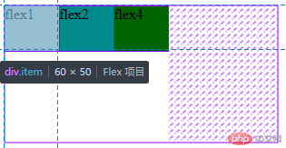
<!DOCTYPE html><html lang="en"><head><meta charset="UTF-8" /><meta name="viewport" content="width=device-width, initial-scale=1.0" /><title>项目放大因子</title><style>.container {width: 300px;height: 150px;}.container {display: flex;}.item {width: 50px;height: 50px;background-color: brown;flex-grow: initial;flex-grow: 2;}.item:first-of-type {background-color: darkgrey;}.item:nth-of-type(2) {/* flex-grow: 3; */background-color: darkcyan;}.item:last-of-type {background-color: darkgreen;}</style></head><body><div class="container"><div class="item">flex1</div><div class="item">flex2</div><div class="item">flex4</div></div></body></html>
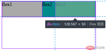
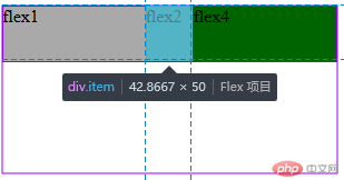
flex-shrink属性flex-shrink才有意义| 序号 | 属性值 | 描述 |
|---|---|---|
| 1 | 1默认值 |
允许项目收缩 |
| 2 | initial |
设置初始默认值,与 1 等效 |
| 3 | 0 |
禁止收缩,保持原始尺寸 |
| 4 | n |
收缩因子: 正数 |
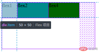
<!DOCTYPE html><html lang="en"><head><meta charset="UTF-8" /><meta name="viewport" content="width=device-width, initial-scale=1.0" /><title>收缩因子</title><style>.container {width: 300px;height: 150px;}.container {display: flex;flex-flow: row nowrap;}.item {width: 150px;height: 50px;background-color: brown;flex-shrink: 0;}.item:first-of-type {flex-shrink: 1;background-color: darkgrey;}.item:nth-of-type(2) {flex-shrink: 5;background-color: darkcyan;}.item:last-of-type {flex-shrink: 1;background-color: darkgreen;}</style></head><body><div class="container"><div class="item">flex1</div><div class="item">flex2</div><div class="item">flex4</div></div></body></html>
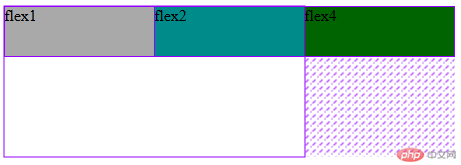
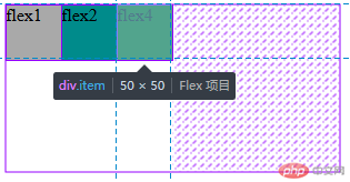
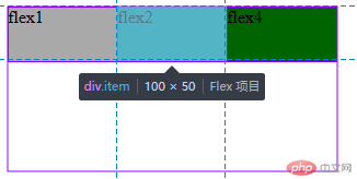
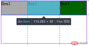
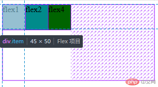
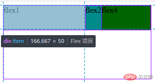
flex-basis属性min-width/min-height值覆盖| 序号 | 属性值 | 描述 |
|---|---|---|
| 1 | auto |
默认值: 项目原来的大小 |
| 2 | px |
像素 |
| 3 | % |
百分比 |
优先级: 项目大小 <
flex-basis<min-width/height
<!DOCTYPE html><html lang="en"><head><meta charset="UTF-8" /><meta name="viewport" content="width=device-width, initial-scale=1.0" /><title>项目计算大小</title><style>.container {width: 300px;height: 150px;}.container {display: flex;flex-flow: row nowrap;}.item {width: 50px;height: 50px;background-color: brown;}.item {/* flex-basis: auto; */flex-basis: 60px;/* flex-basis: 15%; */}.item:first-of-type {background-color: darkgrey;}.item:nth-of-type(2) {background-color: darkcyan;}.item:last-of-type {background-color: darkgreen;}</style></head><body><div class="container"><div class="item">flex1</div><div class="item">flex2</div><div class="item">flex4</div></div></body></html>
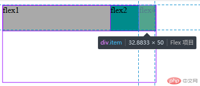
flex属性flex属性,可以将以上三个属性进行简化:flex: flex-grow flex-shrink flex-basis| 序号 | 属性值 | 描述 |
|---|---|---|
| 1 | 第一个值: 整数 | flex-grow |
| 2 | 第二个值: 整数 | flex-shrink |
| 3 | 第三个值: 有效宽度 | flex-basis |
举例:
| 序号 | 案例 | 描述 |
|---|---|---|
| 1 | flex: 0 1 auto |
默认值: 不放大,可收缩, 初始宽度 |
| 2 | flex: 1 1 auto |
项目自动放大或收缩适应容器 |
| 3 | flex: 0 0 100px |
按计算大小填充到容器中 |
| 序号 | 属性值 | 描述 |
|---|---|---|
| 1 | 第一个值: 整数 | flex-grow |
| 3 | 第二个值: 有效宽度 | flex-basis |
举例:
| 案例 | 描述 |
|---|---|
flex: 0 180px |
禁止放大,按计算大小填充到容器中 |
| 序号 | 属性值 | 描述 | ||
|---|---|---|---|---|
| 1 | 整数 | flex-grow |
||
| 2 | 有效宽度 | flex-basis |
||
| 3 | 关键字 | `initial | auto | none` |
举例:
| 序号 | 案例 | 描述 |
|---|---|---|
| 1 | flex: 1 |
flex: 1 1 auto |
| 2 | flex: 180px |
flex: 1 1 180px |
| 3 | initial |
flex: 0 1 auto |
| 4 | auto |
flex: 1 1 auto |
| 5 | none |
flex: 0 0 auto |
推荐使用
flex, 就像推荐使用flex-grow设置主轴与换行一样
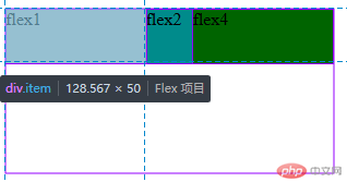
<!DOCTYPE html><html lang="en"><head><meta charset="UTF-8" /><meta name="viewport" content="width=device-width, initial-scale=1.0" /><title>flex属性缩写</title><style>.container {width: 300px;height: 150px;}.container {display: flex;}.item {width: 100px;height: 50px;background-color: brown;}.item:first-of-type {background-color: darkgrey;flex: 2 1 auto;/* flex: 0 1 50px; */}.item:nth-of-type(2) {flex: 1 2;background-color: darkcyan;}.item:last-of-type {flex: 0;background-color: darkgreen;}</style></head><body><div class="container"><div class="item">flex1</div><div class="item">flex2</div><div class="item">flex4</div></div></body></html>

需重点掌握的属性flex-flow 简化 flex-direction, flex-wrap 属性
justify-content设置 flex 项目在主轴上对齐方式
align-items 设置 flex 项目在交叉轴上对齐方式
flex 分别是flex-basis``flex-grow``flex-sharink的简化缩写
align-self 单独自定义某个项目在交叉轴上的对齐方式
order单独自定义某个项目在交叉轴上的对齐方式
这一章节需要多写多背!

Copyright 2014-2025 https://www.php.cn/ All Rights Reserved | php.cn | 湘ICP备2023035733号


