


 收藏
收藏


 天蓬老师
天蓬老师批改状态:合格
老师批语:你这个作业也值得推荐, flex属性不多, 细节比较多, 要注意
display属性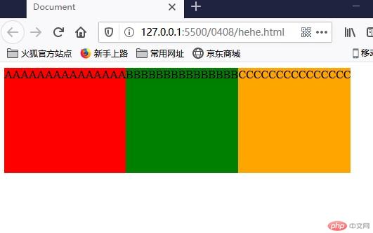
<style type="text/css">.container {width: 400px;height: 500px;display: flex;}#div51 {background-color: red;width: 200px;height: 150px;}#div52 {background-color: green;width: 200px;height: 150px;}#div53 {background-color: orange;width: 300px;height: 150px;}</style></head><body><div class="container"><div id="div51">AAAAAAAAAAAAAAA</div><div id="div52">BBBBBBBBBBBBBBB</div><div id="div53">CCCCCCCCCCCCCCC</div></div></body>
flex-direction属性| 序号 | 属性值 | 描述 |
|---|---|---|
| 1 | row默认值 |
主轴水平: 起始线居中,项目从左到右显示 |
| 2 | row-reverse |
主轴水平:起始线居右, 项目从右向左显示 |
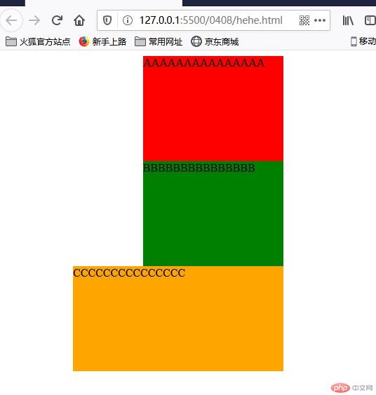
| 3 | column |
主轴垂直: 起始线居上,项目从上向下显示 |
| 4 | column-reverse |
主轴垂直: 起始线居下,项目从下向上显示 |
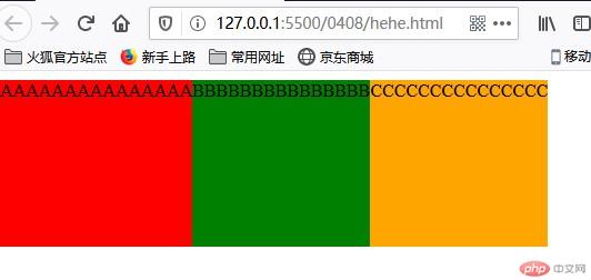
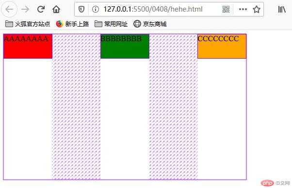
row
<style type="text/css">.container {width: 400px;height: 500px;display: flex;flex-direction: row;}
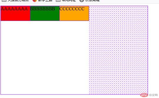
row-reverse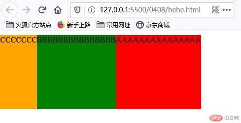
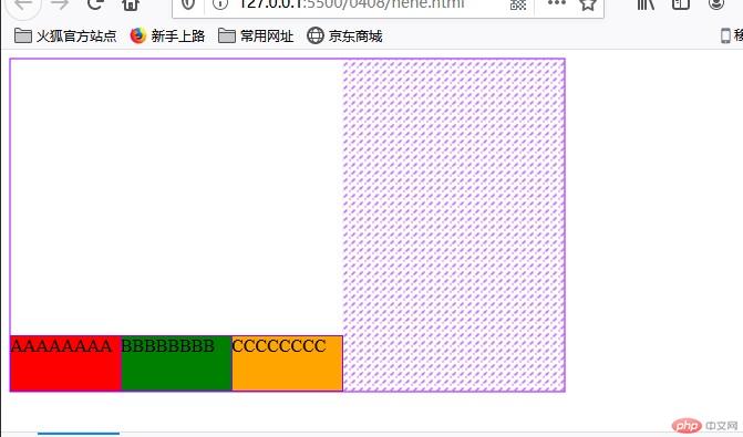
column-reverse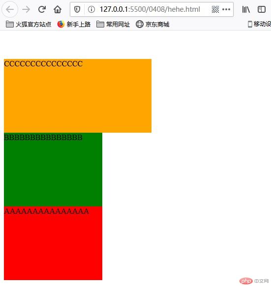
flex-wrap属性nowrap默认值 , 项目不换行: 单行容器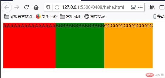
wrap, 项目换行: 多行容器,第一行在上方
wrap-reverse , 项目换行: 多行容器,第一行在下方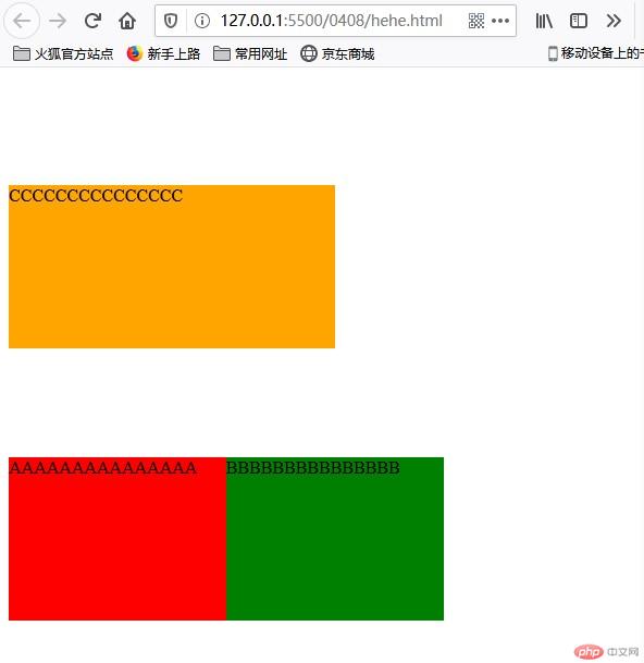
<!DOCTYPE html><html lang="en"><head><meta charset="UTF-8" /><meta name="viewport" content="width=device-width, initial-scale=1.0" /><title>Document</title><style type="text/css">.container {width: 400px;height: 500px;display: flex;flex-direction: row;flex-wrap: wrap-reverse;}#div51 {background-color: red;width: 200px;height: 150px;}#div52 {background-color: green;width: 200px;height: 150px;}#div53 {background-color: orange;width: 300px;height: 150px;}</style></head><body><div class="container"><div id="div51">AAAAAAAAAAAAAAA</div><div id="div52">BBBBBBBBBBBBBBB</div><div id="div53">CCCCCCCCCCCCCCC</div></div></body></html>
flex-flow属性flex-flow是属性flex-direction和flex-wrap的简写flex-flow: flex-direction flex-wrap| 属性值 | 描述 |
|---|---|
row nowrap默认值 |
主轴水平, 项目不换行 |
<style type="text/css">.container {width: 400px;height: 500px;display: flex;flex-flow: column wrap-reverse;}
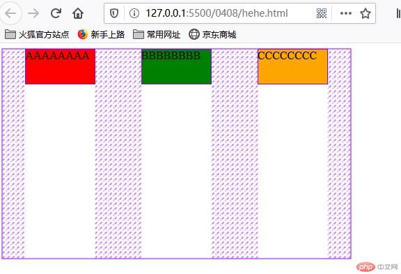
justify-content属性当容器中主轴方向上存在剩余空间时, 该属性才有意义
| 序号 | 属性值 | 描述 |
|---|---|---|
| 1 | flex-start默认 |
所有项目与主轴起始线对齐 |
| 2 | flex-end |
所有项目与主轴终止线对齐 |
| 3 | center |
所有项目与主轴中间线对齐: 居中对齐 |
| 4 | space-between |
两端对齐: 剩余空间在头尾项目之外的项目间平均分配 |
| 5 | space-around |
分散对齐: 剩余空间在每个项目二侧平均分配 |
| 6 | space-evenly |
平均对齐: 剩余空间在每个项目之间平均分配 |
<style type="text/css">.container {width: 500px;height: 300px;display: flex;justify-content: center;}

<style type="text/css">.container {width: 500px;height: 300px;display: flex;justify-content: space-around;}
<style type="text/css">.container {width: 500px;height: 300px;display: flex;/* justify-content: space-around; */justify-content: space-between;}
<style type="text/css">.container {width: 500px;height: 300px;display: flex;/* justify-content: space-around; */justify-content: space-evenly;}

align-items属性| 序号 | 属性值 | 描述 |
|---|---|---|
| 1 | flex-start默认 |
与交叉轴起始线对齐 |
| 2 | flex-end |
与交叉轴终止线对齐 |
| 3 | center |
与交叉轴中间线对齐: 居中对齐 |
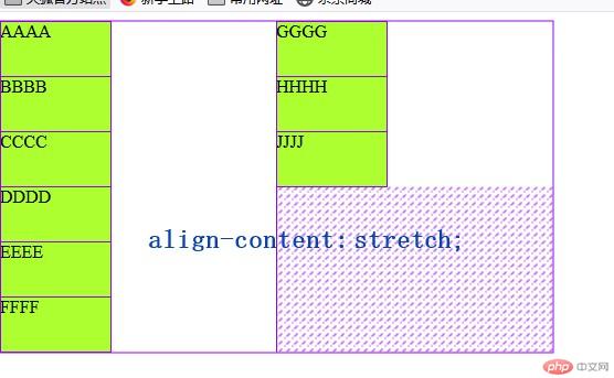
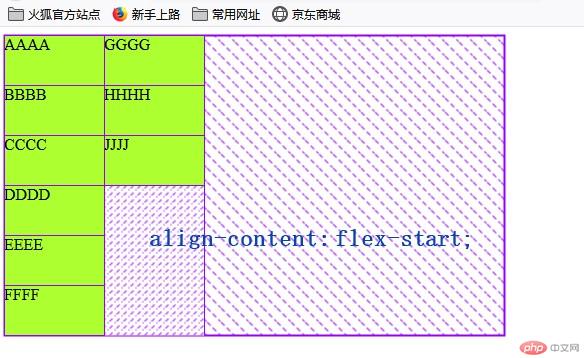
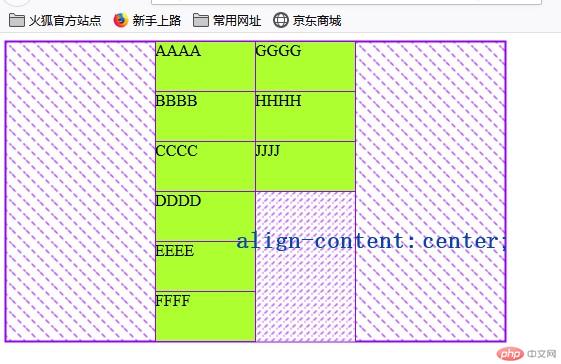
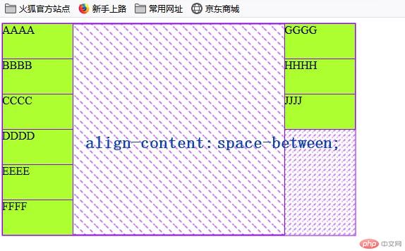
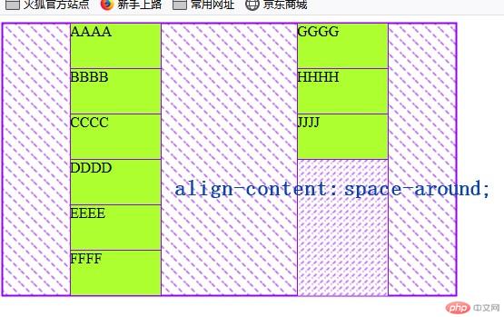
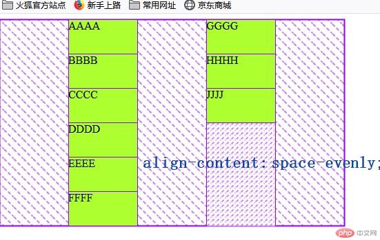
align-content属性提示: 多行容器中通过设置
flex-wrap: wrap | wrap-reverse实现
| 序号 | 属性值 | 描述 |
|---|---|---|
| 1 | stretch默认 |
项目拉伸占据整个交叉轴 |
| 1 | flex-start |
所有项目与交叉轴起始线(顶部)对齐 |
| 2 | flex-end |
所有项目与交叉轴终止线对齐 |
| 3 | center |
所有项目与交叉轴中间线对齐: 居中对齐 |
| 4 | space-between |
两端对齐: 剩余空间在头尾项目之外的项目间平均分配 |
| 5 | space-around |
分散对齐: 剩余空间在每个项目二侧平均分配 |
| 6 | space-evenly |
平均对齐: 剩余空间在每个项目之间平均分配 |
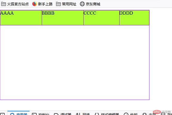
<!DOCTYPE html><html lang="en"><head><meta charset="UTF-8" /><meta name="viewport" content="width=device-width, initial-scale=1.0" /><title>Document</title><style type="text/css">.container {width: 500px;height: 300px;display: flex;flex-flow: column wrap;align-content: center;}.div51 {background-color: greenyellow;width: 100px;height: 50px;}</style></head><body><div class="container"><div class="div51">AAAA</div><div class="div51">BBBB</div><div class="div51">CCCC</div><div class="div51">DDDD</div><div class="div51">EEEE</div><div class="div51">FFFF</div><div class="div51">GGGG</div><div class="div51">HHHH</div><div class="div51">JJJJ</div></div></body></html>

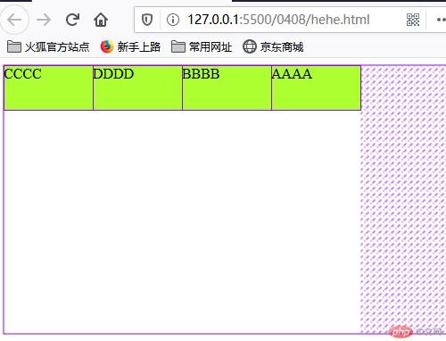
<style type="text/css">.container {width: 500px;height: 300px;display: flex;}.div51 {background-color: greenyellow;width: 100px;height: 50px;}.div51:first-of-type {order: 4;}.div51:nth-of-type(2) {order: 3;}</style>
align-self属性align-items, 用以自定义某个项目的对齐方式| 序号 | 属性值 | 描述 |
|---|---|---|
| 1 | auto默认值 |
继承 align-items 属性值 |
| 2 | flex-start |
与交叉轴起始线对齐 |
| 3 | flex-end |
与交叉轴终止线对齐 |
| 4 | center |
与交叉轴中间线对齐: 居中对齐 |
| 5 | stretch |
在交叉轴方向上拉伸 |
| 6 | baseline |
与基线对齐(与内容相关用得极少) |
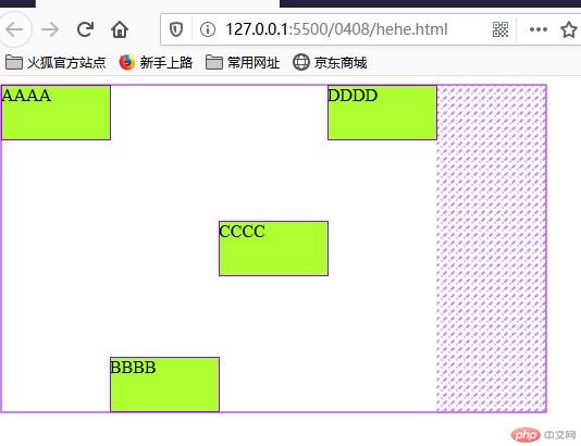
<!DOCTYPE html><html lang="en"><head><meta charset="UTF-8" /><meta name="viewport" content="width=device-width, initial-scale=1.0" /><title>Document</title><style type="text/css">.container {width: 500px;height: 300px;display: flex;}.div51 {background-color: greenyellow;width: 100px;height: 50px;}.div51:first-of-type {align-self: stretch;}.div51:nth-of-type(2) {align-self: flex-end;}.div51:nth-of-type(3) {align-self: center;}</style></head><body><div class="container"><div class="div51">AAAA</div><div class="div51">BBBB</div><div class="div51">CCCC</div><div class="div51">DDDD</div></div></body></html
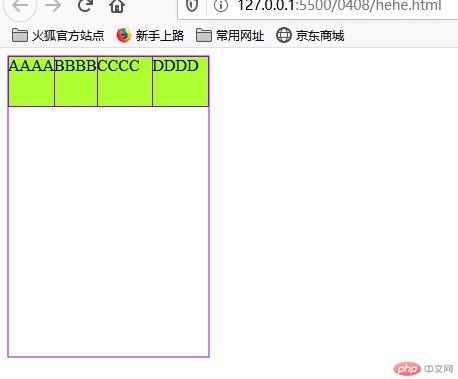
flex-grow属性flex-grow才有意义| 序号 | 属性值 | 描述 |
|---|---|---|
| 1 | 0默认值 |
不放大,保持初始值 |
| 2 | initial |
设置默认值,与0等效 |
| 3 | n |
放大因子: 正数 |
<!DOCTYPE html><html lang="en"><head><meta charset="UTF-8" /><meta name="viewport" content="width=device-width, initial-scale=1.0" /><title>Document</title><style type="text/css">.container {width: 500px;height: 300px;display: flex;}.div51 {background-color: greenyellow;width: 100px;height: 50px;/* 允许放大 */flex-grow: 0;}.div51:first-of-type {flex-grow: 2;/*(500-400)/(2+2+1)*2+100=140*/}.div51:nth-of-type(2) {flex-grow: 2;}.div51:nth-of-type(3) {flex-grow: 1;}</style></head><body><div class="container"><div class="div51">AAAA</div><div class="div51">BBBB</div><div class="div51">CCCC</div><div class="div51">DDDD</div></div></body></html>
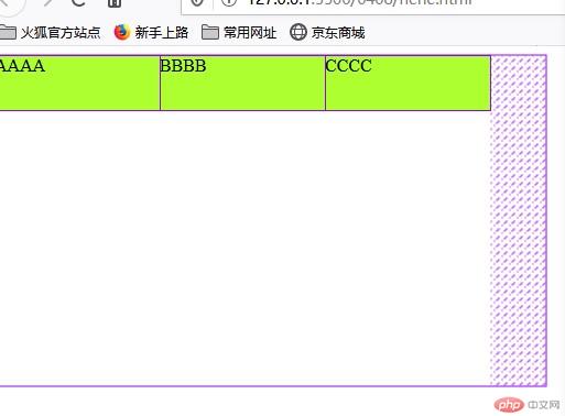
flex-shrink属性flex-shrink才有意义| 序号 | 属性值 | 描述 |
|---|---|---|
| 1 | 1默认值 |
允许项目收缩 |
| 2 | initial |
设置初始默认值,与 1 等效 |
| 3 | 0 |
禁止收缩,保持原始尺寸 |
| 4 | n |
收缩因子: 正数 |
<style type="text/css">.container {width: 200px;height: 300px;display: flex;flex-flow: row nowrap;}.div51 {background-color: greenyellow;width: 100px;height: 50px;}.div51:first-of-type {flex-shrink: 3;}.div51:nth-of-type(2) {flex-shrink: 2;}.div51:nth-of-type(3) {flex-shrink: 1;}</style>
flex-basis属性min-width/min-height值覆盖| 序号 | 属性值 | 描述 |
|---|---|---|
| 1 | auto |
默认值: 项目原来的大小 |
| 2 | px |
像素 |
| 3 | % |
百分比 |
<style type="text/css">.container {width: 500px;height: 300px;display: flex;flex-flow: row wrap;}.div51 {background-color: greenyellow;width: 100px;height: 50px;flex-basis: 200px;/* max-width: 优先级大于flex-basis,故此处150生效; */max-width: 150px;}</style>
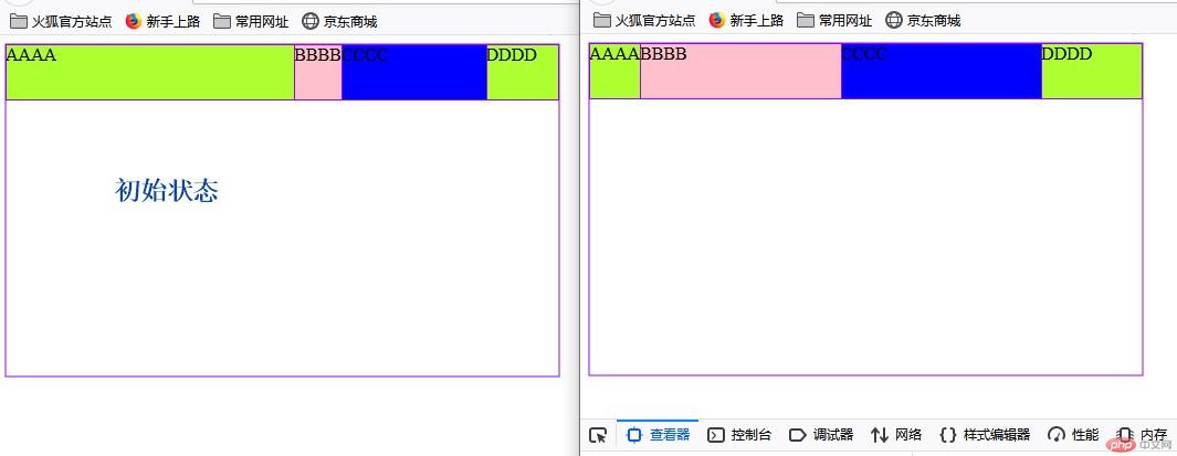
flex属性flex属性,可以将以上三个属性进行简化:语法: flex: flex-grow flex-shrink flex-basis
示例初始状态:
| 序号 | 属性值 | 描述 |
|---|---|---|
| 1 | 第一个值: 整数 | flex-grow |
| 2 | 第二个值: 整数 | flex-shrink |
| 3 | 第三个值: 有效宽度 | flex-basis |
举例:
| 序号 | 案例 | 描述 |
|---|---|---|
| 1 | flex: 0 1 auto |
默认值: 不放大,可收缩, 初始宽度 |
| 2 | flex: 1 1 auto |
项目自动放大或收缩适应容器 |
| 3 | flex: 0 0 100px |
按计算大小填充到容器中 |
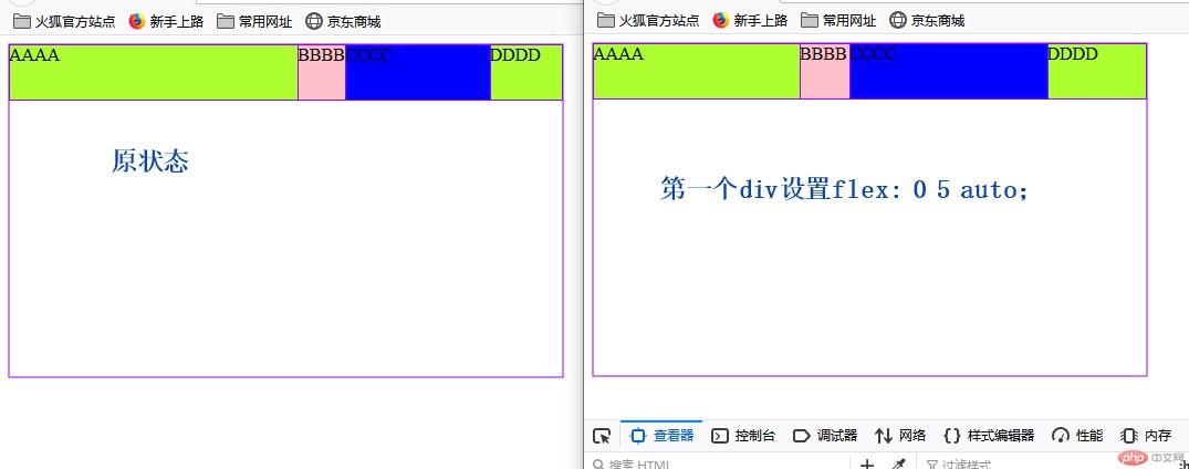
<style type="text/css">.container {width: 500px;height: 300px;display: flex;flex-flow: row nowrap;}.div51 {background-color: greenyellow;width: 100px;height: 50px;}.div51:first-of-type {background-color: greenyellow;width: 400px;height: 50px;flex: 0 5 auto;}.div51:nth-of-type(2) {background-color: pink;width: 50px;height: 50px;}.div51:nth-of-type(3) {background-color: blue;width: 200px;height: 50px;}</style>
| 序号 | 属性值 | 描述 |
|---|---|---|
| 1 | 第一个值: 整数 | flex-grow |
| 3 | 第二个值: 有效宽度 | flex-basis |
举例:
| 案例 | 描述 |
|---|---|
flex: 0 180px |
禁止放大,按计算大小填充到容器中 |
| 序号 | 属性值 | 描述 | ||
|---|---|---|---|---|
| 1 | 整数 | flex-grow |
||
| 2 | 有效宽度 | flex-basis |
||
| 3 | 关键字 | `initial | auto | none` |
举例:
| 序号 | 案例 | 描述 |
|---|---|---|
| 1 | flex: 1 |
flex: 1 1 auto |
| 2 | flex: 180px |
flex: 1 1 180px |
| 3 | initial |
flex: 0 1 auto |
| 4 | auto |
flex: 1 1 auto |
| 5 | none |
flex: 0 0 auto |
<style>.container {width: 500px;height: 300px;display: flex;flex-flow: row nowrap;}.div51 {background-color: greenyellow;width: 100px;height: 50px;}.div51:first-of-type {background-color: greenyellow;width: 400px;height: 50px;flex: 1;}.div51:nth-of-type(2) {background-color: pink;width: 50px;height: 50px;flex: 200px;}.div51:nth-of-type(3) {background-color: blue;width: 200px;height: 50px;}</style>
推荐使用
flex, 就像推荐使用flex-grow设置主轴与换行一样
flex-basis < min-width/height
Copyright 2014-2025 https://www.php.cn/ All Rights Reserved | php.cn | 湘ICP备2023035733号


