
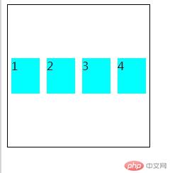
<!DOCTYPE html><html lang="en"><head><meta charset="UTF-8" /><meta name="viewport" content="width=device-width, initial-scale=1.0" /><title>容器与项目</title><style>/* 将父元素设定为容器 */.container {border: 1px solid;width: 250px;height: 200px;display: flex;/* display属性值有flex和inline-flex ,区别在于多个相同容器时,inline-flex设定为行排列*//* display: inline-flex; */}/* 项目 */.item {width: 50px;height: 50px;background-color: aqua;margin: 5px;}</style></head><body><div class="container"><div class="item">1</div><div class="item">2</div><div class="item">3</div><div class="item">4</div></div><div class="container"><div class="item">1</div><div class="item">2</div><div class="item">3</div><div class="item">4</div></div></body></html>
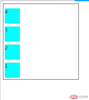
<!DOCTYPE html><html lang="en"><head><meta charset="UTF-8" /><meta name="viewport" content="width=device-width, initial-scale=1.0" /><title>主轴方向</title><style>/* 将父元素设定为容器 */.container {border: 1px solid;width: 250px;height: 250px;display: flex;/*flex-direction设定主轴方向,默认为横向 */flex-direction: row;/* 橫向反方向 */flex-direction: row-reverse;/* 垂直方向 */flex-direction: column;/* 垂直反方向 */flex-direction: column-reverse;}/* 项目 */.item {width: 50px;height: 50px;background-color: aqua;margin: 5px;}</style></head><body><div class="container"><div class="item">1</div><div class="item">2</div><div class="item">3</div><div class="item">4</div></div></body></html>

<!DOCTYPE html><html lang="en"><head><meta charset="UTF-8" /><meta name="viewport" content="width=device-width, initial-scale=1.0" /><title>项目换行</title><style>/* 将父元素设定为容器 */.container {border: 1px solid;width: 250px;height: 250px;display: flex;/*flex-wrap设定项目换行与否,默认为不换行 */flex-wrap: nowrap;/*换行 ,第一行在上方*/flex-wrap: wrap;/*换行 ,第一行在下方*/flex-wrap: wrap-reverse;}.item {width: 50px;height: 50px;background-color: aqua;margin: 5px;}</style></head><body><div class="container"><div class="item">1</div><div class="item">2</div><div class="item">3</div><div class="item">4</div><div class="item">5</div></div></body></html>

<!DOCTYPE html><html lang="en"><head><meta charset="UTF-8" /><meta name="viewport" content="width=device-width, initial-scale=1.0" /><title>flex-flow属性</title><style>.container {border: 1px solid;width: 250px;height: 250px;display: flex;/*flex-flow属性是flex-direction和flex-wrap的简写*//* 默认值为row nowrap */flex-flow: row nowrap;flex-flow: row wrap;flex-flow: row wrap-reverse;flex-flow: column nowrap;flex-flow: column wrap;flex-flow: column wrap-reverse;flex-flow: row-reverse nowrap;flex-flow: row-reverse wrap;flex-flow: row-reverse wrap-reverse;flex-flow: column-reverse nowrap;flex-flow: column-reverse wrap;flex-flow: column-reverse wrap-reverse;}.item {width: 50px;height: 50px;background-color: aqua;margin: 5px;}</style></head><body><div class="container"><div class="item">1</div><div class="item">2</div><div class="item">3</div><div class="item">4</div><div class="item">5</div></div></body></html>

<!DOCTYPE html><html lang="en"><head><meta charset="UTF-8" /><meta name="viewport" content="width=device-width, initial-scale=1.0" /><title>主轴项目对齐</title><style>.container {border: 1px solid;width: 200px;height: 300px;display: flex;flex-flow: column nowrap;}/* 主轴方向有剩余空间*/.container {/* 默认起始线对齐 */justify-content: flex-start;/* 终止线对齐 */justify-content: flex-end;/* 两端对齐 */justify-content: space-between;/* 分散对其 */justify-content: space-around;/* 平均对齐 */justify-content: space-evenly;}.item {width: 50px;height: 50px;background-color: aqua;margin: 5px;}</style></head><body><div class="container"><div class="item">1</div><div class="item">2</div><div class="item">3</div><div class="item">4</div></div></body></html>
<!DOCTYPE html><html lang="en"><head><meta charset="UTF-8" /><meta name="viewport" content="width=device-width, initial-scale=1.0" /><title>交叉轴项目对齐(单行容器)</title><style>.container {border: 1px solid;width: 200px;height: 200px;display: flex;flex-flow: row nowrap;}/* 交叉轴有剩余空间 *//* align-items仅适用于单行容器 */.container {/* 默认从交叉轴起始线 */align-items: flex-start;/* 交叉轴终止线 */align-items: flex-end;/* 剧中 */align-items: center;}.item {width: 50px;height: 50px;background-color: aqua;margin: 5px;}</style></head><body><div class="container"><div class="item">1</div><div class="item">2</div><div class="item">3</div><div class="item">4</div></div></body></html>

<!DOCTYPE html><html lang="en"><head><meta charset="UTF-8" /><meta name="viewport" content="width=device-width, initial-scale=1.0" /><title>交叉轴项目对齐(多行容器)</title><style>.container {border: 1px solid;width: 250px;height: 200px;display: flex;flex-flow: row wrap;}/* 交叉轴有剩余空间 *//* align-content仅适用于多行容器 */.container {/* 默认交叉轴 */align-content: stretch;align-content: flex-start;align-content: flex-end;align-content: center;align-content: space-between;align-content: space-around;/* align-content: space-evenly; */}.item {width: 50px;height: 50px;background-color: aqua;}</style></head><body><div class="container"><div class="item">1</div><div class="item">2</div><div class="item">3</div><div class="item">4</div><div class="item">5</div><div class="item">6</div><div class="item">7</div></div></body></html>

<!DOCTYPE html><html lang="en"><head><meta charset="UTF-8" /><meta name="viewport" content="width=device-width, initial-scale=1.0" /><title>项目交叉轴单独对齐</title><style>.container {border: 1px solid;width: 200px;height: 200px;display: flex;flex-flow: row wrap;}/* 默认值为auto,继承align-items,这里align-items为默认值flex-start */.item:first-child {align-self: auto;}.item:nth-child(3) {align-self:baseline}.item:nth-child(2) {align-self:stretch}.item:nth-last-child(2) {align-self: flex-end;}.item:nth-last-child(1) {align-self: center;}.item {width: 50px;height: 50px;background-color: aqua;}.item:nth-child(2){height: auto;}</style></head><body><div class="container"><div class="item">1</div><div class="item">2</div><div class="item">3</div><div class="item">4</div><div class="item">5</div></div></body></html>

<!DOCTYPE html><html lang="en"><head><meta charset="UTF-8" /><meta name="viewport" content="width=device-width, initial-scale=1.0" /><title>放大因子</title><style>.container {border: 1px solid;width: 300px;height: 200px;display: flex;flex-flow: row wrap;}/* 放大因子flex-grow,默认值为0或initial,禁止放大 */.container{flex-grow: initial;flex-grow: 0;}/* 300px-200px=100px,四个项目总共1+2+2=5份,每份20px *//* 项目1:70px */.item:first-child {background-color: lawngreen;flex-grow: 1;}/* 项目3:90px */.item:nth-child(3) {background-color: lightcoral;flex-grow: 2;}/* 项目2:90px */.item:nth-child(2) {flex-grow: 2;background-color: lightseagreen;}/* 项目4:50px */.item:last-child{flex-grow: 0;background-color: magenta;}.item {width: 50px;height: 50px;}</style></head><body><div class="container"><div class="item">1</div><div class="item">2</div><div class="item">3</div><div class="item">4</div></div></body></html>

<!DOCTYPE html><html lang="en"><head><meta charset="UTF-8" /><meta name="viewport" content="width=device-width, initial-scale=1.0" /><title>收缩因子</title><style>.container {border: 1px solid;width: 200px;height: 200px;display: flex;flex-flow: row nowrap;}/*收缩因子 flex-shrink默认值为1,即允许收缩 ;0为禁止收缩;n为收缩份数*//* 需收100px*5-200px=300px,共1+2+3+2+2=10份,每份30px *//* 项目1:70px */.item:first-child {background-color: lightpink;flex-shrink: 1;}/* 项目2:40px */.item:nth-child(2) {background-color: magenta;flex-shrink: 2;}/* 项目3:10px */.item:nth-child(3) {background-color: lightseagreen;flex-shrink: 3;}/* 项目4:40px */.item:nth-last-child(2) {background-color: yellowgreen;flex-shrink: 2;}/* 项目5:40px */.item:nth-last-child(1) {background-color: tomato;flex-shrink: 2;}.item {width: 100px;height: 50px;}</style></head><body><div class="container"><div class="item">1</div><div class="item">2</div><div class="item">3</div><div class="item">4</div><div class="item">5</div></div></body></html>

<!DOCTYPE html>
<html lang="en">
<head>
<meta charset="UTF-8" />
<meta name="viewport" content="width=device-width, initial-scale=1.0" />
<title>flex-basis有效宽度</title>
<style>
.container {
border: 1px solid;
width: 300px;
height: 250px;
display: flex;
flex-flow: row wrap;
}
.item {
width: 50px;
height: 50px;
background-color: aqua;
}
.item {
/ 默认值为auto,项目原来大小 /
flex-basis: auto;
/flex-basis大于width /
flex-basis: 70px;
flex-basis: 40%;
/max-width/min-width大于flex-basis /
max-width: 100px;
}
</style>
</head>
<body>
<div class="container">
<div class="item">1</div>
<div class="item">2</div>
<div class="item">3</div>
<div class="item">4</div>
<div class="item">5</div>
</div>
</body>
</html>
<!DOCTYPE html>
<html lang="en">
<head>
<meta charset="UTF-8" />
<meta name="viewport" content="width=device-width, initial-scale=1.0" />
<title>flex属性</title>
<style>
.container {
border: 1px solid;
width: 300px;
height: 250px;
display: flex;
flex-flow: row wrap;
}
.item {
width: 50px;
height: 50px;
background-color: aqua;
}
/ 项目flex属性是flex-grow、flex-shrik和flex-basis简写 /
.item:first-child {
/ 1 1 auto /
flex: auto;
}
.item:nth-child(2) {
/ 0 0 auto /
flex: none;
}
.item:nth-child(3) {
/ 0 1 auto /
flex: initial;
}
.item:nth-child(4) {
/ 1 1 100px /
flex: 100px;
}
.item:nth-child(5) {
/ 1 1 auto /
flex: 1;
}
</style>
</head>
<body>
<div class="container">
<div class="item">1</div>
<div class="item">2</div>
<div class="item">3</div>
<div class="item">4</div>
<div class="item">5</div>
</div>
</body>
</html>
```
作业总结:一点点的失误,哪怕多个空格、错个字母,都会让你郁闷抓狂,浪费大把时间就错,所以认真很重要!属性太多,要多加练习,多加记忆!

Copyright 2014-2025 https://www.php.cn/ All Rights Reserved | php.cn | 湘ICP备2023035733号


 收藏
收藏


