


 收藏
收藏


 天蓬老师
天蓬老师批改状态:合格
老师批语:不错, 用上锚点了, 有个建议, 在跳转到目标处之后应该另一个按钮, 再跳转到头部, <a hre="#">回到顶部</a>就可以


flex布局?flex意为弹性布局,布局元素大小在flex容器中自动伸缩,以适应容器的变化,特别适合响应式布局
| 序号 | 名称 | 描述 |
|---|---|---|
| 1. | flex-direction | 主轴方向 |
| 2. | flex-wrap | 主轴上项目换行方式 |
| 3. | flex-flow | 主轴方向和主轴上的项目换行方式的复合属性 |
| 4. | justify-content | 主轴上的项目对齐方式 |
| 5. | align-items | 交叉轴上的项目对齐方式(适用于单行容器) |
| 6. | align-content | 交叉轴上的项目对齐方式(适用于多行容器) |
flex-direction
<!DOCTYPE html><html lang="en"><head><meta charset="UTF-8"><meta name="viewport" content="width=device-width, initial-scale=1.0"><style>.flex-container {/* 将容器设置为flex容器 */display: flex;/* 设置主轴的方向,默认从左到右排列 */flex-direction: row;/* 主轴方向从右到左 *//* flex-direction: row-reverse; *//* 主轴方向从上到下 *//* flex-direction: column; *//* 主轴方向从下到上 *//* flex-direction: column-reverse; */width: 300px;height: 150px;}.item {width: 100px;height: 100px;}</style><title>Document</title></head><body><div class="flex-container"><div class="item">flex1</div><div class="item">flex2</div><div class="item">flex3</div><div class="item">flex4</div></div></body></html>


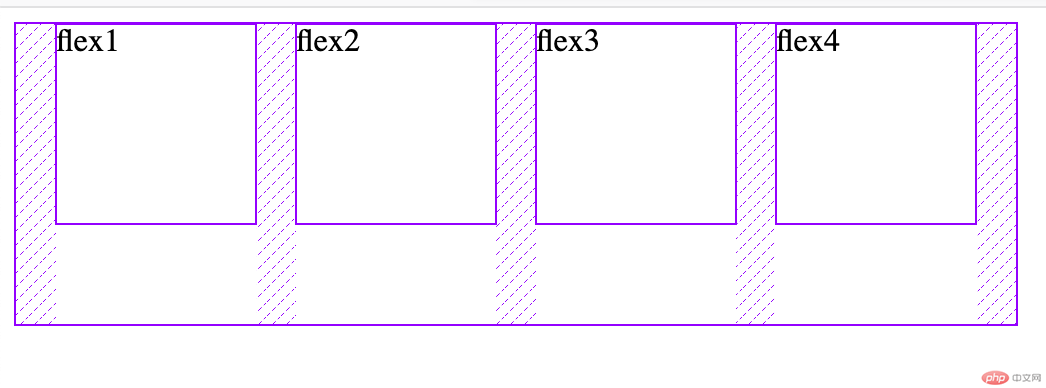
flex-wrap
<!DOCTYPE html><html lang="en"><head><meta charset="UTF-8"><meta name="viewport" content="width=device-width, initial-scale=1.0"><style>.flex-container {display: flex;/* 设置主轴方向项目换行方式,默认不换行 */flex-wrap: nowrap;/* 换行 *//* flex-wrap: wrap; *//* 反向换行 *//* flex-wrap: wrap-reverse; */width: 300px;height: 300px;}.item {width: 100px;height: 100px;}</style><title>Document</title></head><body><div class="flex-container"><div class="item">flex1</div><div class="item">flex2</div><div class="item">flex3</div><div class="item">flex4</div></div></body></html>


flex-flow
<!DOCTYPE html><html lang="en"><head><meta charset="UTF-8"><meta name="viewport" content="width=device-width, initial-scale=1.0"><style>.flex-container {display: flex;/* flex-flow:为flex-direction和flex-wrap的复合属性 */flex-flow: row wrap;width: 300px;height: 300px;}.item {width: 100px;height: 100px;}</style><title>Document</title></head><body><div class="flex-container"><div class="item">flex1</div><div class="item">flex2</div><div class="item">flex3</div><div class="item">flex4</div></div></body></html>

justify-content
<!DOCTYPE html><html lang="en"><head><meta charset="UTF-8"><meta name="viewport" content="width=device-width, initial-scale=1.0"><style>.flex-container {display: flex;width: 500px;height: 150px;/* 主轴上项目对齐方式,默认左对齐 */justify-content: flex-start;/* 右对齐 *//* justify-content: flex-end; *//* 居中对齐 *//* justify-content: center; *//* 两端对齐 *//* justify-content: space-between; *//* 分散对齐,项目间距是两侧两倍 *//* justify-content: space-around; *//* 平均对齐 *//* justify-content: space-evenly; */}.item {width: 100px;height: 100px;}</style><title>Document</title></head><body><div class="flex-container"><div class="item">flex1</div><div class="item">flex2</div><div class="item">flex3</div><div class="item">flex4</div></div></body></html>


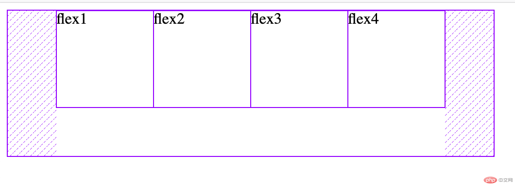


align-items
<!DOCTYPE html><html lang="en"><head><meta charset="UTF-8"><meta name="viewport" content="width=device-width, initial-scale=1.0"><style>.flex-container {display: flex;/* 交叉轴对齐方式,默认为起始线对齐 */align-items: flex-start;/* 终止线对齐 *//* align-items: flex-end; *//* 居中对齐 *//* align-items: center; */width: 400px;height: 150px;}.item {width: 100px;height: 100px;}</style><title>Document</title></head><body><div class="flex-container"><div class="item">flex1</div><div class="item">flex2</div><div class="item">flex3</div><div class="item">flex4</div></div></body></html>


<!DOCTYPE html><html lang="en"><head><meta charset="UTF-8"><meta name="viewport" content="width=device-width, initial-scale=1.0"><style>.flex-container {display: flex;flex-flow: row wrap;/* 多行容器项目交叉轴对齐方式,默认为stretch *//* align-content: stretch; *//* 起始线对齐 */align-content: flex-start;/* 终止线对齐 *//* align-content: flex-end; *//* 居中对齐 *//* align-content: center; *//* 两端对齐 *//* align-content: space-between; *//* 分散对齐 *//* align-content: space-around; *//* 平均对齐 *//* align-content: space-evenly; */width: 300px;height: 300px;}.item {width: 100px;height: 100px;}</style><title>Document</title></head><body><div class="flex-container"><div class="item">flex1</div><div class="item">flex2</div><div class="item">flex3</div><div class="item">flex4</div></div></body></html>
效果图同主轴对齐方式
| 序号 | 名称 | 描述 |
|---|---|---|
| 1. | order | 项目排序 |
| 2. | align-self | 交叉轴独立对齐方式 |
| 3. | ||
| 3. | ||
| 3. | ||
| 3. |
order
<!DOCTYPE html><html lang="en"><head><meta charset="UTF-8"><meta name="viewport" content="width=device-width, initial-scale=1.0"><style>.flex-container {display: flex;width: 400px;/* 项目排序,默认为0,支持负数数值越小排在前面*//* order: 0; */}.item {width: 100px;height: 100px;}.item:first-of-type {order: 4;}.item:nth-of-type(2) {order: 1;}.item:nth-of-type(3) {/* 支持负数排序 */order: -1;}.item:last-of-type {order: 6;}</style><title>Document</title></head><body><div class="flex-container"><div class="item">flex1</div><div class="item">flex2</div><div class="item">flex3</div><div class="item">flex4</div></div></body></html>


Copyright 2014-2025 https://www.php.cn/ All Rights Reserved | php.cn | 湘ICP备2023035733号


