


 收藏
收藏


 天蓬老师
天蓬老师批改状态:合格
老师批语:如果能理解auto的作用, 就算是合格了

几个概念:
框模型: 盒模型
元素框:无论什么元素, CSS 都会生成一个矩形框来显示
从内至外分别:
内容区content:元素框的中心区域
内边距padding
边框border
外边距margin
后三者都是可选的,宽度允许为 0
**记忆技巧:
逆时针方向;第二个值是表示左右。
边框border 可以设置宽度、样式和颜色。
float / position / Flex / Grid 等布局方式,改变默认行为<p>,段落文本就在当前的 HTML 文档中<img><img>通过src属性指向一张图片,渲染时该图片就会插入到该元素的位置<input>, 通过type属性指定要插入的表单元素类型<input type="radio"><html>元素, xml 文档中, 可以是任何元素<p>, 标题<h3>, 通用容器<div>等display: block都可声明为块级框<span>,<strong>,<a>display: inline都可声明为行内框display: inline-bolck;display属性inline,适用所有元素, 不能继承box-sizing进行调整,默认为内容宽度(content-box)box-sizing属性box-sizing: 指示浏览器如何计算一个元素的总宽度和总高度width/height默认只会应用到”内容区”padding/border时,计算盒子总大小非常麻烦| 序号 | 属性值 | 描述 |
|---|---|---|
| 1 | content-box |
默认值,width/height只应用到内容区 |
| 1 | border-box |
width/height还包括padding,border |
width 总宽度是不变的, 宽度计算边界在边框上,所以 width=broder+padding+contentbox-sizing: 适用于所有能设置 width 和 height 的所有元素box-sizing: 通常只适用于块级, 也适合置换元素和行内块元素(因为都可以设置宽高)涉及七个属性
| 序号 | 属性 | 默认值 | 描述 |
|---|---|---|---|
| 1 | margin-left |
auto | 左外边距, 正负均可 |
| 2 | border-left |
0 | 左边框 |
| 3 | padding-left |
0 | 左内边距 |
| 4 | width |
auto | 内容区宽度, 必须正值 |
| 5 | padding-right |
0 | 右内边距 |
| 6 | border-right |
0 | 右边框 |
| 7 | margin-right |
auto | 右外边距, 正负均可 |
auto,其它属性要么 0,要么具体值与横向格式化一样,也涉及七个属性
| 序号 | 属性 | 默认值 | 描述 |
|---|---|---|---|
| 1 | margin-top |
auto | 上外边距, 正负均可 |
| 2 | border-top |
0 | 上边框 |
| 3 | padding-top |
0 | 上内边距 |
| 4 | height |
auto | 内容区高度, 必须正值 |
| 5 | padding-bottom |
0 | 下内边距 |
| 6 | border-bottom |
0 | 下边框 |
| 7 | margin-bottom |
auto | 下外边距, 正负均可 |
auto会被解析为0auto时, 由浏览器根据父元素空间自动计算auto时, 浏览器会将它强制设置为0
<!DOCTYPE html><html lang="en"><head><meta charset="UTF-8"><meta name="viewport" content="width=device-width, initial-scale=1.0"><title>margin-left: auto;用法案例</title><style>*:not(body){outline: 1px dashed;}div{width: 600px;background-color: darkgray;}p{margin-left: auto;margin-right: 100px;width: 200px;background-color: chartreuse;}</style></head><body><div><p>margin-left: auto;用法案例</p></div></body></html>

<!DOCTYPE html><html lang="en"><head><meta charset="UTF-8"><meta name="viewport" content="width=device-width, initial-scale=1.0"><title>margin-right: auto;用法案例</title><style>*:not(body){outline: 1px dashed;}div{width: 600px;background-color: darkgray;}p{margin-left: 100px;margin-right: auto;width: 200px;background-color: chartreuse;}</style></head><body><div><p>margin-right: auto;用法案例</p></div></body></html>

<!DOCTYPE html><html lang="en"><head><meta charset="UTF-8"><meta name="viewport" content="width=device-width, initial-scale=1.0"><title>width: auto;用法案例</title><style>*:not(body){outline: 1px dashed;}div{width: 600px;background-color: darkgray;}p{margin-left: 100px;margin-right: 100px;width: auto;background-color: chartreuse;}</style></head><body><div><p>width: auto;用法案例</p></div></body></html>

<!DOCTYPE html><html lang="en"><head><meta charset="UTF-8"><meta name="viewport" content="width=device-width, initial-scale=1.0"><title>margin: auto;用法案例</title><style>*:not(body){outline: 1px dashed;}div{width: 600px;background-color: darkgray;}p{margin: auto;width: 200px;background-color: chartreuse;}</style></head><body><div><p>margin: auto;用法案例</p></div></body></html>

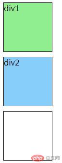
<!DOCTYPE html><html lang="en"><head><meta charset="UTF-8"><meta name="viewport" content="width=device-width, initial-scale=1.0"><title>Document</title><style>div{width: 100px;height: 100px;border: 1px solid #000;}.div1{background-color: lightgreen;width: 100px;height: 100px;margin-bottom: 10px;}.div2{background-color:lightskyblue;width: 100px;height: 100px;margin-top: 10px;margin-bottom: 10px;}</style></head><body><div class="div1">div1</div><div class="div2">div2</div></body></html>
总结:
1.本节课概念多,记不住,还好总算记住最重要的元素框。
2.通过diaplay可声明为各种方式,记住:改变的是显示方式, 并不能改变元素的本质。
3.非置换元素和置换元素是重要概念,只要记住外部引用的图片是置换元素,文本是非置换元素就容易理解了。
4.纵向格式化时,外边距选auto时强制为0,还有折叠现象。
其他的等有时间重看笔记和视频再慢慢理解。

Copyright 2014-2025 https://www.php.cn/ All Rights Reserved | php.cn | 湘ICP备2023035733号


