


 收藏
收藏


 天蓬老师
天蓬老师批改状态:合格
老师批语:每个属性都值得去研究, 但刚接触应该将重点放在一些常用属性上
display属性| 序号 | 属性值 | 描述 | 备注 |
|---|---|---|---|
| 1 | flex; |
创建 flex 块级容器 | 内部子元素自动成为 flex 项目 |
| 2 | inline-flex; |
创建 flex 行内容器 | 内部子元素自动成为 flex 项目 |
| 序号 | 容器/项目 | 默认行为 |
|---|---|---|
| 1 | 容器主轴 | 水平方向 |
| 2 | 项目排列 | 沿主轴起始线排列(当前起始线居左) |
| 3 | 项目类型 | 自动转换”行内块级”元素,不管之前是什么类型 |
| 4 | 容器主轴空间不足时 | 项目自动收缩尺寸以适应空间变化,不会换行显示 |
| 5 | 容器主轴存在未分配空间时 | 项目保持自身大小不会放大并充满空间 |
<!DOCTYPE html><html lang="en"><head><meta charset="UTF-8" /><meta name="viewport" content="width=device-width, initial-scale=1.0" /><title>Document</title></head><style>.flex-content {width: 620px;display: flex;background-color: cornflowerblue;}.flex-item {width: 130px;height: 80px;background-color: cyan;font-size: 1.5rem;}</style><body><div class="flex-content"><div class="flex-item">1</div><div class="flex-item">2</div><div class="flex-item">3</div></div></body></html>
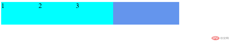
flex-directionrow | row-reverse | column | column-reverseitem在容器中默认是横向从左到右排列的。除此之外,我们还可以将它设置为横向从右到左(row-reverse)、纵向从上到下(column)、纵向从下到上(column-reverse)row(默认值) ,项目从左到右排列flex-direction:rowrow(默认值)代码实例
<!DOCTYPE html><html lang="en"><head><meta charset="UTF-8" /><meta name="viewport" content="width=device-width, initial-scale=1.0" /><title>Document</title></head><style>.flex-content {width: 620px;display: flex;background-color: cornflowerblue;}.flex-item {width: 130px;height: 80px;background-color: cyan;font-size: 1.5rem;}.flex-content {flex-direction: row;}</style><body><div class="flex-content"><div class="flex-item">1</div><div class="flex-item">2</div><div class="flex-item">3</div></div></body></html>
row(默认值)实例截图
row-reverserow-reverse项目反向排列(从右到左)flex-direction:row-reverse
<!DOCTYPE html><html lang="en"><head><meta charset="UTF-8" /><meta name="viewport" content="width=device-width, initial-scale=1.0" /><title>Document</title></head><style>.flex-content {width: 620px;display: flex;background-color: cornflowerblue;}.flex-item {width: 130px;height: 80px;background-color: cyan;font-size: 1.5rem;}/* 默认 *//* .flex-content {flex-direction: row;} *//* 重右到左 */.flex-content {flex-direction: row-reverse;}</style><body><div class="flex-content"><div class="flex-item">1</div><div class="flex-item">2</div><div class="flex-item">3</div></div></body></html>

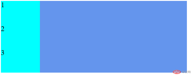
columnflex-direction:column
<!DOCTYPE html><html lang="en"><head><meta charset="UTF-8" /><meta name="viewport" content="width=device-width, initial-scale=1.0" /><title>Document</title></head><style>.flex-content {width: 620px;display: flex;background-color: cornflowerblue;}.flex-item {width: 130px;height: 80px;background-color: cyan;font-size: 1.5rem;}/* 默认 *//* .flex-content {flex-direction: row;} *//* 重右到左 *//* .flex-content {flex-direction: row-reverse;} *//* 重上往下 */.flex-content {flex-direction: column;}</style><body><div class="flex-content"><div class="flex-item">1</div><div class="flex-item">2</div><div class="flex-item">3</div></div></body></html>
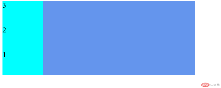
column-reverseflex-direction:column-reverse
<!DOCTYPE html><html lang="en"><head><meta charset="UTF-8" /><meta name="viewport" content="width=device-width, initial-scale=1.0" /><title>Document</title></head><style>.flex-content {width: 620px;display: flex;background-color: cornflowerblue;}.flex-item {width: 130px;height: 80px;background-color: cyan;font-size: 1.5rem;}/* 默认 *//* .flex-content {flex-direction: row;} *//* 重右到左 *//* .flex-content {flex-direction: row-reverse;} *//* 重上往下 *//* .flex-content {flex-direction: column;} *//* 重下往上 */.flex-content {flex-direction: column-reverse;}</style><body><div class="flex-content"><div class="flex-item">1</div><div class="flex-item">2</div><div class="flex-item">3</div></div></body></html>
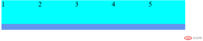
nowrap(默认值),item在容器中不换行,但item所设置的width可能失效flex-wrap:nowrap
<!DOCTYPE html><html lang="en"><head><meta charset="UTF-8" /><meta name="viewport" content="width=device-width, initial-scale=1.0" /><title>Document</title></head><style>.flex-content {width: 620px;height: 100px;display: flex;background-color: cornflowerblue;}.flex-item {width: 130px;height: 80px;background-color: cyan;font-size: 1.5rem;}/* 默认 *//* .flex-content {flex-direction: row;} *//* 重右到左 *//* .flex-content {flex-direction: row-reverse;} *//* 重上往下 *//* .flex-content {flex-direction: column;} *//* 重下往上 *//* .flex-content {flex-direction: column-reverse;} *//* 项目不换行,我们总宽度为620px,现在五个项目是650px */.flex-content {flex-wrap: nowrap;}</style><body><div class="flex-content"><div class="flex-item">1</div><div class="flex-item">2</div><div class="flex-item">3</div><div class="flex-item">4</div><div class="flex-item">5</div></div></body></html>
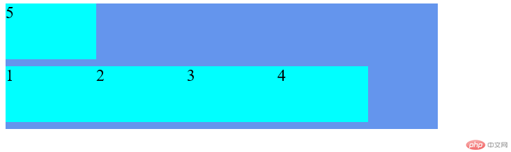
wrap,item宽度不改变,容纳不下新增item时,自动换行flex-wrap:wrap
<!DOCTYPE html><html lang="en"><head><meta charset="UTF-8" /><meta name="viewport" content="width=device-width, initial-scale=1.0" /><title>Document</title></head><style>.flex-content {width: 620px;height: 100px;display: flex;background-color: cornflowerblue;}.flex-item {width: 130px;height: 80px;background-color: cyan;font-size: 1.5rem;}/* 默认 *//* .flex-content {flex-direction: row;} *//* 重右到左 *//* .flex-content {flex-direction: row-reverse;} *//* 重上往下 *//* .flex-content {flex-direction: column;} *//* 重下往上 *//* .flex-content {flex-direction: column-reverse;} *//* 项目不换行,我们总宽度为620px,现在五个项目是650px *//* .flex-content {flex-wrap: nowrap;} *//* 现在项目自动换行了 */.flex-content {flex-wrap: wrap;}</style><body><div class="flex-content"><div class="flex-item">1</div><div class="flex-item">2</div><div class="flex-item">3</div><div class="flex-item">4</div><div class="flex-item">5</div></div></body></html>
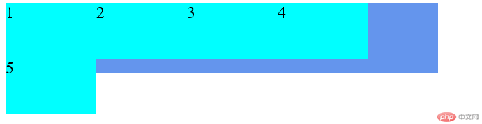
wrap-reverse,反向换行,正常情况下换行是空间不够时向下换行,而wrap-reverse是空间不够时向上换行flex-wrap:wrap-reverse
<!DOCTYPE html><html lang="en"><head><meta charset="UTF-8" /><meta name="viewport" content="width=device-width, initial-scale=1.0" /><title>Document</title></head><style>.flex-content {width: 620px;height: 180px;display: flex;background-color: cornflowerblue;}.flex-item {width: 130px;height: 80px;background-color: cyan;font-size: 1.5rem;}/* 默认 *//* .flex-content {flex-direction: row;} *//* 重右到左 *//* .flex-content {flex-direction: row-reverse;} *//* 重上往下 *//* .flex-content {flex-direction: column;} *//* 重下往上 *//* .flex-content {flex-direction: column-reverse;} *//* 项目不换行,我们总宽度为620px,现在五个项目是650px *//* .flex-content {flex-wrap: nowrap;} *//* 现在项目自动换行了 *//* .flex-content {flex-wrap: wrap;} *//* 项目反向 */.flex-content {flex-wrap: wrap-reverse;}</style><body><div class="flex-content"><div class="flex-item">1</div><div class="flex-item">2</div><div class="flex-item">3</div><div class="flex-item">4</div><div class="flex-item">5</div></div></body></html>
flex-flowflex-flow:<flex-direction> <flex-wrap>
.flex-content{flex-flow:row wrap;}//相当于.flex-content{flex-direction:row;flex-wrap:wrap;}
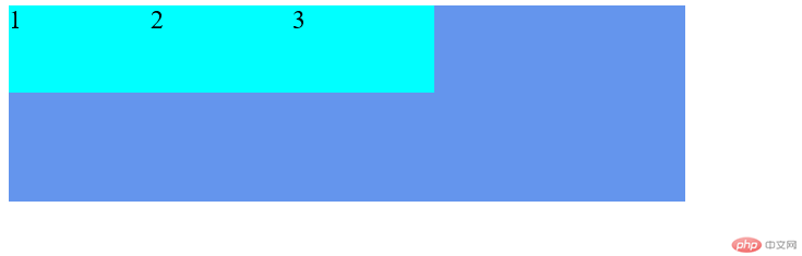
justify-contentflex-start | flex-end | center | space-between | space-aroundflex-start 项目左对齐justify-content: flex-start
<!DOCTYPE html><html lang="en"><head><meta charset="UTF-8" /><meta name="viewport" content="width=device-width, initial-scale=1.0" /><title>Document</title></head><style>.flex-content {width: 620px;height: 180px;display: flex;background-color: cornflowerblue;/* 项目左对齐 */justify-content: flex-start;}.flex-item {width: 130px;height: 80px;background-color: cyan;font-size: 1.5rem;}</style><body><div class="flex-content"><div class="flex-item">1</div><div class="flex-item">2</div><div class="flex-item">3</div></div></body></html>
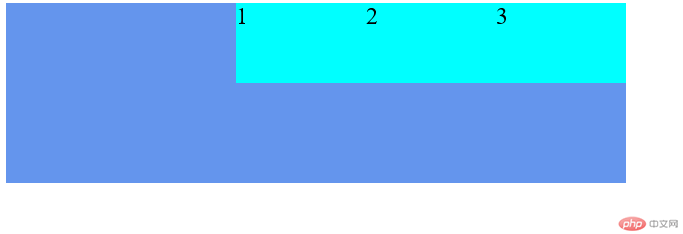
flex-end 项目右对齐justify-content: flex-end
<!DOCTYPE html><html lang="en"><head><meta charset="UTF-8" /><meta name="viewport" content="width=device-width, initial-scale=1.0" /><title>Document</title></head><style>.flex-content {width: 620px;height: 180px;display: flex;background-color: cornflowerblue;/* 项目左对齐 *//* justify-content: flex-start; *//* 项目右对齐 */justify-content: flex-end;}.flex-item {width: 130px;height: 80px;background-color: cyan;font-size: 1.5rem;}</style><body><div class="flex-content"><div class="flex-item">1</div><div class="flex-item">2</div><div class="flex-item">3</div></div></body></html>
center 项目居中justify-content: center
<!DOCTYPE html><html lang="en"><head><meta charset="UTF-8" /><meta name="viewport" content="width=device-width, initial-scale=1.0" /><title>Document</title></head><style>.flex-content {width: 620px;height: 180px;display: flex;background-color: cornflowerblue;/* 项目左对齐 *//* justify-content: flex-start; *//* 项目右对齐 *//* justify-content: flex-end; *//* 项目居中 */justify-content: center;}.flex-item {width: 130px;height: 80px;background-color: cyan;font-size: 1.5rem;}</style><body><div class="flex-content"><div class="flex-item">1</div><div class="flex-item">2</div><div class="flex-item">3</div></div></body></html>

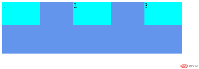
space-between 项目两端对齐justify-content: space-between
<!DOCTYPE html><html lang="en"><head><meta charset="UTF-8" /><meta name="viewport" content="width=device-width, initial-scale=1.0" /><title>Document</title></head><style>.flex-content {width: 620px;height: 180px;display: flex;background-color: cornflowerblue;/* 项目左对齐 *//* justify-content: flex-start; *//* 项目右对齐 *//* justify-content: flex-end; *//* 项目居中 *//* justify-content: center; *//* 项目两端对齐 */justify-content: space-between;}.flex-item {width: 130px;height: 80px;background-color: cyan;font-size: 1.5rem;}</style><body><div class="flex-content"><div class="flex-item">1</div><div class="flex-item">2</div><div class="flex-item">3</div></div></body></html>
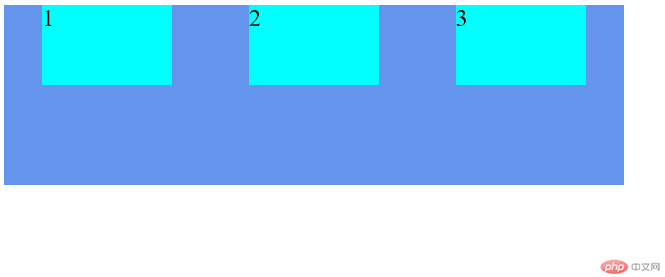
space-around 每个项目间隔相同justify-content: space-around
<!DOCTYPE html><html lang="en"><head><meta charset="UTF-8" /><meta name="viewport" content="width=device-width, initial-scale=1.0" /><title>Document</title></head><style>.flex-content {width: 620px;height: 180px;display: flex;background-color: cornflowerblue;/* 项目左对齐 *//* justify-content: flex-start; *//* 项目右对齐 *//* justify-content: flex-end; *//* 项目居中 *//* justify-content: center; *//* 项目两端对齐 *//* justify-content: space-between; *//* 项目间隔相同 */justify-content: space-around;}.flex-item {width: 130px;height: 80px;background-color: cyan;font-size: 1.5rem;}</style><body><div class="flex-content"><div class="flex-item">1</div><div class="flex-item">2</div><div class="flex-item">3</div></div></body></html>
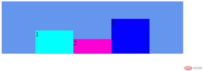
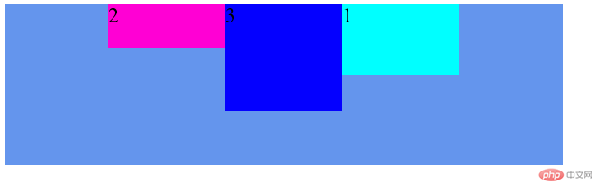
align-itemsjustify-content恰好相反,align-items定义了项目的竖直方向对齐方式。其属性值有flex-start | flex-end | center | baseline | strectchflex-start 项目顶端对齐align-items: flex-start
<!DOCTYPE html><html lang="en"><head><meta charset="UTF-8" /><meta name="viewport" content="width=device-width, initial-scale=1.0" /><title>Document</title></head><style>.flex-content {width: 620px;height: 180px;display: flex;background-color: cornflowerblue;/* 项目左对齐 *//* justify-content: flex-start; *//* 项目右对齐 *//* justify-content: flex-end; *//* 项目居中 */justify-content: center;/* 项目两端对齐 *//* justify-content: space-between; *//* 项目间隔相同 *//* justify-content: space-around; */align-items: flex-start;}.flex-item1 {width: 130px;height: 80px;background-color: cyan;font-size: 1.5rem;}.flex-item2 {width: 130px;height: 50px;background-color: rgb(255, 0, 212);font-size: 1.5rem;}.flex-item3 {width: 130px;height: 120px;background-color: rgb(4, 0, 255);font-size: 1.5rem;}</style><body><div class="flex-content"><div class="flex-item1">1</div><div class="flex-item2">2</div><div class="flex-item3">3</div></div></body></html>

flex-end 项目底端对齐align-items: flex-end
<!DOCTYPE html><html lang="en"><head><meta charset="UTF-8" /><meta name="viewport" content="width=device-width, initial-scale=1.0" /><title>Document</title></head><style>.flex-content {width: 620px;height: 180px;display: flex;background-color: cornflowerblue;/* 项目左对齐 *//* justify-content: flex-start; *//* 项目右对齐 *//* justify-content: flex-end; *//* 项目居中 */justify-content: center;/* 项目两端对齐 *//* justify-content: space-between; *//* 项目间隔相同 *//* justify-content: space-around; *//* 项目顶端对齐 *//* align-items: flex-start; *//* 项目底端对齐 */align-items: flex-end;}.flex-item1 {width: 130px;height: 80px;background-color: cyan;font-size: 1.5rem;}.flex-item2 {width: 130px;height: 50px;background-color: rgb(255, 0, 212);font-size: 1.5rem;}.flex-item3 {width: 130px;height: 120px;background-color: rgb(4, 0, 255);font-size: 1.5rem;}</style><body><div class="flex-content"><div class="flex-item1">1</div><div class="flex-item2">2</div><div class="flex-item3">3</div></div></body></html>
center 项目中间对齐align-items: center
<!DOCTYPE html><html lang="en"><head><meta charset="UTF-8" /><meta name="viewport" content="width=device-width, initial-scale=1.0" /><title>Document</title></head><style>.flex-content {width: 620px;height: 180px;display: flex;background-color: cornflowerblue;/* 项目左对齐 *//* justify-content: flex-start; *//* 项目右对齐 *//* justify-content: flex-end; *//* 项目居中 */justify-content: center;/* 项目两端对齐 *//* justify-content: space-between; *//* 项目间隔相同 *//* justify-content: space-around; *//* 项目顶端对齐 *//* align-items: flex-start; *//* 项目底端对齐 *//* align-items: flex-end; *//* 项目中间对齐 */align-items: center;}.flex-item1 {width: 130px;height: 80px;background-color: cyan;font-size: 1.5rem;}.flex-item2 {width: 130px;height: 50px;background-color: rgb(255, 0, 212);font-size: 1.5rem;}.flex-item3 {width: 130px;height: 120px;background-color: rgb(4, 0, 255);font-size: 1.5rem;}</style><body><div class="flex-content"><div class="flex-item1">1</div><div class="flex-item2">2</div><div class="flex-item3">3</div></div></body></html>

order 定义了项目的排列顺列,order的值越小,项目的排列位置越靠前。默认值为0
<!DOCTYPE html><html lang="en"><head><meta charset="UTF-8" /><meta name="viewport" content="width=device-width, initial-scale=1.0" /><title>Document</title></head><style>.flex-content {width: 620px;height: 180px;display: flex;background-color: cornflowerblue;justify-content: center;}.flex-item1 {width: 130px;height: 80px;background-color: cyan;font-size: 1.5rem;}.flex-item2 {width: 130px;height: 50px;background-color: rgb(255, 0, 212);font-size: 1.5rem;}.flex-item3 {width: 130px;height: 120px;background-color: rgb(4, 0, 255);font-size: 1.5rem;}.flex-item1 {order: 3;}.flex-item2 {order: 1;}.flex-item3 {order: 2;}</style><body><div class="flex-content"><div class="flex-item1">1</div><div class="flex-item2">2</div><div class="flex-item3">3</div></div></body></html>
flex-grow 定义了项目的放大比例,默认值为0,表示不放大在这里依次给.flex-item的flex-grow的值设置为0、2、3。其中0表示.flex-item的默认宽度,并没有放大。2、3表示将剩余的空间分为2+3=5份,其中item2占2/5份,.flex-item3占3/5份。
<!DOCTYPE html><html lang="en"><head><meta charset="UTF-8" /><meta name="viewport" content="width=device-width, initial-scale=1.0" /><title>Document</title></head><style>.flex-content {width: 620px;height: 180px;display: flex;background-color: cornflowerblue;justify-content: center;}.flex-item1 {width: 130px;height: 80px;background-color: cyan;font-size: 1.5rem;}.flex-item2 {width: 130px;height: 50px;background-color: rgb(255, 0, 212);font-size: 1.5rem;}.flex-item3 {width: 130px;height: 120px;background-color: rgb(4, 0, 255);font-size: 1.5rem;}/* .flex-item1 {order: 3;}.flex-item2 {order: 1;}.flex-item3 {order: 2;} */.flex-item1 {flex-grow: 0;}.flex-item2 {flex-grow: 2;}.flex-item3 {flex-grow: 3;}</style><body><div class="flex-content"><div class="flex-item1">1</div><div class="flex-item2">2</div><div class="flex-item3">3</div></div></body></html>

flex-shrink 定义了项目的缩小比例。默认值为1,表示当空间不足时将项目缩小至能被空间容纳flex-shrink的值必须大于或等于0。当值为负数时,此值无效,相当于默认值。当值为0时,表示项目不缩放。值为1时,项目缩放。在这里,flex-item1、2、3的宽都被设置为130px,然而总的宽为320px,显然是不够宽的,但是因为flex-item1的flex-shrink值为0,所以不会被缩放,flex-item2、flex-item3的flex-shrink值为1,flex容器容纳不下时缩小了,所以它又能装下了。
<!DOCTYPE html><!DOCTYPE html><html lang="en"><head><meta charset="UTF-8" /><meta name="viewport" content="width=device-width, initial-scale=1.0" /><title>Document</title></head><style>.flex-content {width: 320px;height: 180px;display: flex;background-color: cornflowerblue;justify-content: center;}.flex-item1 {width: 130px;height: 80px;background-color: cyan;font-size: 1.5rem;}.flex-item2 {width: 130px;height: 50px;background-color: rgb(255, 0, 212);font-size: 1.5rem;}.flex-item3 {width: 130px;height: 120px;background-color: rgb(4, 0, 255);font-size: 1.5rem;}/* .flex-item1 {order: 3;}.flex-item2 {order: 1;}.flex-item3 {order: 2;} *//* .flex-item1 {flex-grow: 0;}.flex-item2 {flex-grow: 2;}.flex-item3 {flex-grow: 3;} */.flex-item1 {flex-shrink: 0;}.flex-item2 {flex-shrink: 1;}.flex-item3 {flex-shrink: 1;}</style><body><div class="flex-content"><div class="flex-item1">1</div><div class="flex-item2">2</div><div class="flex-item3">3</div></div></body></html>
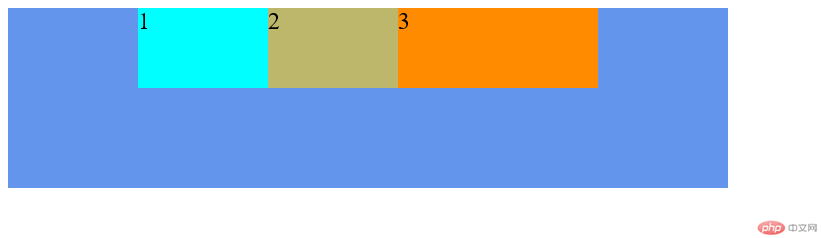
flex-basis 定义了flex items 在被放进一个flex容器之前的大小(flex-basis含义)。默认值为auto通过flex-basis的含义可以很直观的感觉到flex-basis的作用跟width似乎一样。但是两者是有区别的,尽管两者都可以设置flex-item3的宽,但在flex容器中flex-basis的优先级高于width,即两者同时存在时,width会被屏蔽,无论代码中两者的先后顺序如何。
<!DOCTYPE html><html lang="en"><head><meta charset="UTF-8" /><meta name="viewport" content="width=device-width, initial-scale=1.0" /><title>Document</title></head><style>.flex-content {width: 720px;height: 180px;display: flex;background-color: cornflowerblue;justify-content: center;}.flex-item1 {width: 130px;height: 80px;background-color: cyan;font-size: 1.5rem;}.flex-item2 {width: 130px;height: 80px;background-color: darkkhaki;font-size: 1.5rem;}.flex-item3 {height: 80px;background-color: darkorange;font-size: 1.5rem;}.flex-item3 {flex-basis: 200px;width: 130px;}</style><body><div class="flex-content"><div class="flex-item1">1</div><div class="flex-item2">2</div><div class="flex-item3">3</div></div></body></html>
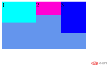
flex 是flex-grow, flex-shrink 和 flex-basis的简写,默认值为0 1 auto。flex-shrink和flex-basis是可选属性。align-self 定义了单个项目的竖直方向对齐方式,默认值为auto,表示继承父元素的align-items属性,如果没有父元素,则等同于stretchflex-item1、flex-item3未设置align-self,其默认值为auto,所以继承了父元素的flex-start保持顶端对齐。而flex-item2设置了align-self为flex-end,固flex-item2是底端对齐的。
<!DOCTYPE html><html lang="en"><head><meta charset="UTF-8" /><meta name="viewport" content="width=device-width, initial-scale=1.0" /><title>Document</title></head><style>.flex-content {width: 720px;height: 180px;display: flex;background-color: cornflowerblue;justify-content: center;}.flex-item1 {width: 130px;height: 80px;background-color: cyan;font-size: 1.5rem;}.flex-item2 {width: 130px;height: 80px;background-color: darkkhaki;font-size: 1.5rem;}.flex-item3 {width: 130px;height: 80px;background-color: darkorange;font-size: 1.5rem;}.flex-content {align-items: flex-start;}.flex-item2 {align-self: flex-end;}</style><body><div class="flex-content"><div class="flex-item1">1</div><div class="flex-item2">2</div><div class="flex-item3">3</div></div></body></html>

学习总结:
一、容器属性:
1.flex-direction(方向)
2.flex-wrap(换行)
3.flex-flow(方向、换行的简写)
4.justify-content(水平方向对齐)
5.align-items(竖直方向对齐)
6.align-content(多行对齐)
二、项目属性:
1.order(顺序)
2.flex-grow(放大)
3.flex-shrink(缩小)
4.flex-basis(宽)
5.flex(放大、缩小、宽的简写)
6.align-self (单个竖直方向对齐)

Copyright 2014-2025 https://www.php.cn/ All Rights Reserved | php.cn | 湘ICP备2023035733号


