


 收藏
收藏


 天蓬老师
天蓬老师批改状态:合格
老师批语:仔细想一下, flex其实挺简单的, 不是吗?

flex-direction:row-reverse设置为从右到左排列
<style>header {background-color: skyblue;}.nav-container {display: flex;flex-direction:row;flex-direction:row-reverse;}</style><header><nav><ul class="nav-container"><li class=""><img src="" alt="LOGO" /></li><li class=""><a href="">导航1</a></li><li class=""><a href="">导航2</a></li><li class=""><a href="">导航3</a></li><li class=""><a href="">导航4</a></li></ul></nav></header>
效果图:
1).默认方向,从左至右
2).反方向
<style>header {background-color: skyblue;}.nav-container {display: flex;flex-direction:column;flex-direction:row-reverse;}</style><header><nav><ul class="nav-container"><li class=""><img src="" alt="LOGO" /></li><li class=""><a href="">导航1</a></li><li class=""><a href="">导航2</a></li><li class=""><a href="">导航3</a></li><li class=""><a href="">导航4</a></li></ul></nav></header>
效果图:
1).默认方向,从上到下
2).反方向
flex-wrap属性,设置项目在容器内是否可以换行,默认不允许换行。flex-flow属性同时设置容器主轴方向和是否换行(推荐使用)
<style>.content {border-style: groove;width: 150px;height: 80px;margin-top: 10px;}main > section {width: 600px;display: flex;border-style: dotted;flex-flow: row nowrap;/*水平方向,不允许换行*/flex-flow: row wrap;/*水平方向,允许换行*/}</style><main><section><div class="content"><p>我是段落01</p></div><div class="content"><p>我是段落02</p></div><div class="content"><p>我是段落03</p></div><div class="content"><p>我是段落04</p></div><div class="content"><p>我是段落05</p></div><div class="content"><p>我是段落06</p></div><div class="content"><p>我是段落07</p></div></section></main>
效果图:
1).默认不允许换行,项目被压缩
2).允许换行,当剩余宽度不足容纳一个项目块时,就换行
justify-content属性,设置主轴线上的项目对齐方式。只有当容器主轴线上有剩余空间时才生效
<style>.content {border-style: groove;width: 150px;height: 80px;margin-top: 10px;}main > section {width: 600px;display: flex;border-style: dotted;flex-flow: row wrap;/*水平方向,允许换行*/justify-content: center;justify-content: flex-end;justify-content: space-evenly;}</style><main><section><div class="content"><p>我是段落01</p></div><div class="content"><p>我是段落02</p></div><div class="content"><p>我是段落03</p></div><div class="content"><p>我是段落04</p></div><div class="content"><p>我是段落05</p></div><div class="content"><p>我是段落06</p></div><div class="content"><p>我是段落07</p></div></section></main>
示例:
1).居中对齐
2).靠终止边对齐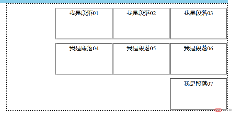
3).平分对齐
align-items属性,适用于单行容器align-content属性,适用于多行容器
<style>.content {border-style: groove;width: 150px;height: 80px;margin-top: 10px;}main > section {width: 600px;height: 180px;display: flex;border-style: dotted;flex-flow: row nowrap;align-items: center; /*交叉轴 居中对齐 */align-items: flex-end; /* 交叉轴终止边对齐 */}</style><main><section><div class="content"><p>我是段落01</p></div><div class="content"><p>我是段落02</p></div><div class="content"><p>我是段落03</p></div></main>
1).交叉轴居中对齐
2).交叉轴靠终止边对齐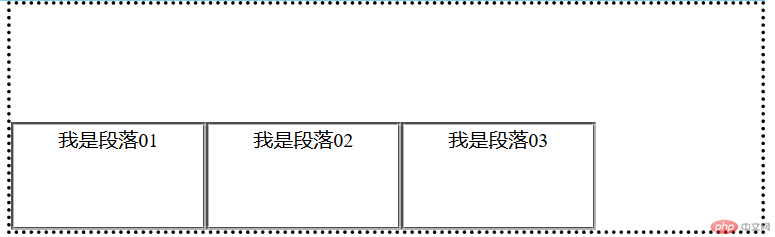
<style>.content {border-style: groove;width: 120px;height: 80px;margin-top: 10px;}main > section {width: 600px;height: 280px;display: flex;border-style: dotted;flex-flow: row wrap;align-content: center; /*交叉轴 居中对齐 */align-content: flex-end; /*交叉轴终止边对齐 */}</style><main><section><div class="content"><p>我是段落01</p></div><div class="content"><p>我是段落02</p></div><div class="content"><p>我是段落03</p></div><div class="content"><p>我是段落04</p></div><div class="content"><p>我是段落05</p></div><div class="content"><p>我是段落06</p></div><div class="content"><p>我是段落07</p></div></section></main>
1).交叉轴居中对齐
2).交叉轴靠终止边对齐
align-self属性,可以单独设置项目在交叉轴上的对齐align-content,项目align-self属性失效
<style>.content {border-style: groove;width: 120px;height: 80px;margin-top: 10px;}.content:last-of-type {align-self: flex-end;}main > section {width: 600px;height: 280px;display: flex;border-style: dotted;flex-flow: row wrap;/* align-content: center; */align-items: center; /*交叉轴 居中对齐 */}</style><main><section><div class="content"><p>我是段落01</p></div><div class="content"><p>我是段落02</p></div><div class="content"><p>我是段落03</p></div><div class="content"><p>我是段落04</p></div><div class="content"><p>我是段落05</p></div><div class="content"><p>我是段落06</p></div><div class="content"><p>我是段落07</p></div></section></main>

flex-grow属性,设置项目的放大系数,默认0,不放大。flex-grow才有意义flex-shrink属性,设置项目的缩小系数,默认1,允许缩小。flex-shrink才有意义flex-basis属性,设置flex 元素在主轴方向上的初始大小flex: flex-grow flex-shrink flex-basis
<!DOCTYPE html><html lang="en"><head><meta charset="UTF-8" /><meta name="viewport" content="width=device-width, initial-scale=1.0" /><title>flex弹性布局示例</title><style>body {width: 800px;height: 2000px;display: flex;flex-flow: column wrap;align-items: center;margin: auto;}/* * {outline-style: groove;} */header {background-color: skyblue;}nav {width: 800px;margin: auto;}.nav-container {display: flex;justify-content: space-around;}li {list-style-type: none;}ol > li {list-style-type: decimal;}.container {width: 800px;display: flex;justify-content: space-between;}aside {/* */flex: 1 1 200px;margin-right: 5%;}main {flex: 3 1 auto;}.content {border-style: groove;width: 120px;height: 80px;margin-top: 10px;flex: 1 0 100px;}/*.content:last-of-type {flex: 1 1 80px;}.content:nth-of-type(6) {flex: 2 1 80px;}*/main > section {width: 600px;height: 280px;display: flex;flex-flow: row wrap;/* align-content: center; */align-items: center; /*交叉轴 居中对齐 */}p {margin: auto;text-align: center;}footer {width: inherit;height: 80px;background-color: #ffff80;}</style></head><body><header><nav><ul class="nav-container"><li class=""><img src="" alt="LOGO" /></li><li class=""><a href="">导航1</a></li><li class=""><a href="">导航2</a></li><li class=""><a href="">导航3</a></li><li class=""><a href="">导航4</a></li></ul></nav></header><div class="container"><aside><!-- <h3>排行榜</h3> --><ol><li><a href="">排名1</a></li><li><a href="">排名2</a></li><li><a href="">排名3</a></li><li><a href="">排名4</a></li><li><a href="">排名5</a></li><li><a href="">排名6</a></li><li><a href="">排名7</a></li><li><a href="">排名8</a></li><li><a href="">排名9</a></li><li><a href="">排名10</a></li></ol></aside><main><section><div class="content"><p>我是段落01</p></div><div class="content"><p>我是段落02</p></div><div class="content"><p>我是段落03</p></div><div class="content"><p>我是段落04</p></div><div class="content"><p>我是段落05</p></div><div class="content"><p>我是段落06</p></div><div class="content"><p>我是段落07</p></div></section></main></div><footer><section><p>底部导航</p></section></footer></body></html>


Copyright 2014-2025 https://www.php.cn/ All Rights Reserved | php.cn | 湘ICP备2023035733号


