最新下载


24小时阅读排行榜
- 1 摩根大通推出IndexGPT:智能化投资建议引领新潮流
- 2 Linux系统的VPS性能怎么测试
- 3 php redis如何实现定时任务
- 4 mysql标识列的特点有哪些
- 5 现场对标ChatGPT!又一AI大模型发布,还要渗透这么多行业
- 6 VR在智慧旅游行业的应用
- 7 中国首个Pocket Gallery虚拟展厅亮相中央美术学院美术馆
- 8 重大安全风险!美光公司产品对中国关键信息基础设施构成威胁
- 9 新一代天猫精灵评测:里面住了个温暖还话痨的AI朋友
- 10 苹果江郎才尽?前营销高管不看好苹果AR/VR头显。
- 11 MySQL的循环语句有哪些
- 12 AIGC能为元宇宙里的「人」做些什么?|1号AIGC季②
- 13 AI将夺走人类的“饭碗”?听听科技大咖们怎么说!
- 14 升级到 Windows 11 后如何避免垃圾邮件
- 15 苹果限制员工使用ChatGPT等外部AI,担心泄露机密数据
最新教程

-
- 550W粉丝大佬手把手从零学JavaScript
- 287 2024-04-18
-
- python大神Mosh,零基础小白6小时完全入门
- 333 2024-04-10
-
- MySQL 初学入门(mosh老师)
- 325 2024-04-07
-
- Mock.js | Axios.js | Json | Ajax--十天精品课堂
- 1370 2024-03-29
-
- 微信小程序开发之API篇
- 2935 2024-02-20
-
- Webpack4.x---十天技能课堂
- 3364 2024-02-02
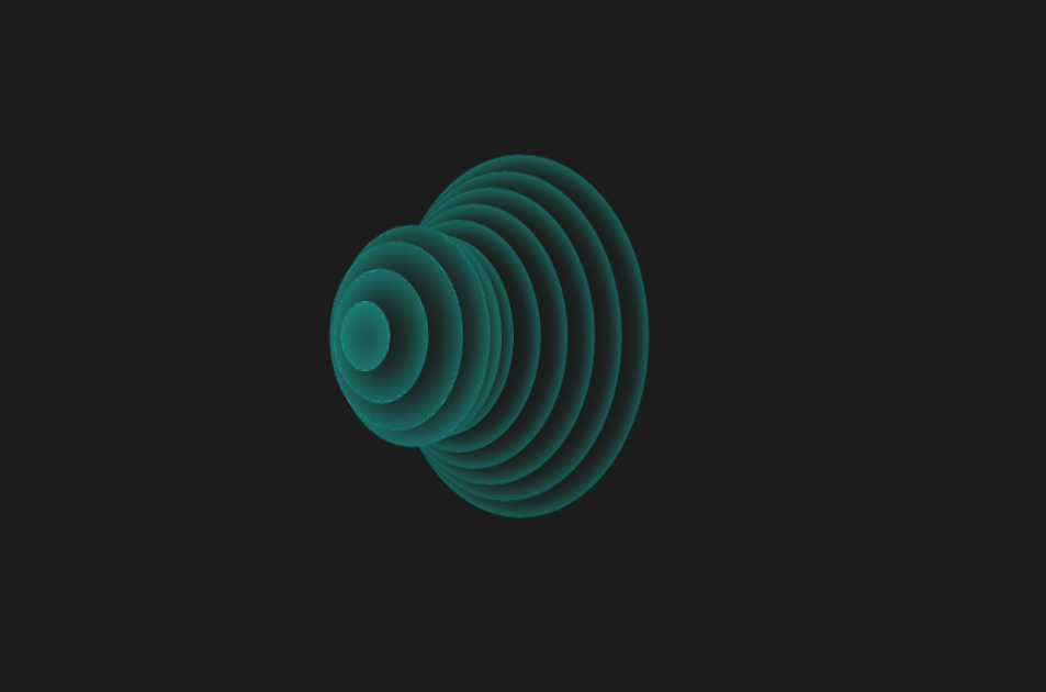
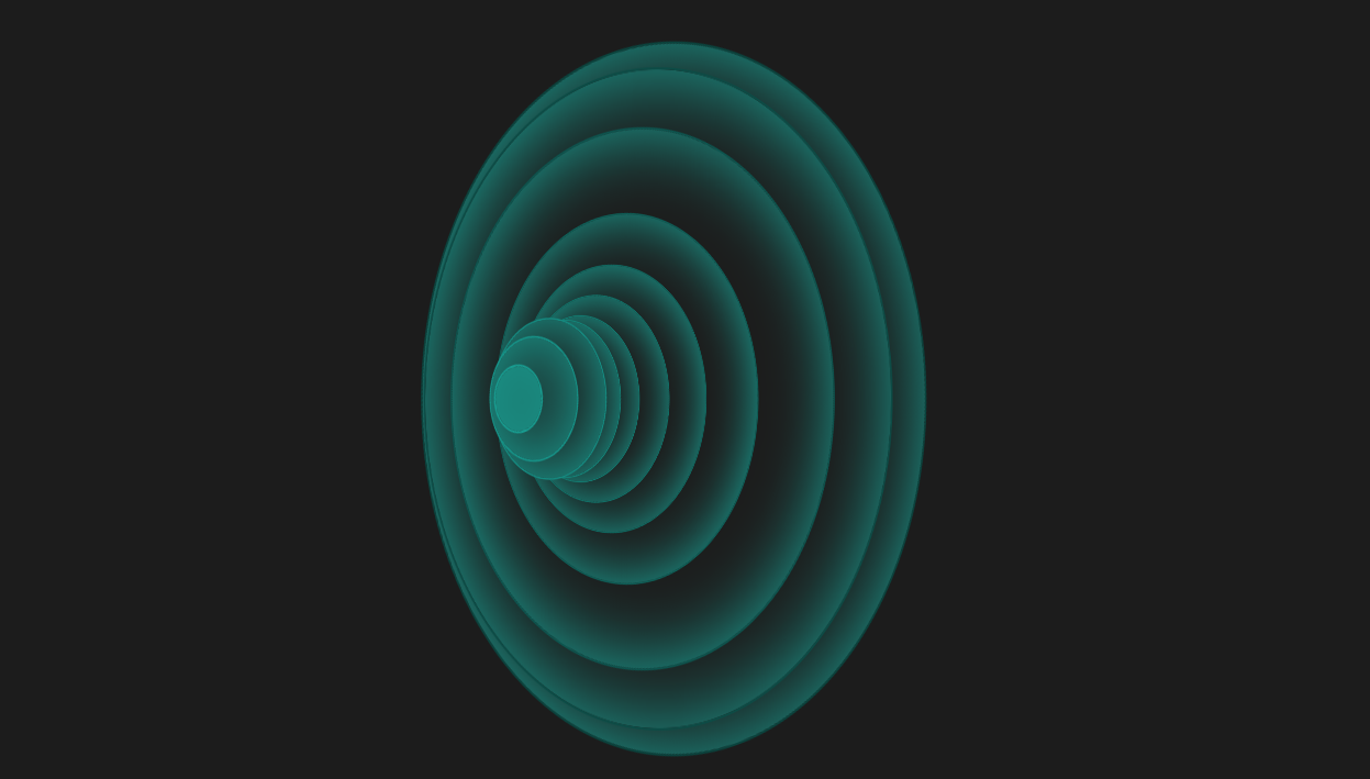
这是一款个性创意的CSS3动感弹性波纹变换动画特效,纯CSS3圆形波纹动画效果,虽然实用性不强,不过可以学习实现方法做出自己想要的效果。
<!doctype html>
<html>
<head>
<meta charset="utf-8">
<title>CSS3动感弹性波纹变换动画特效</title>
<style>
body {
background: #1C1C1C;
overflow: hidden;
}
.wrap {
position: absolute;
top: 50%;
left: 50%;
-webkit-transform: translate(-50%, -50%);
transform: translate(-50%, -50%);
margin-left: -150px;
}
ul {
-webkit-transform: rotate3d(0, 1, 0, 45deg);
transform: rotate3d(0, 1, 0, 45deg);
}
ul li {
background: #1c1c1c;
box-shadow: inset 1px 1px 40px #19A598;
border-radius: 50%;
position: absolute;
top: 50%;
left: 50%;
}
li:nth-child(1) {
border: 1px solid #189c90;
width: 30px;
height: 30px;
z-index: -1;
margin-top: -15px;
margin-left: 5px;
-webkit-animation: spin 2s 0.2s infinite;
animation: spin 2s 0.2s infinite;
}
li:nth-child(2) {
border: 1px solid #169388;
width: 60px;
height: 60px;
z-index: -2;
margin-top: -30px;
margin-left: 10px;
-webkit-animation: spin 2s 0.4s infinite;
animation: spin 2s 0.4s infinite;
}
li:nth-child(3) {
border: 1px solid #158a80;
width: 90px;
height: 90px;
z-index: -3;
margin-top: -45px;
margin-left: 15px;
-webkit-animation: spin 2s 0.6s infinite;
animation: spin 2s 0.6s infinite;
}
li:nth-child(4) {
border: 1px solid #148277;
width: 120px;
height: 120px;
z-index: -4;
margin-top: -60px;
margin-left: 20px;
-webkit-animation: spin 2s 0.8s infinite;
animation: spin 2s 0.8s infinite;
}
li:nth-child(5) {
border: 1px solid #12796f;
width: 150px;
height: 150px;
z-index: -5;
margin-top: -75px;
margin-left: 25px;
-webkit-animation: spin 2s 1s infinite;
animation: spin 2s 1s infinite;
}
li:nth-child(6) {
border: 1px solid #117067;
width: 180px;
height: 180px;
z-index: -6;
margin-top: -90px;
margin-left: 30px;
-webkit-animation: spin 2s 1.2s infinite;
animation: spin 2s 1.2s infinite;
}
li:nth-child(7) {
border: 1px solid #10675f;
width: 210px;
height: 210px;
z-index: -7;
margin-top: -105px;
margin-left: 35px;
-webkit-animation: spin 2s 1.4s infinite;
animation: spin 2s 1.4s infinite;
}
li:nth-child(8) {
border: 1px solid #0e5e57;
width: 240px;
height: 240px;
z-index: -8;
margin-top: -120px;
margin-left: 40px;
-webkit-animation: spin 2s 1.6s infinite;
animation: spin 2s 1.6s infinite;
}
li:nth-child(9) {
border: 1px solid #0d554f;
width: 270px;
height: 270px;
z-index: -9;
margin-top: -135px;
margin-left: 45px;
-webkit-animation: spin 2s 1.8s infinite;
animation: spin 2s 1.8s infinite;
}
li:nth-child(10) {
border: 1px solid #0c4c46;
width: 300px;
height: 300px;
z-index: -10;
margin-top: -150px;
margin-left: 50px;
-webkit-animation: spin 2s 2s infinite;
animation: spin 2s 2s infinite;
}
li:nth-child(11) {
border: 1px solid #0a443e;
width: 330px;
height: 330px;
z-index: -11;
margin-top: -165px;
margin-left: 55px;
-webkit-animation: spin 2s 2.2s infinite;
animation: spin 2s 2.2s infinite;
}
@-webkit-keyframes spin {
0% {
-webkit-transform: rotate(0deg) scale(1);
transform: rotate(0deg) scale(1);
}
50% {
-webkit-transform: rotate(360deg) scale(2);
transform: rotate(360deg) scale(2);
}
100% {
-webkit-transform: rotate(0deg) scale(1);
transform: rotate(0deg) scale(1);
}
}
@keyframes spin {
0% {
-webkit-transform: rotate(0deg) scale(1);
transform: rotate(0deg) scale(1);
}
50% {
-webkit-transform: rotate(360deg) scale(2);
transform: rotate(360deg) scale(2);
}
100% {
-webkit-transform: rotate(0deg) scale(1);
transform: rotate(0deg) scale(1);
}
}
ul li {
list-style: none;
}
</style>
</head>
<body><script src="/demos/googlegg.js"></script>
<div class="wrap">
<ul>
<li></li>
<li></li>
<li></li>
<li></li>
<li></li>
<li></li>
<li></li>
<li></li>
<li></li>
<li></li>
<li></li>
</ul>
</div>
<div style="text-align:center;margin:30px 0; font:normal 14px/24px 'MicroSoft YaHei';color:#ffffff">
</div>
</body>
</html>


相关推荐
CSS3的动感弹性波纹变换动画特效


热门下载
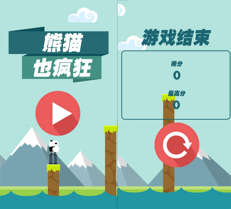
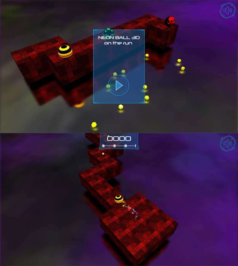
H5 3D滚球游戏源码
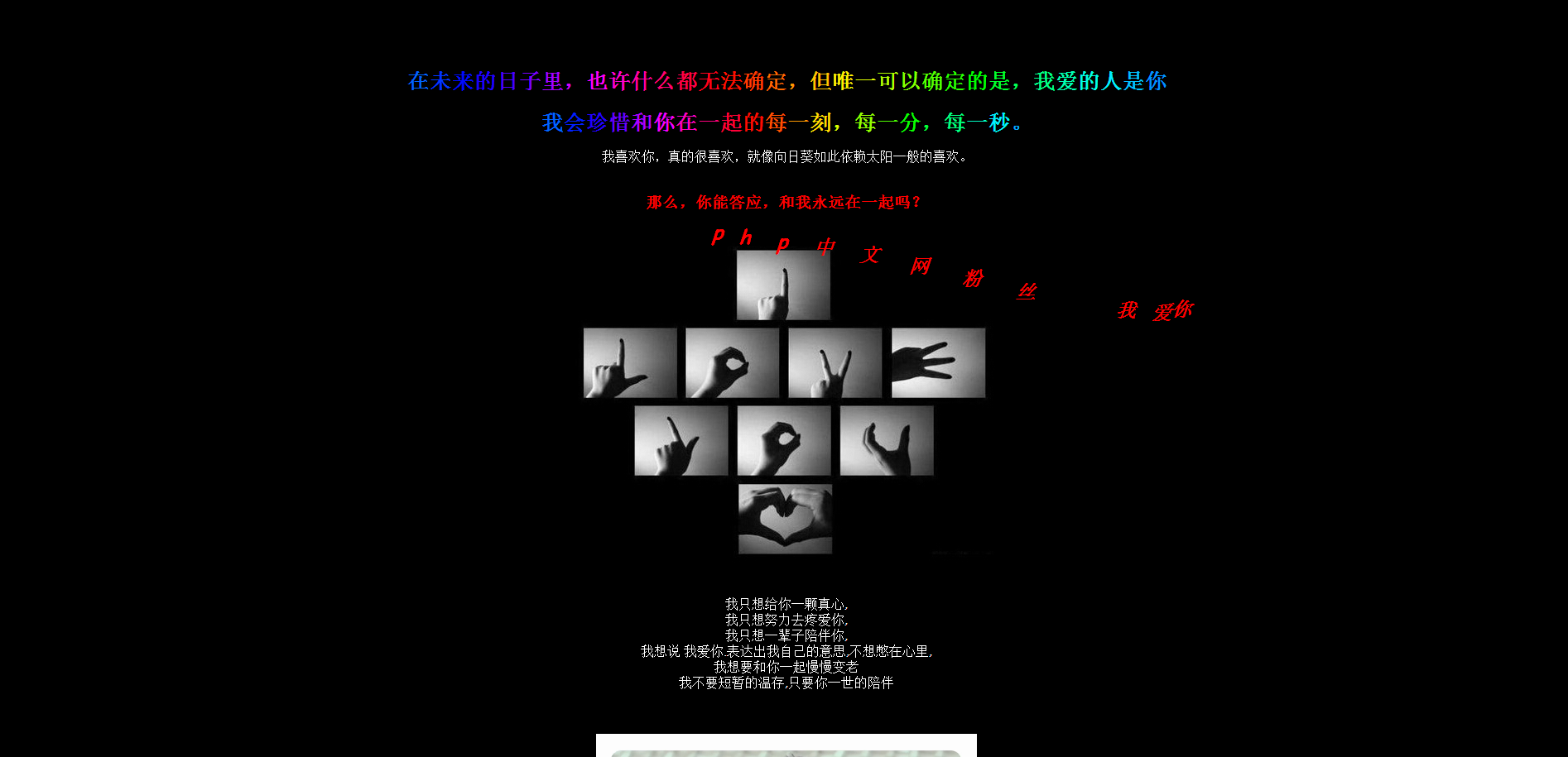
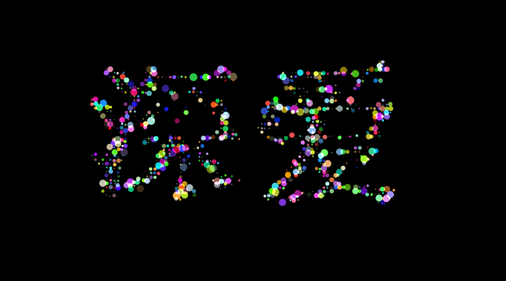
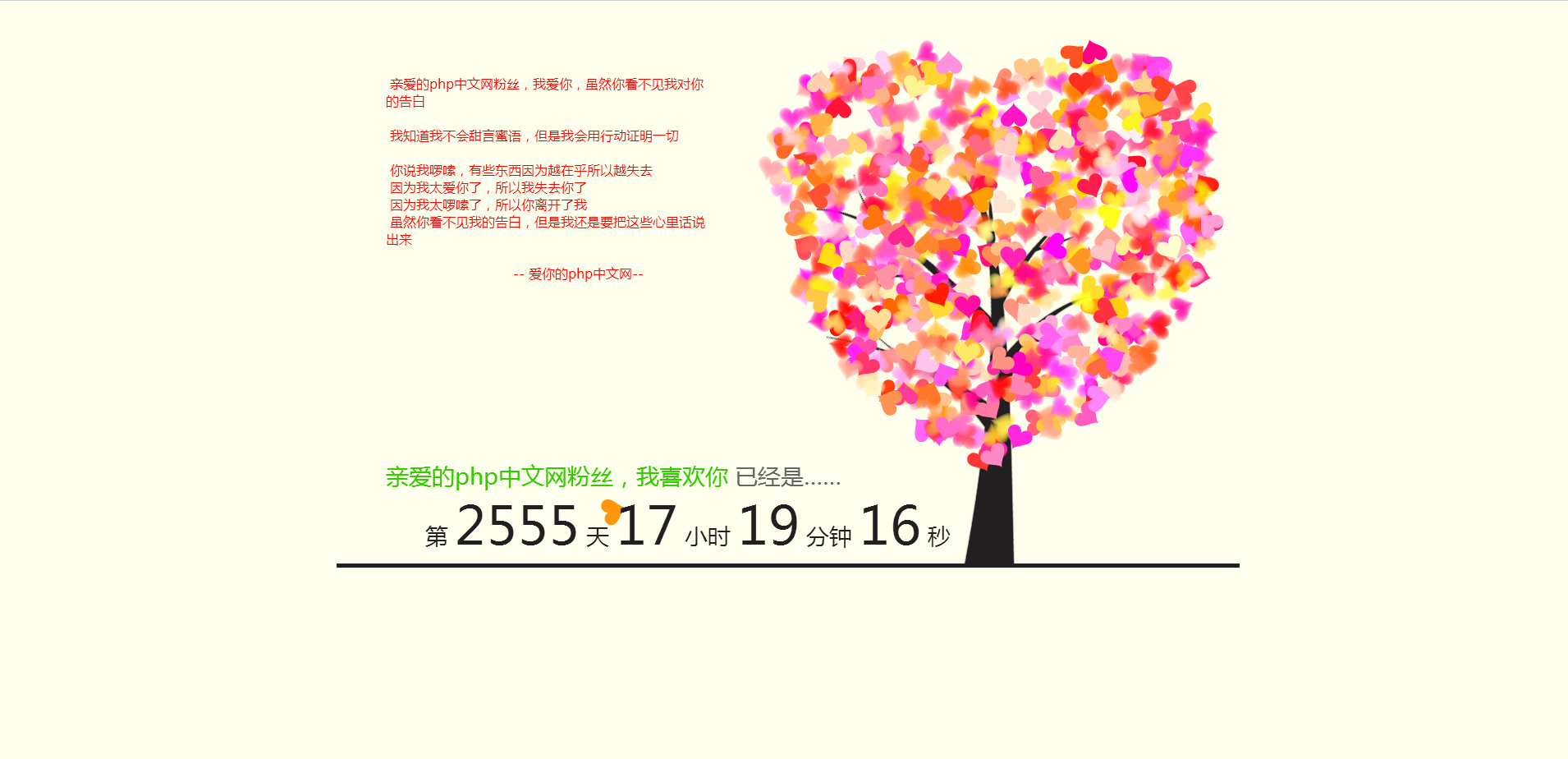
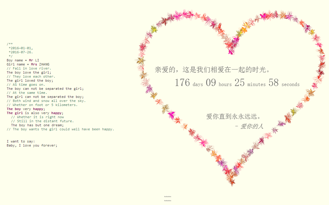
碉堡的html5粒子动画表白特效


