This article mainly introduces the example code of using Vue to dynamically generate form forms. It is very good and has reference value. Friends in need can refer to it
Form with data collection, verification and submission functions The generator includes elements such as check boxes, radio boxes, input boxes, and drop-down selection boxes, as well as three-level linkage between provinces and municipalities, time selection, date selection, color selection, file/picture upload functions, and supports event expansion.
Welcome everyone to star for learning and communication: github address
Example
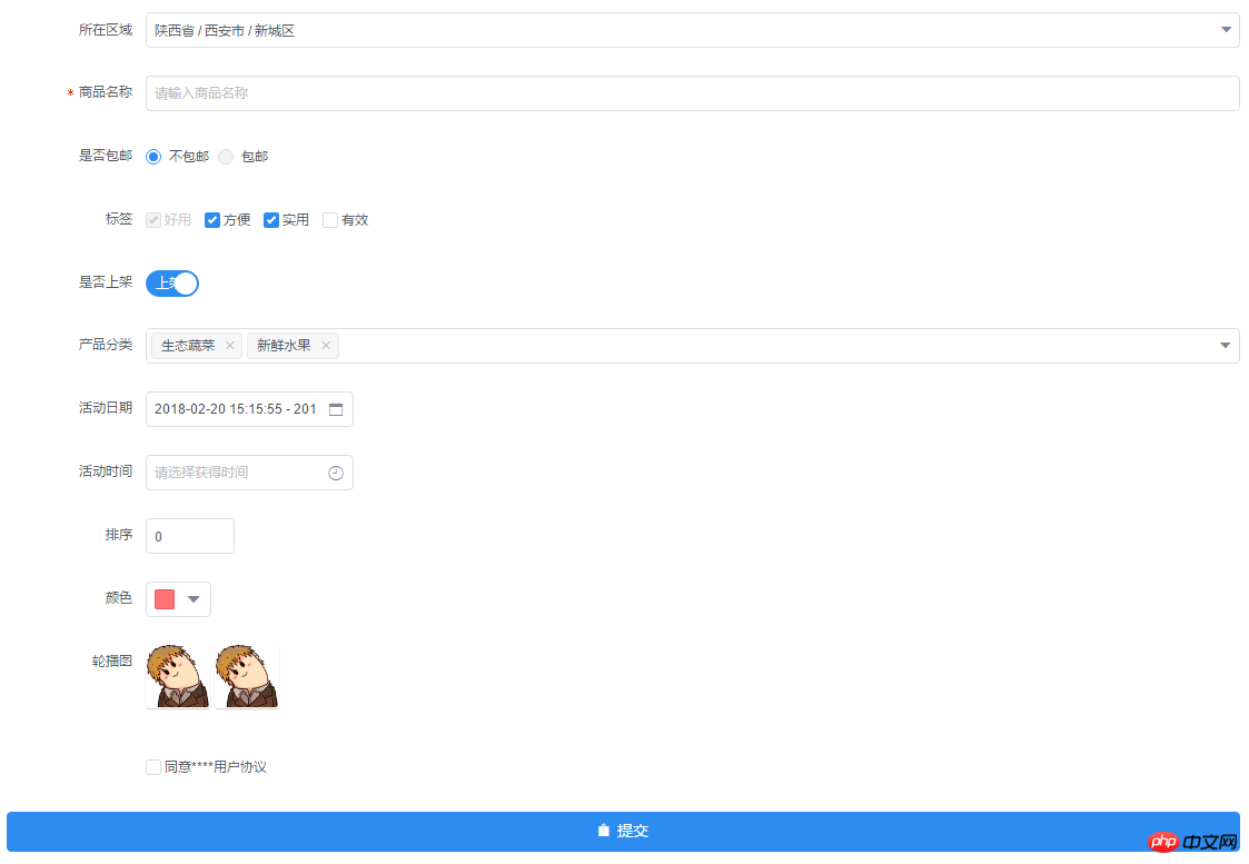
##https://raw.githubusercontent.com/xaboy /form-create/dev/images/sample110.jpg
INSTALL
npm install form-create
Copy after login
OR
git clone https://github.com/xaboy/form-create.git
cd form-create
npm install
Copy after login
Introduction
Attention! iview version Please>=2.9.2, otherwise there may be problems
Use
let rules = window.mock;
new Vue({
 mounted:function(){
 let $f = this.$formCreate(mock,
   {
    onSubmit:function (formData) {
     console.log(formData);
     $f.submitStatus({loading:true});
   }
  });
  //动态添加表单元素
  $f.append($r,'goods_name');
 }
})
Copy after login
$formCreate parameters
- rules Form generation rules [inputRule,selectRule,...]
- options Initialization configuration parameters (see createOptions at the bottom for details)
- $f Instance method
- formData() Gets the value of the form
- getValue(field) Gets the value of the specified field value
- changeField(field,value) Modify the value of the specified field
##resetFields() Reset the form
 $f.validateField(field,(errMsg)=>{
  if(errMsg){
   //TODO 验证未通过
  }else{
   //TODO 验证通过
  }
 });
Copy after login
prepend(rule, field = undefined) Enter the specified form element before the field field. If the field is not passed in, the default is the first
$f.prepend({
  type:"input",
  title:"商品简介",
  field:"goods_info",
  value:"",
  props: {
   "type": "text",
   "placeholder": "请输入商品简介",
  },
  validate:[
   { required: true, message: '请输入商品简介', trigger: 'blur' },
  ],
 });
Copy after login
append(rule, field = undefined) Enter the specified form element before the field. If the field is not passed in, the default is the last
$f.append({
  type:"input",
  title:"商品简介",
  field:"goods_info",
  value:"",
  props: {
   "type": "text",
   "placeholder": "请输入商品简介",
  },
  validate:[
   { required: true, message: '请输入商品简介', trigger: 'blur' },
  ],
 });
Copy after login
submitStatus(props) Modify the form submit button status$f.submitStatus({
//按钮类型,可选值为primary、ghost、dashed、text、info、success、warning、error或者不设置
type:"primary",
//按钮大小,可选值为large、small、default或者不设置
size:"large",
//按钮形状,可选值为circle或者不设置
shape:undefined,
//开启后,按钮的长度为 100%
long:true,
//设置button原生的type,可选值为button、submit、reset
htmlType:"button",
//设置按钮为禁用状态
disabled:false,
//设置按钮的图标类型
icon:"ios-upload",
//按钮文字提示
innerText:"提交",
//设置按钮为加载中状态
loading:false
})Copy after login
btn.loading() Let the form submit button enter the loading state
- btn.finish() Let the form submit button return to the normal state
hidden hidden fields
hiddenRule:
{
 type:"hidden",//必填!
 //字段名称
 field:"id", //必填!
 //input值
 value:"14" //必填!
}
Copy after login
input Input box
inputRule :
{
  type:"input",//必填!
  //label名称
  title:"商品名称",//必填!
  //字段名称
  field:"goods_name",//必填!
  //input值
  value:"iphone 7",
  props: {
   //输入框类型,可选值为 text、password、textarea、url、email、date
   "type": "text", //必填!
   //是否显示清空按钮
   "clearable":false,
   //设置输入框为禁用状态
   "disabled": false,
   //设置输入框为只读
   "readonly": false,
   //文本域默认行数,仅在 textarea 类型下有效
   "rows": 4,
   //自适应内容高度,仅在 textarea 类型下有效,可传入对象,如 { minRows: 2, maxRows: 6 }
   "autosize": false,
   //将用户的输入转换为 Number 类型
   "number": false,
   //自动获取焦点
   "autofocus": false,
   //原生的自动完成功能,可选值为 off 和 on
   "autocomplete": "off",
   //占位文本
   "placeholder": "请输入商品名称",
   //输入框尺寸,可选值为large、small、default或者不设置
   "size": "default",
   //原生的 spellcheck 属性
   "spellcheck": false,
  },
  event:{
   //按下回车键时触发
   enter:(event)=>{},
   //设置 icon 属性后,点击图标时触发
   click:(event)=>{},
   //数据改变时触发
   change:(event)=>{},
   //输入框聚焦时触发
   focus:(event)=>{},
   //输入框失去焦点时触发
   blur:(event)=>{},
   //原生的 keyup 事件
   keyup:(event)=>{},
   //原生的 keydown 事件
   keydown:(event)=>{},
   //原生的 keypress 事件
   keypress:(event)=>{},
  },
  validate:[
   { required: true, message: '请输入goods_name', trigger: 'blur' },
  ],
 }
Copy after login
validate form validation rules, please view the specific configuration: https://github.com/yiminghe/async-validator
radio radio button
radioRule :
{
  type:"radio",//必填!
  //label名称
  title:"是否包邮",//必填!
  //字段名称
  field:"is_postage",//必填!
  //input值
  value:"0",
  //可选参数
  options:[
   {value:"0",label:"不包邮",disabled:false},
   {value:"1",label:"包邮",disabled:true},
  ],//必填!
  props: {
   //可选值为 button 或不填,为 button 时使用按钮样式
   "type":undefined,
   //单选框的尺寸,可选值为 large、small、default 或者不设置
   "size":"default",
   //是否垂直排列,按钮样式下无效
   "vertical":false,
  },
  event:{
   //在选项状态发生改变时触发,返回当前状态。通过修改外部的数据改变时不会触发
   change:(...arg)=>{},
  },
  validate:[],
 }
Copy after login
checkbox checkbox
checkboxRule :
{
  type:"checkbox",//必填!
  //label名称
  title:"标签",//必填!
  //字段名称
  field:"label",//必填!
  //input值
  value:[
   "1","2","3"
  ],
  //可选参数
  options:[
   {value:"1",label:"好用",disabled:true},
   {value:"2",label:"方便",disabled:false},
   {value:"3",label:"实用",disabled:false},
   {value:"4",label:"有效",disabled:false},
  ],//必填!
  props: {
   //多选框组的尺寸,可选值为 large、small、default 或者不设置
   "size":"default",
  },
  event:{
   //只在单独使用时有效。在选项状态发生改变时触发,通过修改外部的数据改变时不会触发
   change:(...arg)=>{},
  },
  validate:[],
 }
Copy after login
select selector
selectRule :
{
  type: "select",//必填!
  field: "cate_id",//必填!
  title: "产品分类",//必填!
  //input值
  value: ["104","105"],
  //可选参数
  options: [
   {"value": "104", "label": "生态蔬菜", "disabled": false},
   {"value": "105", "label": "新鲜水果", "disabled": false},
  ],//必填!
  props: {
    //是否支持多选
   "multiple": true,
   //是否可以清空选项,只在单选时有效
   "clearable": false,
   //是否支持搜索
   "filterable": true,
   // 暂不支持远程搜索
   // "remote": false, //是否使用远程搜索
   // "remote-method":Function, //远程搜索的方法
   // "loading": false, //当前是否正在远程搜索
   // "loading-text": "加载中", //远程搜索中的文字提示
   //选择框大小,可选值为large、small、default或者不填
   "size":"default",
   //选择框默认文字
   "placeholder": "请选择",
    //当下拉列表为空时显示的内容
   "not-found-text": "无匹配数据",
   //弹窗的展开方向,可选值为 bottom 和 top
   "placement": "bottom",
   //是否禁用
   "disabled": false,
  },
  event:{
   //选中的Option变化时触发,返回 value
   change:(checked)=>{},
   //搜索词改变时触发
   'query-change':(keyword)=>{},
  },
  validate:[],
 }
Copy after login
switch switch
switchRule :
{
  type:"switch",//必填!
  //label名称
  title:"是否上架",//必填!
  //字段名称
  field:"is_show",//必填!
  //input值
  value:"1",
  props: {
   //开关的尺寸,可选值为large、small、default或者不写。建议开关如果使用了2个汉字的文字,使用 large。
   "size":"default",
   //禁用开关
   "disabled":false,
   //选中时的值,当使用类似 1 和 0 来判断是否选中时会很有用
   "trueValue":"1",
   //没有选中时的值,当使用类似 1 和 0 来判断是否选中时会很有用
   "falseValue":"0",
  },
  slot: {
   //自定义显示打开时的内容
   open:"上架",
   //自定义显示关闭时的内容
   close:"下架",
  },
  event:{
   //开关变化时触发,返回当前的状态 0 | 1
   change:(bool)=>{},
  },
  validate:[],
 }
Copy after login
DatePicker Date Picker
DatePickerRule :
{
  type: "DatePicker",//必填!
  field: "section_day",//必填!
  title: "活动日期",//必填!
  //input值, type为daterange,datetimerange value为数组 [start_value,end_value]
  value: ['2018-02-20', new Date()],
  props: {
   //显示类型,可选值为 date、daterange、datetime、datetimerange、year、month
   "type": "datetimerange",//必填!
   //展示的日期格式
   "format": "yyyy-MM-dd HH:mm:ss",
   //日期选择器出现的位置,可选值为toptop-starttop-endbottombottom-startbottom-endleftleft-startleft-endrightright-startright-end
   "placement": "bottom-start",
   //占位文本
   "placeholder":"请选择获得时间",
   //是否显示底部控制栏,开启后,选择完日期,选择器不会主动关闭,需用户确认后才可关闭
   "confirm":false,
   //尺寸,可选值为large、small、default或者不设置
   "size":"default",
   //是否禁用选择器
   "disabled":false,
   //是否显示清除按钮
   "clearable":true,
   //完全只读,开启后不会弹出选择器
   "readonly":false,
   //文本框是否可以输入
   "editable":false,
  },
  event:{
   //日期发生变化时触发,已经格式化后的日期,比如 2016-01-01
   change:(value)=>{},
   //弹出日历和关闭日历时触发 true | false
   'open-change':(bool)=>{},
   //在 confirm 模式或 clearable = true 时有效,在清空日期时触发
   clear:(...arg)=>{},
  },
  validate:[],
 }
Copy after login
TimePicker Time Picker
TimePickerRule :
{
  type: "TimePicker",//必填!
  field: "section_time",//必填!
  title: "活动时间",//必填!
  //input值, type为timerange value为数组 [start_value,end_value]
  value: [],
  props: {
   //显示类型,可选值为 time、timerange
   "type": "timerange", //必填!
   //展示的时间格式
   "format": "HH:mm:ss",
   //下拉列表的时间间隔,数组的三项分别对应小时、分钟、秒。例如设置为 [1, 15] 时,分钟会显示:00、15、30、45。
   "steps": [],
   //时间选择器出现的位置,可选值为toptop-starttop-endbottombottom-startbottom-endleftleft-startleft-endrightright-startright-end
   "placement": "bottom-start",
   //占位文本
   "placeholder":"请选择获得时间",
   //是否显示底部控制栏,开启后,选择完日期,选择器不会主动关闭,需用户确认后才可关闭
   "confirm":false,
   //尺寸,可选值为large、small、default或者不设置
   "size":"default",
   //是否禁用选择器
   "disabled":false,
   //是否显示清除按钮
   "clearable":true,
   //完全只读,开启后不会弹出选择器
   "readonly":false,
   //文本框是否可以输入
   "editable":false,
  },
  event:{
   //时间发生变化时触发 已经格式化后的时间,比如 09:41:00
   change:(checked)=>{},
   //弹出浮层和关闭浮层时触发 true | false
   'open-change':(bool)=>{},
   //在清空日期时触发
   clear:(...arg)=>{},
  },
  validate:[],
 }
Copy after login
InputNumber number input box
InputNumberRule :
{
  type: "InputNumber",//必填!
  field: "sort",//必填!
  title: "排序",//必填!
  //input值
  value: 1,
  props: {
   //最大值
   "max": undefined,
   //最小值
   "min": undefined,
   //每次改变的步伐,可以是小数
   "step": 1,
   //输入框尺寸,可选值为large、small、default或者不填
   "size":"default",
   //设置禁用状态
   "disabled":false,
   //是否设置为只读
   "readonly":false,
   //是否可编辑
   "editable":true,
   //数值精度
   "precision":0,
  },
  event:{
   //数值改变时的回调,返回当前值
   change:(value)=>{},
   //聚焦时触发
   focus:(event)=>{},
   //失焦时触发
   blur:(event)=>{},
  },
  validate:[],
 }
Copy after login
ColorPicker Color Picker
ColorPickerRule :
{
  type: "ColorPicker",//必填!
  field: "color",//必填!
  title: "颜色",//必填!
  //input值
  value: '#ff7271',
  props: {
   //是否支持透明度选择
   "alpha": false,
   //是否支持色彩选择
   "hue": true,
   //是否显示推荐的颜色预设
   "recommend": false,
   //尺寸,可选值为large、small、default或者不设置
   "size":"default",
   //自定义颜色预设
   "colors":[],
   //颜色的格式,可选值为 hsl、hsv、hex、rgb,开启 alpha 时为 rgb,其它为 hex
   "format":"hex",
  },
  event:{
   //当绑定值变化时触发,返回当前值
   change:(color)=>{},
   //聚焦时触发 面板中当前显示的颜色发生改变时触发
   'active-change':(color)=>{},
  },
  validate:[],
 }
Copy after login
Cascader Multi-level linkage
CascaderRule:
{
  type:"cascader",//必填!
  title:"所在区域",//必填!
  field:"address",//必填!
  //input值
  value:['陕西省','西安市','新城区'],
  props:{
   //可选项的数据源,格式参照示例说明
   data:window.province || [],//必填!
   //选择后展示的函数,用于自定义显示格式
   renderFormat:label => label.join(' / '),
   //是否禁用选择器
   disabled:false,
   //是否支持清除
   clearable:true,
   //输入框占位符
   placeholder:'请选择',
   //次级菜单展开方式,可选值为 click 或 hover
   trigger:'click',
   //当此项为 true 时,点选每级菜单选项值都会发生变化,具体见上面的示例
   changeOnSelect:false,
   //输入框大小,可选值为large和small或者不填
   size:undefined,
   //动态获取数据,数据源需标识 loading
   loadData:()=>{},
   //是否支持搜索
   filterable:false,
   //当搜索列表为空时显示的内容
   notFoundText:'无匹配数据',
   //是否将弹层放置于 body 内,在 Tabs、带有 fixed 的 Table 列内使用时,建议添加此属性,它将不受父级样式影响,从而达到更好的效果
   transfer:false,
  },
  event:{
   //选择完成后的回调,返回值 value 即已选值 value,selectedData 为已选项的具体数据
   change:(value, selectedData)=>{},
   //展开和关闭弹窗时触发
   'visible-change':bool=>{}
  },
  validate:[],
 }
Copy after login
Upload Upload
UploadRule :
{
  type: "Upload",//必填!
  field: "pic",//必填!
  title: "轮播图",//必填!
  //input值,当maxLength等与1时值为字符串,大于1时值为数组
  value: ['http://img1.touxiang.cn/uploads/20131030/30-075657_191.jpg','http://img1.touxiang.cn/uploads/20131030/30-075657_191.jpg'], //input值
  props: {
   //上传控件的类型,可选值为 select(点击选择),drag(支持拖拽)
   "type":"select", //必填!
   //上传文件类型,可选值为 image(图片上传),file(文件上传)
   "uploadType":"image", //必填!
   //上传的地址
   "action": "", //必填!
   //上传的文件字段名
   "name":"",
   //上传时附带的额外参数
   "data":{},
   //设置上传的请求头部
   "headers": {},
   //是否支持多选文件
   "multiple": true,
   //支持发送 cookie 凭证信息
   "withCredentials":false,
   //不支持
   // "showUploadList":false, //是否显示已上传文件列表
   // "defaultFileList":[], // 默认已上传的文件列表
   //接受上传的文件类型
   "accept":"",
   //支持的文件类型,与 accept 不同的是,format 是识别文件的后缀名,accept 为 input 标签原生的 accept 属性,会在选择文件时过滤,可以两者结合使用
   "format":[],
   //文件大小限制,单位 kb
   "maxSize":undefined,
   //可上传文件数量
   "maxLength":1,
   //上传文件之前的钩子,参数为上传的文件,若返回 false 或者 Promise 则停止上传
   "beforeUpload":()=>{},
   //文件上传时的钩子,返回字段为 event, file, fileList
   "onProgress":()=>{},
   //文件上传成功时的钩子,返回字段为 response, file, fileList,若需有把文件添加到文件列表中,在函数值返回即可
   "onSuccess":function () {
    return 'http://img1.touxiang.cn/uploads/20131030/30-075657_191.jpg';
   }, //必填!
   //文件上传失败时的钩子,返回字段为 error, file, fileList
   "onError":(error, file, fileList)=>{},
   //点击已上传的文件链接时的钩子,返回字段为 file, 可以通过 file.response 拿到服务端返回数据
   "onPreview":()=>{},
   //文件列表移除文件时的钩子,返回字段为 file, fileList
   "onRemove":()=>{},
   //文件格式验证失败时的钩子,返回字段为 file, fileList
   "onFormatError":()=>{},
   //文件超出指定大小限制时的钩子,返回字段为 file, fileList
   "onExceededSize":()=>{},
   //辅助操作按钮的图标 ,设置为false将不显示
   handleIcon:'ionic',
   //点击辅助操作按钮事件
   onHandle:(src)=>{},
   //是否可删除,设置为false是不显示删除按钮
   allowRemove:true,
  },
 }
Copy after login
accept File type: https://developer.mozilla.org/en- US/docs/Web/HTML/Element/input#attr-accept
Global configuration createOptions
{
 //插入节点,默认document.body
 el:null,
 //form配置
 form:{
  //是否开启行内表单模式
  inline:false,
  //表单域标签的位置,可选值为 left、right、top
  labelPosition:'right',
  //表单域标签的宽度,所有的 FormItem 都会继承 Form 组件的 label-width 的值
  labelWidth:125,
  //是否显示校验错误信息
  showMessage:true,
  //原生的 autocomplete 属性,可选值为 off 或 on
  autocomplete:'off',
 },
 //文件上传全局配置
 upload:{
  //上传文件之前的钩子,参数为上传的文件,若返回 false 或者 Promise 则停止上传
  beforeUpload:()=>{},
  //文件上传时的钩子,返回字段为 event, file, fileList
  onProgress:(event, file, fileList)=>{},
  //文件上传成功时的钩子,返回字段为 response, file, fileList,若需有把文件添加到文件列表中,在函数值返回即可
  onSuccess:(response, file, fileList)=>{
   // return 'filePath';
  },
  //文件上传失败时的钩子,返回字段为 error, file, fileList
  onError:(error, file, fileList)=>{},
  //点击已上传的文件链接时的钩子,返回字段为 file, 可以通过 file.response 拿到服务端返回数据
  onPreview:(file)=>{},
  //文件列表移除文件时的钩子,返回字段为 file, fileList
  onRemove:(file, fileList)=>{},
  //文件格式验证失败时的钩子,返回字段为 file, fileList
  onFormatError:(file, fileList)=>{},
  //文件超出指定大小限制时的钩子,返回字段为 file, fileList
  onExceededSize:(file, fileList)=>{},
  //辅助操作按钮的图标 ,设置为false将不显示
  handleIcon:'ios-eye-outline',
  //点击辅助操作按钮事件
  onHandle:(src)=>{},
  //是否可删除,设置为false是不显示删除按钮
  allowRemove:true,
 },
 //表单提交事件
 onSubmit:(formData)=>{},
 //提交按钮配置,设置为false时不显示按钮
 submitBtn:{
  //按钮类型,可选值为primary、ghost、dashed、text、info、success、warning、error或者不设置
  type:"primary",
  //按钮大小,可选值为large、small、default或者不设置
  size:"large",
  //按钮形状,可选值为circle或者不设置
  shape:undefined,
  //开启后,按钮的长度为 100%
  long:true,
  //设置button原生的type,可选值为button、submit、reset
  htmlType:"button",
  //设置按钮为禁用状态
  disabled:false,
  //设置按钮的图标类型
  icon:"ios-upload",
  //按钮文字提示
  innerText:"提交",
  //设置按钮为加载中状态
  loading:false,
 }
}
Copy after login
The above is the entire content of this article, I hope it will be helpful to everyone’s learning. For more related content, please pay attention to the PHP Chinese website!
Related recommendations:
How to use Vue-resource to complete interaction in VUE
Vue method to implement two-way binding
The above is the detailed content of Introduction to using Vue to dynamically generate forms. For more information, please follow other related articles on the PHP Chinese website!


 0
0 2
2 249
249


![[Web front-end] Node.js quick start](https://img.php.cn/upload/course/000/000/067/662b5d34ba7c0227.png)


