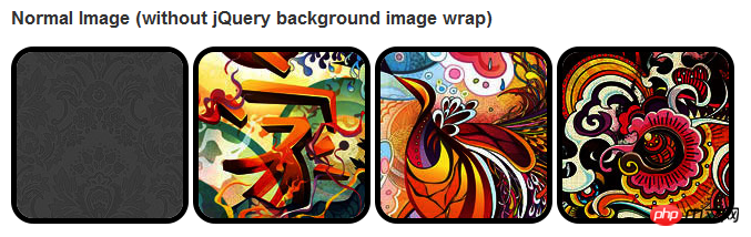
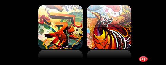
在css3中,直接在图片上使用box-shadow 和 border-radius,浏览器并不能很好的渲染。但是如果把图片作为background-image,添加的样式浏览器可以很好的渲染。我将会介绍如何使用box-shadow, border-radius 和 transition创建不同图片样式效果。
通过查看demo能注意到,我们为第一行图片设置了border-radius 和 内嵌box-shadow。firefox渲染了图片的border-radius,但是没有渲染内嵌box-shadow。chrome和Safari两种效果都没有渲染。
.normal img {
border: solid 5px #000;
-webkit-border-radius: 20px;
-moz-border-radius: 20px;  border-radius: 20px;
-webkit-box-shadow: inset 0 1px 5px rgba(0,0,0,.5);
-moz-box-shadow: inset 0 1px 5px rgba(0,0,0,.5);
box-shadow: inset 0 1px 5px rgba(0,0,0,.5);
}firefox效果:
chrome/safari
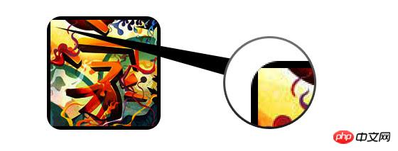
为了使border-radius 和 内嵌box-shadow能够正常工作,我们需要把图片转换成background-image的方式。
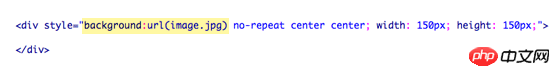
为了动态完成这一工作,我们需要借助jquery为每一个图片添加背景图片的包装。下面的js代码为每一个图片添加了一个span的包装,span的背景图片路径就是图片的路径。
代码比较简单,我想就没有讲解的必要了。不清楚了可以直接去查jquery的api。
<script type="text/javascript" src="http://ajax.googleapis.com/ajax/libs/jquery/1.5/jquery.min.js"></script>
<script type="text/javascript">
$(document).ready(function(){
$("img").load(function() {
$(this).wrap(function(){
return '<span class="image-wrap ' + $(this).attr('class') + '" style="position:relative;
display:inline-block; background:url(' + $(this).attr('src') + ') no-repeat center center;
width: ' + $(this).width() + 'px; height: ' + $(this).height() + 'px;" />';
});
$(this).css("opacity","0");
});
});</script>上面的代码会输出如下结果:
<span class="image-wrap " style="position:relative;
display:inline-block; background:url(image.jpg) no-repeat center center;
width: 150px; height: 150px;">
<img src="image.jpg" style="max-width:90%" alt="HTML5实践-如何使用css3丰富图片样式的详解(一)" >
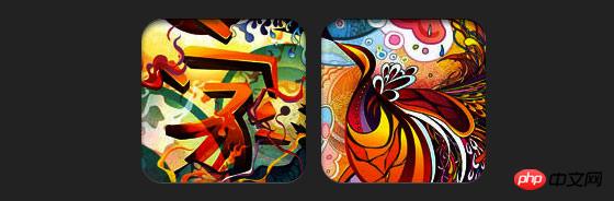
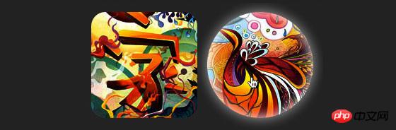
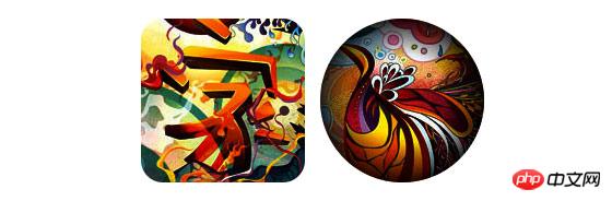
</span>添加我们使用border-radius来实现圆形图片的效果,效果如下:
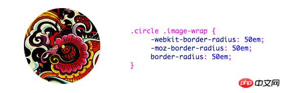
css:
.circle .image-wrap {
    -webkit-border-radius: 50em;
    -moz-border-radius: 50em;
    border-radius: 50em;
}下面是卡片风格的图片,使用了多个内嵌box-shadow。
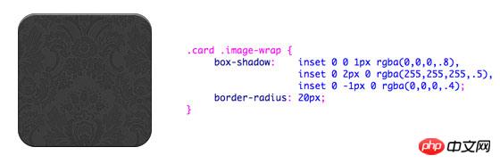
css:
.card .image-wrap {
    -webkit-box-shadow: inset 0 0 1px rgba(0,0,0,.8), inset 0 2px 0 rgba(255,255,255,.5), inset 0 -1px 0 rgba(0,0,0,.4);
    -moz-box-shadow: inset 0 0 1px rgba(0,0,0,.8), inset 0 2px 0 rgba(255,255,255,.5), inset 0 -1px 0 rgba(0,0,0,.4);
    box-shadow: inset 0 0 1px rgba(0,0,0,.8), inset 0 2px 0 rgba(255,255,255,.5), inset 0 -1px 0 rgba(0,0,0,.4);

    -webkit-border-radius: 20px;
    -moz-border-radius: 20px;
    border-radius: 20px;
}下面是浮雕效果。
css:
.embossed .image-wrap {
    -webkit-box-shadow: inset 0 0 2px rgba(0,0,0,.8),
    inset 0 2px 0 rgba(255,255,255,.5),
    inset 0 -7px 0 rgba(0,0,0,.6),
    inset 0 -9px 0 rgba(255,255,255,.3);
    -moz-box-shadow: inset 0 0 2px rgba(0,0,0,.8),
    inset 0 2px 0 rgba(255,255,255,.5), inset 0 -7px 0 rgba(0,0,0,.6),
    inset 0 -9px 0 rgba(255,255,255,.3);
    box-shadow: inset 0 0 2px rgba(0,0,0,.8),
    inset 0 2px 0 rgba(255,255,255,.5),
    inset 0 -7px 0 rgba(0,0,0,.6), inset 0 -9px 0 rgba(255,255,255,.3);

    -webkit-border-radius: 20px;
    -moz-border-radius: 20px;
    border-radius: 20px;
}相对于浮雕样式,新样式添加了1px blur属性。
css:
.soft-embossed .image-wrap {
    -webkit-box-shadow: inset 0 0 4px rgba(0,0,0,1),
    inset 0 2px 1px rgba(255,255,255,.5),
    inset 0 -9px 2px rgba(0,0,0,.6),
    inset 0 -12px 2px rgba(255,255,255,.3);
    -moz-box-shadow: inset 0 0 4px rgba(0,0,0,1),
    inset 0 2px 1px rgba(255,255,255,.5),
    inset 0 -9px 2px rgba(0,0,0,.6),
    inset 0 -12px 2px rgba(255,255,255,.3);
    box-shadow: inset 0 0 4px rgba(0,0,0,1),
    inset 0 2px 1px rgba(255,255,255,.5),
    inset 0 -9px 2px rgba(0,0,0,.6),
    inset 0 -12px 2px rgba(255,255,255,.3);

    -webkit-border-radius: 20px;
    -moz-border-radius: 20px;
    border-radius: 20px;
}使用内嵌box-shadow就可以实现抠图效果。
css:
.cut-out .image-wrap {
    -webkit-box-shadow: 0 1px 0 rgba(255,255,255,.2),
    inset 0 4px 5px rgba(0,0,0,.6),
    inset 0 1px 0 rgba(0,0,0,.6);
    -moz-box-shadow: 0 1px 0 rgba(255,255,255,.2),
    inset 0 4px 5px rgba(0,0,0,.6),
    inset 0 1px 0 rgba(0,0,0,.6);
    box-shadow: 0 1px 0 rgba(255,255,255,.2),
    inset 0 4px 5px rgba(0,0,0,.6),
    inset 0 1px 0 rgba(0,0,0,.6);

    -webkit-border-radius: 20px;
    -moz-border-radius: 20px;
    border-radius: 20px;
}在这个例子中我们为图片包装添加transition属性,鼠标滑过的时候,他会从圆角变为圆形。然后我们使用多个box-shadow实现发光效果。
css:
.morphing-glowing .image-wrap {
    -webkit-transition: 1s;
    -moz-transition: 1s;
    transition: 1s;

    -webkit-border-radius: 20px;
    -moz-border-radius: 20px;
    border-radius: 20px;
}.morphing-glowing .image-wrap:hover {
    -webkit-box-shadow: 0 0 20px rgba(255,255,255,.6),
    inset 0 0 20px rgba(255,255,255,1);
    -moz-box-shadow: 0 0 20px rgba(255,255,255,.6),
    inset 0 0 20px rgba(255,255,255,1);
    box-shadow: 0 0 20px rgba(255,255,255,.6),
    inset 0 0 20px rgba(255,255,255,1);

    -webkit-border-radius: 60em;
    -moz-border-radius: 60em;
    border-radius: 60em;
}高光的效果是通过为元素添加 :after 伪类实现的。
css:
.glossy .image-wrap {
    -webkit-box-shadow: inset 0 -1px 0 rgba(0,0,0,.5);
    -moz-box-shadow: inset 0 -1px 0 rgba(0,0,0,.5);
    box-shadow: inset 0 -1px 0 rgba(0,0,0,.5);

    -webkit-border-radius: 20px;
    -moz-border-radius: 20px;
    border-radius: 20px;
}.glossy .image-wrap:after {
    position: absolute;
    content: ' ';
    width: 100%;
    height: 50%;
    top: 0;
    left: 0;

    -webkit-border-radius: 20px;
    -moz-border-radius: 20px;
    border-radius: 20px;

    background: -moz-linear-gradient(top, rgba(255,255,255,0.7) 0%, rgba(255,255,255,.1) 100%);
    background: -webkit-gradient(linear, left top, left bottom, color-stop(0%,rgba(255,255,255,0.7)), color-stop(100%,rgba(255,255,255,.1)));
    background: linear-gradient(top, rgba(255,255,255,0.7) 0%,rgba(255,255,255,.1) 100%);
}在这个例子中,我们将高光效果移到底部就实现倒影效果。
css:
.reflection .image-wrap:after {
    position: absolute;
    content: ' ';
    width: 100%;
    height: 30px;
    bottom: -31px;
    left: 0;

    -webkit-border-top-left-radius: 20px;
    -webkit-border-top-right-radius: 20px;
    -moz-border-radius-topleft: 20px;
    -moz-border-radius-topright: 20px;
    border-top-left-radius: 20px;
    border-top-right-radius: 20px;

    background: -moz-linear-gradient(top, rgba(0,0,0,.3) 0%, rgba(255,255,255,0) 100%);
    background: -webkit-gradient(linear, left top, left bottom, color-stop(0%,rgba(0,0,0,.3)),
    color-stop(100%,rgba(255,255,255,0)));
    background: linear-gradient(top, rgba(0,0,0,.3) 0%,rgba(255,255,255,0) 100%);
}.reflection .image-wrap:hover {
    position: relative;
    top: -8px;
}本例我们使用:before 和 :after 将高光和倒影效果组合起来。
css:
.glossy-reflection .image-wrap {
    -webkit-box-shadow: inset 0 -1px 0 rgba(0,0,0,.5), inset 0 1px 0 rgba(255,255,255,.6);
    -moz-box-shadow: inset 0 -1px 0 rgba(0,0,0,.5), inset 0 1px 0 rgba(255,255,255,.6);
    box-shadow: inset 0 -1px 0 rgba(0,0,0,.5), inset 0 1px 0 rgba(255,255,255,.6);

    -webkit-transition: 1s;
    -moz-transition: 1s;
    transition: 1s;

    -webkit-border-radius: 20px;
    -moz-border-radius: 20px;
    border-radius: 20px;
}.glossy-reflection .image-wrap:before {
    position: absolute;
    content: ' ';
    width: 100%;
    height: 50%;
    top: 0;
    left: 0;

    -webkit-border-radius: 20px;
    -moz-border-radius: 20px;
    border-radius: 20px;

    background: -moz-linear-gradient(top, rgba(255,255,255,0.7) 0%, rgba(255,255,255,.1) 100%);
    background: -webkit-gradient(linear, left top, left bottom, color-stop(0%,rgba(255,255,255,0.7)), color-stop(100%,rgba(255,255,255,.1)));
    background: linear-gradient(top, rgba(255,255,255,0.7) 0%,rgba(255,255,255,.1) 100%);
}.glossy-reflection .image-wrap:after {
    position: absolute;
    content: ' ';
    width: 100%;
    height: 30px;
    bottom: -31px;
    left: 0;

    -webkit-border-top-left-radius: 20px;
    -webkit-border-top-right-radius: 20px;
    -moz-border-radius-topleft: 20px;
    -moz-border-radius-topright: 20px;
    border-top-left-radius: 20px;
    border-top-right-radius: 20px;

    background: -moz-linear-gradient(top, rgba(230,230,230,.3) 0%, rgba(230,230,230,0) 100%);
    background: -webkit-gradient(linear, left top, left bottom, color-stop(0%,rgba(230,230,230,.3)), color-stop(100%,rgba(230,230,230,0)));
    background: linear-gradient(top, rgba(230,230,230,.3) 0%,rgba(230,230,230,0) 100%);
}在这个例子中,我们使用:after来实现胶带的效果。
css:
.tape .image-wrap {
    -webkit-box-shadow: inset 0 0 2px rgba(0,0,0,.7),
    inset 0 2px 0 rgba(255,255,255,.3), inset 0 -1px 0 rgba(0,0,0,.5), 0 1px 3px rgba(0,0,0,.4);
    -moz-box-shadow: inset 0 0 2px rgba(0,0,0,.7),
    inset 0 2px 0 rgba(255,255,255,.3),
    inset 0 -1px 0 rgba(0,0,0,.5), 0 1px 3px rgba(0,0,0,.4);
    box-shadow: inset 0 0 2px rgba(0,0,0,.7), inset 0 2px 0 rgba(255,255,255,.3),
    inset 0 -1px 0 rgba(0,0,0,.5), 0 1px 3px rgba(0,0,0,.4);
}.tape .image-wrap:after {
    position: absolute;
    content: ' ';
    width: 60px;
    height: 25px;
    top: -10px;
    left: 50%;
    margin-left: -30px;
    border: solid 1px rgba(137,130,48,.2);

    background: -moz-linear-gradient(top, rgba(254,243,127,.6) 0%, rgba(240,224,54,.6) 100%);
    background: -webkit-gradient(linear, left top, left bottom, color-stop(0%,rgba(254,243,127,.6)), color-stop(100%,rgba(240,224,54,.6)));
    background: linear-gradient(top, rgba(254,243,127,.6) 0%,rgba(240,224,54,.6) 100%);
    -webkit-box-shadow: inset 0 1px 0 rgba(255,255,255,.3), 0 1px 0 rgba(0,0,0,.2);
}在这个例子中,我们在元素上使用:after,当鼠标进过的时候实现径向渐变的效果。
css:
.morphing-tinting .image-wrap {
    position: relative;

    -webkit-transition: 1s;
    -moz-transition: 1s;
    transition: 1s;

    -webkit-border-radius: 20px;
    -moz-border-radius: 20px;
    border-radius: 20px;
}.morphing-tinting .image-wrap:hover {
    -webkit-border-radius: 30em;
    -moz-border-radius: 30em;
    border-radius: 30em;
}.morphing-tinting .image-wrap:after {
    position: absolute;
    content: ' ';
    width: 100%;
    height: 100%;
    top: 0;
    left: 0;

    -webkit-transition: 1s;
    -moz-transition: 1s;
    transition: 1s;

    -webkit-border-radius: 30em;
    -moz-border-radius: 30em;
    border-radius: 30em;
}.morphing-tinting .image-wrap:hover:after  {
    background: -webkit-gradient(radial, 50% 50%, 40, 50% 50%, 80, from(rgba(0,0,0,0)), to(rgba(0,0,0,1)));
    background: -moz-radial-gradient(50% 50%, circle, rgba(0,0,0,0) 40px, rgba(0,0,0,1) 80px);
}我们同样可以使用径向渐变产生遮罩,实现羽化的效果。
css:
.feather .image-wrap {
    position: relative;

    -webkit-border-radius: 30em;
    -moz-border-radius: 30em;
    border-radius: 30em;
}.feather .image-wrap:after  {
    position: absolute;
    content: ' ';
    width: 100%;
    height: 100%;
    top: 0;
    left: 0;

    background: -webkit-gradient(radial, 50% 50%, 50, 50% 50%, 70, from(rgba(255,255,255,0)), to(rgba(255,255,255,1)));
    background: -moz-radial-gradient(50% 50%, circle, rgba(255,255,255,0) 50px, rgba(255,255,255,1) 70px);
}这种实现方式在大多数支持border-radius, box-shadow, :before and :after特性的浏览器中(例如Chrome, Firefox 和 Safari),都能很好的工作。在不支持新特性的浏览器中,只会显示原始图片。
借助:before 和:after伪类能为图片创造很多种样式,你可以自己尝试创建出新的效果。
以上就是HTML5实践-如何使用css3丰富图片样式的详解(一)的详细内容,更多请关注php中文网其它相关文章!


 收藏
收藏
 收藏
收藏
 收藏
收藏
Copyright 2014-2024 https://www.php.cn/ All Rights Reserved | php.cn | 湘ICP备2023035733号


 0
0 24
24


![ThinkPHP5实战之[教学管理系统]](https://img.php.cn/upload/course/000/000/068/6253d87459486427.png)