
这篇文章主要介绍了浅谈Html5的背景属性,小编觉得挺不错的,现在分享给大家,也给大家做个参考。一起跟随小编过来看看吧
1、背景属性复习:
background-image
background-color
background-repeat
background-position
background-attachment
2、新增属性:
background-size:
background-size:x y; // 水平 垂直方向的尺寸,像素/百分比/auto/⋯
background-size:cover; //保持宽高比不变,保证占满盒子,但不保证能看到全部
background-size:contain; //保持宽高比不变,保证看清全图,但可能占不满盒子
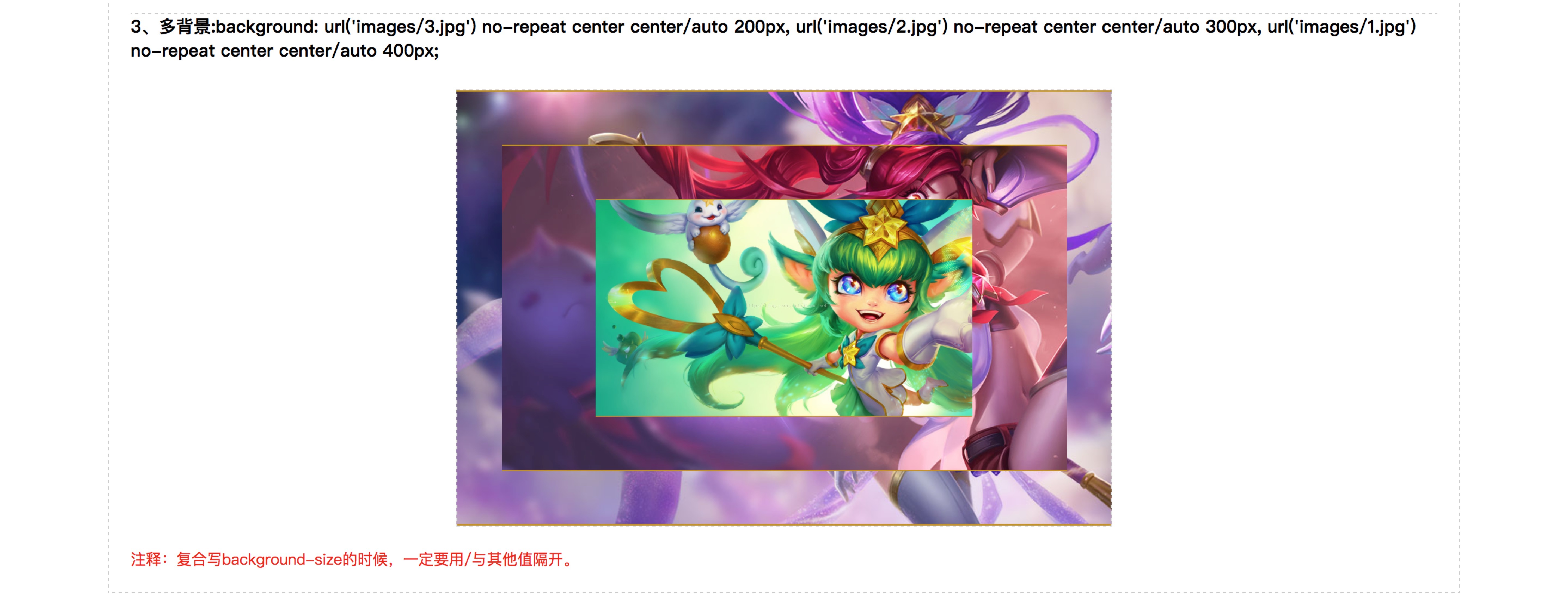
多背景:
background-image:url(1.jpg),url(2.jpg);
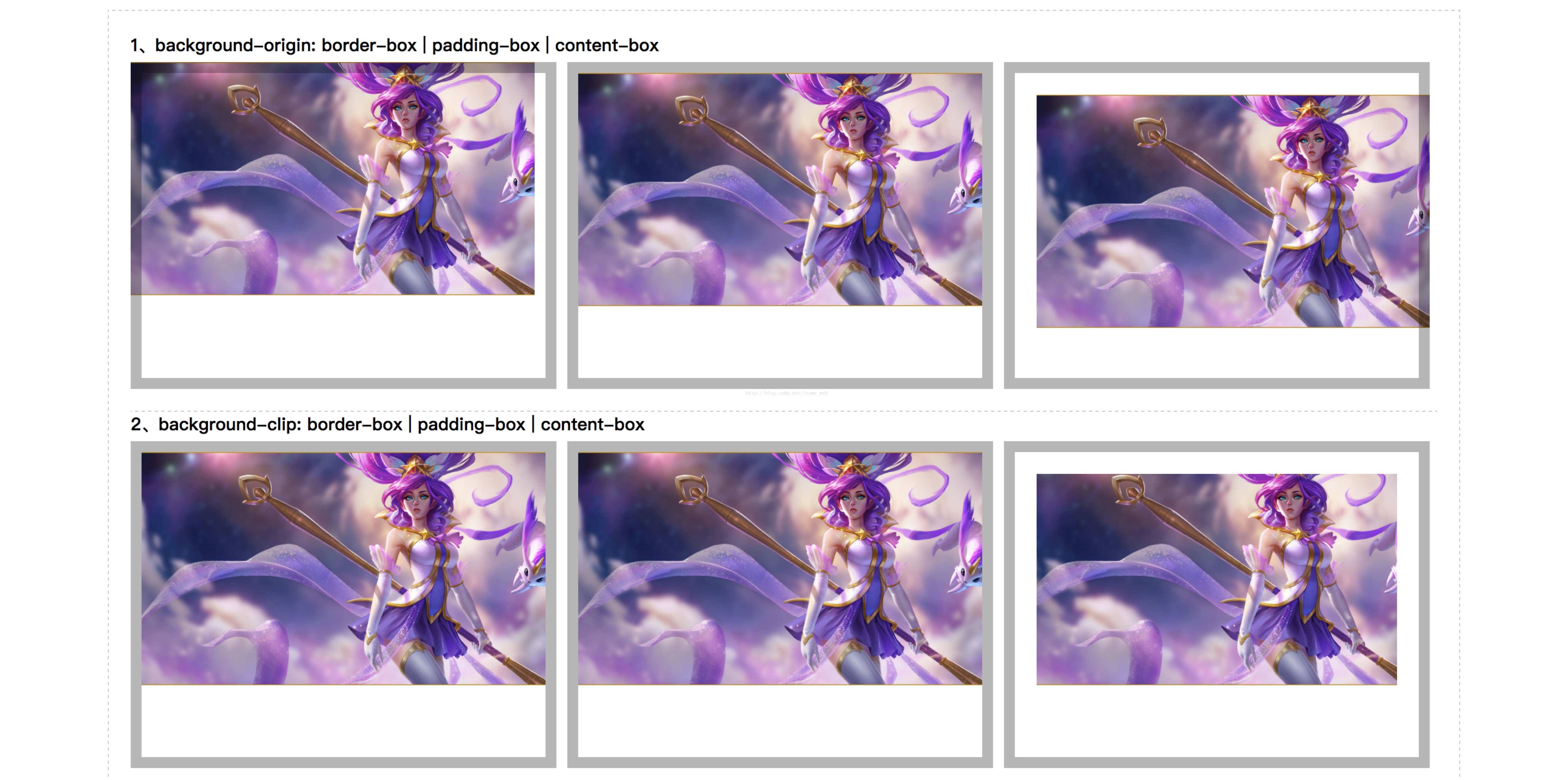
background-origin 背景区域定位
border-box: 从border区域开始显示背景
padding-box: 从padding区域开始显示背景
content-box: 从content内容区域开始显示背景
background-clip 背景绘制区域
border-box: 从border区域开始绘制背景
padding-box: 从padding区域开始绘制背景
content-box: 从content内容区域开始显示背景
3、背景练习代码部分:
<!DOCTYPE HTML>
<html>
<head>
<title>your title name</title>
<meta charset="utf-8">
<meta name="Author" content="Wilson Xu">
<style type="text/css">
*{margin: 0;padding: 0;font-family: "Microsoft yahei";}
a{text-decoration: none;}
a img{display: block;border: none;}
li{list-style: none;}
.container{
width: 1200px;
padding: 20px;
margin: 10px auto;
border: 1px dashed #ccc;
}
.container h4{padding-bottom: 5px;}
.container ul{
width: 1200px;
overflow: hidden;
}
.container ul li{
float: left;
width: 331px;
padding: 20px;
height: 240px;
margin-right: 10px;
border: 10px solid rgba(10,10,10,.3);
background: url('images/1.jpg') no-repeat;
background-size: 371px auto;
}
.container ul li:last-child{margin-right: 0;}
.container ul.origin li:nth-child(1){
background-origin: border-box;
}
.container ul.origin li:nth-child(2){
background-origin: padding-box;
}
.container ul.origin li:nth-child(3){
background-origin: content-box;
}
.container ul.clip li:nth-child(1){
background-clip: border-box;
}
.container ul.clip li:nth-child(2){
background-clip: padding-box;
}
.container ul.clip li:nth-child(3){
background-clip: content-box;
}
section .pic{
width: 600px;
height: 400px;
margin: 20px auto;
border: 1px dashed #ddd;
background: url('images/3.jpg') no-repeat center center/auto 200px, url('images/2.jpg') no-repeat center center/auto 300px, url('images/1.jpg') no-repeat center center/auto 400px;
}
section p{
font-size: 14px;
color: #f01010;
}
</style>
</head>
<body>
<p class="container">
<section>
<h4>1、background-origin: border-box | padding-box | content-box</h4>
<ul class="origin">
<li></li>
<li></li>
<li></li>
</ul>
</section>
<section>
<h4 style="margin-top: 20px;border-top: 1px dashed #ccc;">2、background-clip: border-box | padding-box | content-box</h4>
<ul class="clip">
<li></li>
<li></li>
<li></li>
</ul>
</section>
<section>
<h4 style="margin-top: 20px;border-top: 1px dashed #ccc;">3、多背景:background: url('images/3.jpg') no-repeat center center/auto 200px, url('images/2.jpg') no-repeat center center/auto 300px, url('images/1.jpg') no-repeat center center/auto 400px;
</h4>
<p class="pic"></p>
<p>注释:复合写background-size的时候,一定要用/与其他值隔开。</p>
</section>
</p>
</body>
</html>5、背景练习preview:
6、渐变:
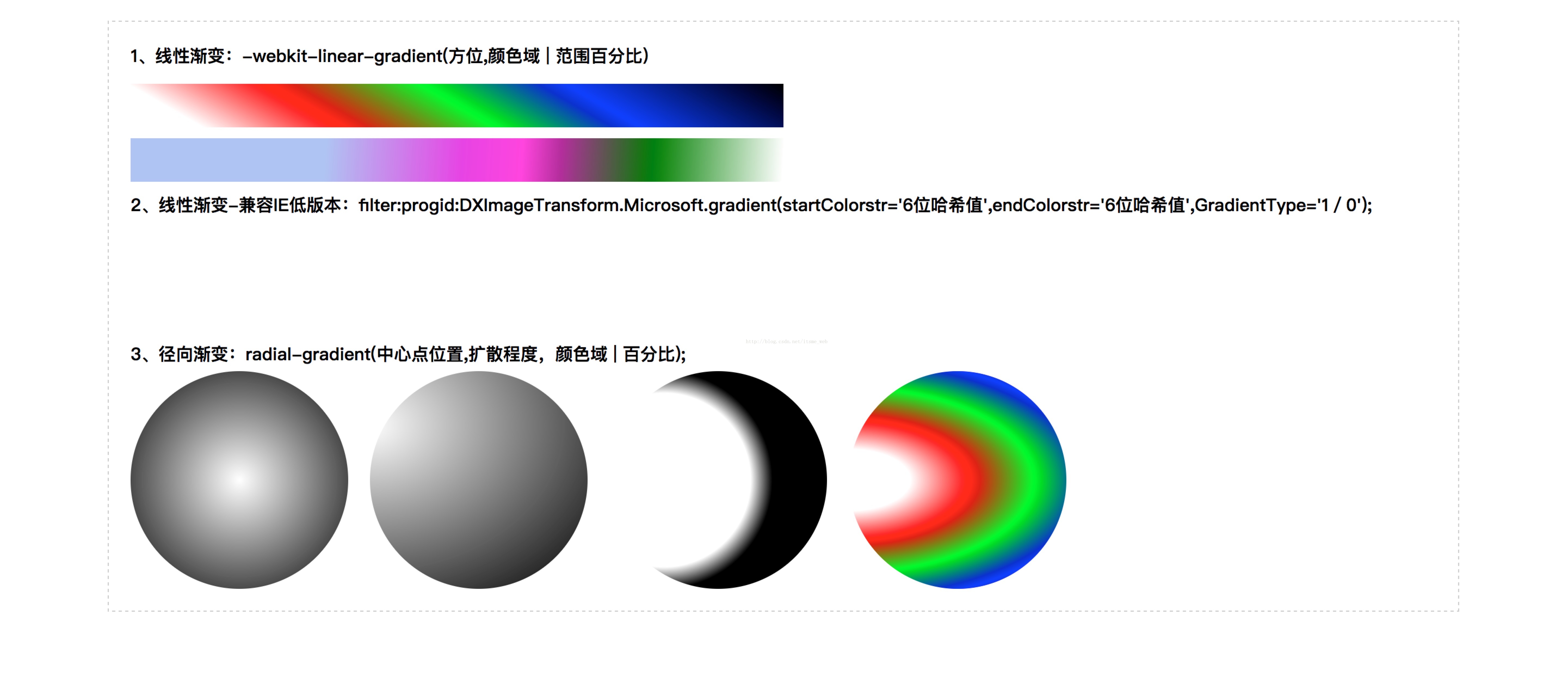
线性渐变:linear-gradient(方位(left/left top/60deg),起始颜色 | 百分比30%,终止颜色);使用时加内核前缀eg:-webkit-linear-gradient,IE9不支持
径向渐变:radial-gradient(中心点位置,扩散程度,颜色域 | 百分比);由中心向四周发散,eg:-webkit-radial-gradient(50px 50px,起始颜色,终止颜色);-webkit-radial-gradient(center,起始颜色,终止颜色);
IE低版本兼容:filter:progid:DXImageTransform.Microsoft.gradient(startColorstr='#ffffff',endColorstr='#ff0000',GradientType='1');1表示从左到右,0是从上到下,并且颜色值只能是6位哈希值
7、渐变练习代码部分:
<!DOCTYPE HTML>
<html>
<head>
<title>your title name</title>
<meta charset="utf-8">
<meta name="Author" content="Wilson Xu">
<style type="text/css">
*{margin: 0;padding: 0;font-family: "Microsoft yahei";}
a{text-decoration: none;}
a img{display: block;border: none;}
li{list-style: none;}
.container{
width: 1200px;
padding: 20px;
margin: 20px auto;
border: 1px dashed #ccc;
}
.container h4{padding-bottom: 5px;}
.container ul{
width: 1200px;
overflow: hidden;
}
.container ul.linear li,
.container ul.filter li{
width: 600px;
height: 40px;
margin: 10px 0;
}
.container ul.linear li:first-child{
background: -webkit-linear-gradient(60deg,#fff 10%, #f00 30%, #0f0 50%, #00f 70%, #000);
}
.container ul.linear li:last-child{
background: -webkit-linear-gradient(left top, rgba(122,156,233,.6) 30%, rgb(255,12,222) 60%, green 80%, #fff);
}
.container ul.filter li:first-child{
background: filter:progid:DXImageTransform.Microsoft.gradient(startColorstr='#abcdef',endColorstr='#f44add',GradientType='0');
}
.container ul.filter li:last-child{
background: filter:progid:DXImageTransform.Microsoft.gradient(startColorstr='#ffffff',endColorstr='#000000',GradientType='1');
}
.container ul.radial li{
width: 200px;
height: 200px;
margin-right: 20px;
float: left;
border-radius: 100%;
}
.container ul.radial li:nth-child(1){
background: -webkit-radial-gradient(center, #fff, #000);
}
.container ul.radial li:nth-child(2){
background: -webkit-radial-gradient(left 50px, #fff, #000);
}
.container ul.radial li:nth-child(3){
background: -webkit-radial-gradient(50px 100px,100px 100px, #fff 80%, #000);
}
.container ul.radial li:nth-child(4){
background: -webkit-radial-gradient(left, #fff 20%, #f00 40%, #0f0 60%, #00f 80%, #000);
}
</style>
</head>
<body>
<p class="container">
<section>
<h4>1、线性渐变:-webkit-linear-gradient(方位,颜色域 | 范围百分比)</h4>
<ul class="linear">
<li></li>
<li></li>
</ul>
</section>
<section>
<h4>2、线性渐变-兼容IE低版本:filter:progid:DXImageTransform.Microsoft.gradient(startColorstr='6位哈希值',endColorstr='6位哈希值',GradientType='1/0');</h4>
<ul class="filter">
<li></li>
<li></li>
</ul>
</section>
<section>
<h4>3、径向渐变:radial-gradient(中心点位置,扩散程度,颜色域 | 百分比);</h4>
<ul class="radial">
<li></li>
<li></li>
<li></li>
<li></li>
</ul>
</section>
</p>
</body>
</html>8、渐变preview:
以上就是实例详解Html5的背景应用的详细内容,更多请关注php中文网其它相关文章!


 收藏
收藏
 收藏
收藏
 收藏
收藏
Copyright 2014-2024 https://www.php.cn/ All Rights Reserved | php.cn | 湘ICP备2023035733号


 0
0 49
49


![ThinkPHP5实战之[教学管理系统]](https://img.php.cn/upload/course/000/000/068/6253d87459486427.png)


