
本文主要和大家介绍了css3 仿写阿里云水纹效果的示例代码的相关资料,小编觉得挺不错的,现在分享给大家,也给大家做个参考。一起跟随小编过来看看吧,希望能帮助到大家。
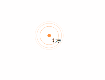
效果图
什么也不说了,上代码。
<!DOCTYPE html>
<html>
<head>
    <title>css3 水纹效果</title>
    <style type="text/css">
        .point_area {
            text-align: center;
            position: relative;
            width: 150px;
            height: 150px;
            transition: opacity .5s ease-out;
        }
        .point_area .point {
            position: absolute;
            top: 0;
            left: 0;
            right: 0;
            bottom: 0;
            width: 10px;
            height: 10px;
            margin: auto;
            -webkit-border-radius: 50%;
            -webkit-background-clip: padding-box;
            -moz-border-radius: 50%;
            -moz-background-clip: padding;
            border-radius: 50%;
            background-clip: padding-box;
            background: transparent;
        }
        .point_area .point_dot {
            z-index: 1;
            background-color: #ff903d;
            border: 1px solid rgba(255,144,61,.37);
        }
        .point_area .point_10 {
            width: 100%;
            height: 100%;
        }
        .point_area .point_10:after {
            content: "";
            display: block;
            position: absolute;
            top: 0;
            right: 0;
            bottom: 0;
            left: 0;
            border-radius: 50%;
            border: 2px solid #ff903d;
            opacity: 0;
            -webkit-animation: ripple 4.5s ease-out 225ms infinite;
            animation: ripple 4.5s ease-out 225ms infinite;
        }
        .point_area .point_40 {
            width: 100%;
            height: 100%;
        }
        .point_area .point_40:after {
            content: "";
            display: block;
            position: absolute;
            top: 0;
            right: 0;
            bottom: 0;
            left: 0;
            border-radius: 50%;
            border: 2px solid #ff903d;
            opacity: 0;
            -webkit-animation: ripple 4.5s ease-out .9s infinite;
            animation: ripple 4.5s ease-out .9s infinite;
        }
        .point_area .point_80 {
            width: 100%;
            height: 100%;
        }
        .point_area .point_80:after {
            content: "";
            display: block;
            position: absolute;
            top: 0;
            right: 0;
            bottom: 0;
            left: 0;
            border-radius: 50%;
            border: 2px solid #ff903d;
            opacity: 0;
            -webkit-animation: ripple 4.5s ease-out 1.8s infinite;
            animation: ripple 4.5s ease-out 1.8s infinite;
        }
        @-webkit-keyframes ripple{
            0%{
                opacity:0;-webkit-transform:scale(.1)
            }
            5%{
                opacity:1
            }
            to{
                opacity:0;
                -webkit-transform:scale(1)
            }
        }
        @keyframes ripple{
            0%{
                opacity:0;
                -webkit-transform:scale(.1);
                transform:scale(.1)
            }
            5%{
                opacity:1
            }
            to{
                opacity:0;
                -webkit-transform:scale(1);
                transform:scale(1)
            }
        }
    </style>
</head>
<body style="position: relative;">
    <p class="point_area" style="top: 158px; left: 661px; position: absolute; width: 110px; height: 110px; visibility: visible; opacity: 1;">
        <p class="point_name" style="position: absolute; top: 45px; left: 65px;">北京</p>
        <a href="#" target="_blank" class="point point_dot"></a>
        <p class="point point_10"></p>
        <p class="point point_40"></p>
        <p class="point point_shadow point_80"></p>
    </p>
</body>
</html>相关推荐:
以上就是css3仿写阿里云水纹效果代码分享的详细内容,更多请关注php中文网其它相关文章!


 收藏
收藏
 收藏
收藏
 收藏
收藏
Copyright 2014-2024 https://www.php.cn/ All Rights Reserved | php.cn | 湘ICP备2023035733号


 0
0 19
19


![ThinkPHP5实战之[教学管理系统]](https://img.php.cn/upload/course/000/000/068/6253d87459486427.png)


