本文实例为大家分享了纯css3绘制打火机动画火焰效果的具体代码,供大家参考,具体内容如下
主要涉及到了以下属性:
<span style="font-family:Comic Sans MS;">animation(webkit-animation),
@keyframes name (@-webkit-keyframes name),
transform,
transform-origin,
transition,
box-shadow(spread属性),
text-shadow
z-index
linear-gradient。
radial-gradient
background-image
</span>
首先html代码如下:
 <span style="font-family:Comic Sans MS;"><!DOCTYPE html>
<html>
 <head>
  <meta charset="UTF-8">
  <title>纯CSS绘制打火机动画火焰特效</title>
  <link rel="stylesheet" href="css/style.css">
 </head>
 <body class="keBody">
  <h1 class="keTitle">纯CSS3绘制打火机动画火焰特效</h1>
  <p class="kePublic">
   <p class="playground">
    <p class="flame"></p>
    <p class="lighterBody">
     <p class="hover">hover me</p>
    </p>
    <p class="lid"></p>
   </p>
   <p class="clear"></p>
  </p>
 </body>
</html></span>style.css文件如下:
<span style="font-family:Comic Sans MS;">@charset "utf-8";
body{
margin:0;
padding:0;
color:#333;
text-align:center;
font:12px "微软雅黑";
}
:before,:after{
position:absolute;
content:"";
}
.keBody{
background:url(../images/bodyBg.jpg) repeat #333;
}
.keTitle{
height:100px;
line-height:100px;
font-size:30px;
font-family:'微软雅黑';
color:#fff;
text-align:center;
background:url(../images/bodyBg3.jpg) repeat-x bottombottom left;
font-weight:normal;
margin-bottom:0;
}
.kePublic{
background:#cccccc;
padding:50px;
}
.playground{
position:relative;
width:140px;
height:400px;
left:50%;
margin-left:-70px;
}
.flame{
opacity: 0;
position: absolute;
bottombottom: 60%;
left: 42%;
width: 14px;
height: 70px;
background-color: white;
border-radius: 100% 100% 0 0;
box-shadow: 0 0 20px #FFFEF0, 0 0 20px #FFFEE6, 0 0 20px #fefcc9, 10px -10px 30px #feec85, -20px -20px 40px #ffae34, 20px -40px 50px #ec760c, -20px -60px 60px #cd4606, 0 -80px 70px #973716, 10px -90px 80px #451b0e;
}
.playground:hover .flame {
opacity:1;
transition:opacity 3s linear;
-webkit-animation:flame 1s infinite linear;
}
.playground:hover .lid{
-webkit-animation:lidoff 1s linear;
/*把物体动画地从一个地方移动到另一个地方,并让它停留在那里:*/
-webkit-animation-fill-mode:forwards;
}
.lighterBody{
position:absolute;
width:140px;
height:130px;
top:200px;
left:0;
background-image:linear-gradient(to rightright,#959595 0%,#0d0d0d 46%,#010101 50%,#0a0a0a 53%,
#4e4e4e 76%,#383838 87%,#1b1b1b 100%);
border-radius:2% 2% 8% 8%;
box-shadow:inset 0 0 5px 5px #333;
}
.lighterBody:before{
width:47px;
height:47px;
top:-50px;
left: 42px;
content:"...";
color:#e6e6e6;
border-radius:6% 6% 0 0;
background-image:linear-gradient(to rightright,#f5f5f5 0%,#dbdce2 21%,#b8bac6 49%,#dddfe3 80%,#f5f6f6 100%);
font-size:30px;
font-weight:bold;
letter-spacing:7px;
line-height:16px;
text-shadow:0 0 5px black;
padding-top:3px;
padding-left:4px;
}
.lighterBody:after{
width:33px;
height:33px;
background-image:radial-gradient(ellipse at center,#7d737d 0%,#0e0e0e 100%);
border-radius:100%;
top:-33px;
left:10px;
box-shadow:inset 0 0 1px 2px gray;
}
.lid{
z-index:2;
position:absolute;
width:140px;
height:75px;
top:125px;
left:0;
background:linear-gradient(to rightright,#959595 0%,#0d0d0d 46%, #010101 50%, #0a0a0a 53%, #4e4e4e 76%, #383838 87%, #1b1b1b 100%);
border-radius:8% 8% 2% 2%;
box-shadow:inset 0 0 5px 5px #333;
/*border-bottom:3px solid #f2f2f2;*/
}
.lid:before{
width:10px;
height:10px;
top:70px;
left:133px;
background-image:radial-gradient(ellipse at center, #959595 0%, #0d0d0d 46%, #010101 50%, #0a0a0a 53%, #4e4e4e 76%, #383838 87%, #1b1b1b 100%);
border-radius:100%;
}
.hover{
z-index:1;
text-align:center;
margin-top:30%;
color:rgba(255,255,255,0.9);
text-shadow:0 1px 1px rgba(0,0,0,0.8);
font: 20px "微软雅黑";
}
.hover:before{
content:"";
z-index:1;
width:0;
height:0;
top:-50px;
left:20px;
border-bottom:35px solid #f2f2f2;
/*border-left:10px solid transparent;*/
}
@-webkit-keyframes flame{
0%{
height:70px;
transform:skewY(0deg);
border-radius:100% 100% 0 0;
}
25%{
height:60px;
transform:skewY(40deg);
border-radius:10% 100% 0 0;
}
60%{
height:65px;
transform:skewY(-20deg);
border-radius:90% 10% 0 0;
}
70%{
height:50px;
transform:skewY(10deg);
border-radius:10% 100% 0 0;
}
100%{
height:70px;
tranform:skewY(0deg);
}
}
@-webkit-keyframes lidoff{
from{
transform:rotate(0deg);
transform-origin:100% 100%;
}
to{
transform:rotate(130deg);
transform-origin:100% 100%;
}
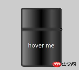
}</span>初始照片:
动态照片
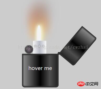
动画效果主要有两个,一是当鼠标悬停在“hover me”上面时打火机盖子打开的情形,由下面的动画代码实现:
 <span   style="max-width:90%">@-webkit-keyframes lidoff{     注意这里要加上-webkit-
     from{
          transform:rotate(0deg);
          transform-origin:100% 100%;
     }
     to{
          transform:rotate(130deg);
          transform-origin:100% 100%;
     }
}
</span> 第二个动画是蜡烛灯光效果的实现:蜡烛由按变量是由transition:opacity 3s linear; 实现的,
蜡烛灯光的随风摆动效果是由下面的代码实现的:
<span style="font-family:Comic Sans MS;font-size:12px;">@-webkit-keyframes lidoff{
    from{
         transform:rotate(0deg);
         transform-origin:100% 100%;
    }
    to{
         transform:rotate(130deg);
         transform-origin:100% 100%;
    }
</span> 将打火机盖与躯干分离的效果是由:box-shadow:inset 0 0 5px 5px #333; 主要是这里的inset(注意不要写成了insert)实现的。
当打火机打开时出现的圆球和白色的小正方形,是由:after :before 配合z-index实现的效果。
下面来介绍通过这个例子我的学到的几个属性需要注意的地方。
transform-origin: 默认的初始位置是图像的中心,100% 100%相当于 right bottom. 0% 0%相当于 left top.
before 和:after : 注入的内容是有关联的目标元素的字子元素,但它会被置于这个元素任何内容的“前” 或"后"。插入的内容在页面的源码里是看不见的,只能在css里看见。同时插入的元素在默认情况是内联元素。因此,为了给插入的元素赋予高度、填充、边距等等,通常必须显示的定义一个块级元素(display:block)。
此外,虽然可能不会插入任何内容,但是content必须写上,如果不插入任何内容,那么content写成 content:"";
IE6和IE7不兼容这两个为元素
伪元素(双冒号),css3中的伪类是(单冒号)
animation-fill-mode: none|forwards|backwards|both|initial|inherit;
规定当动画不播放时(当动画完成时,或当动画有一个延迟未开始播放时),要应用到元素的样式。
background-image:解决了p只能设置一个背景的问题,使一个p可以设置多个背景图片。
box-shadow:一个经常被遗忘的参数--spread(扩展阴影半径),这个曾经被遗忘的spread改变阴影的大小---其值可以是正负值,如果值为正,则整个阴影都延展扩大,反之是负值,则缩小。有了这个参数后可以使用box-shadow像photoshop中的阴影工作一样,制作单边阴影效果。这里注意一点,这个扩展阴影值需要和阴影模糊半径配合使用,一般情况是“扩展阴影半径一般设置为和模糊半径大小,并去其负值”
以上就是本文的全部内容,希望对大家的学习有所帮助,也希望大家多多支持PHP中文网。
更多纯CSS3绘制打火机动画火焰效果示例代码相关文章请关注PHP中文网!


 收藏
收藏
 收藏
收藏
 收藏
收藏
Copyright 2014-2024 https://www.php.cn/ All Rights Reserved | php.cn | 湘ICP备2023035733号


 0
0 24
24


![ThinkPHP5实战之[教学管理系统]](https://img.php.cn/upload/course/000/000/068/6253d87459486427.png)